The Apartment Living Room That Made Me Feel Like a Failure
For about eight months, I hated my living room.
Not mildly disliked. Genuinely dreaded walking into it. The room was small — about 11 by 13 feet, which sounds manageable until you factor in the front door that opened directly into it, the single window on the worst possible wall, the radiator I couldn’t move, and a weird half-wall that jutted out from the kitchen and ate about two feet of the only long wall I had. The room looked like it had been designed by someone who had never met a human being and had only vague secondhand knowledge of furniture.
I tried everything I could think of. Sofa against the long wall: the room looked like a waiting room. Sofa floating in the center: I couldn’t walk around it without doing a sideways shuffle. Sofa angled toward the window: one leg sat directly over the heating vent and the whole arrangement listed slightly to the left like a sinking ship.
I spent months cycling through arrangements, buying things that didn’t work, returning them, convincing myself the problem was the furniture and not the layout, buying different furniture, and ending up in the same defeated place every time.
The breakthrough came from a neighbor — a woman in her seventies who had lived in a similar apartment for decades — who walked into my living room one afternoon, stood in the doorway for about fifteen seconds, and said: “You’re fighting the room. You need to work with it.”
She didn’t elaborate much. But that single reframe changed how I thought about the space. I stopped trying to impose a layout I’d seen somewhere else onto a room with completely different geometry, and I started actually looking at what the room itself was asking for.
What I found — and what this guide is going to walk you through — is that apartment living rooms have specific constraints and specific opportunities that don’t apply to houses, and working with those rather than against them makes an enormous difference.
Why Apartment Living Rooms Are a Different Problem
Before we get into layouts, it’s worth naming what makes apartments specifically difficult — because it’s not just the square footage, and understanding the actual problem changes how you solve it.
The entrance problem. In most apartments, the front door opens directly into the living room or within a few feet of it. There is no foyer, no entry hall, no transitional space. This means the living room has to do double duty as both a social space and an arrival space, and it means the first few feet inside the door are simultaneously high-traffic and visually prominent. Every layout decision in an apartment living room has to account for what the room looks like the moment you open the door — because that view is the whole room.
The wall problem. Apartment living rooms almost always have more interruptions per linear foot of wall than rooms in houses. Windows in awkward positions, doors to bedrooms or bathrooms, electrical panels, heating units, exposed pipes, that one outlet that’s in completely the wrong place. What looks like a usable 12-foot wall is actually a 6-foot wall with a door, a 3-foot section with a radiator, and a 3-foot section that would work if it weren’t in a high-traffic path. Working with actual usable wall sections rather than the room’s theoretical perimeter is one of the most important and most overlooked aspects of apartment layout planning.
The landlord problem. You cannot paint in most apartments without permission. You cannot install anything that requires drilling in many apartments. You cannot change the flooring, the lighting fixtures, or the window treatments. This eliminates a whole category of solutions that work beautifully in owned homes and forces a reliance on furniture, textiles, and portable fixtures to do work that architecture would normally handle. The good news: once you accept these constraints, the solutions that remain are more portable, more intentional, and often more creative.
The scale problem. Apartment living rooms are often not just small in absolute square footage — they are disproportionate in some specific way. Too narrow for their length. Too square for the furniture that was designed for rectangular rooms. Ceilings too low, or occasionally too high, for the furniture scale that reads as “normal.” Identifying the specific disproportionality of your room — not just “it’s small” but “it’s narrow” or “it’s nearly square” or “the ceiling is nine feet in a room that’s only ten feet wide” — is the starting point for finding a layout that works.
I didn’t understand any of this during the eight months I spent hating my living room. I was solving the wrong problem over and over. Once I started solving the right one, everything changed quickly.
Step One: Read Your Room Before You Touch Anything
This is the step that I skipped for eight months and that my neighbor essentially forced me to do in fifteen seconds. Read the room. Actually look at it — not at the furniture in it, but at the architecture.
Stand in the doorway and notice where your eye goes first. That is either your room’s focal point or the place the room wants a focal point to be. If your eye goes to a window with a view, that is your focal point. If it goes to a blank wall, that wall wants a focal point you haven’t given it yet. If it goes to the radiator, your room has a focal point problem that needs solving before anything else.
Walk to the center of the room and turn slowly. Note the interruptions on each wall — every door, window, vent, and protrusion — and note what remains between them. These “clear sections” are your actual available wall real estate, and they are almost always smaller than you think.
Measure those clear sections specifically. Not the room dimensions — the clear sections. You might discover that your “big wall” is actually two usable sections of five feet each with a door between them, which completely changes what furniture can go there.
Mark the fixed constraints: the door swing arc (open the door fully and mark where it lands), any windows you cannot obstruct, the radiator clearance, and any rental restrictions on anchor points. These become the negative space of your floor plan — zones where furniture simply cannot go.
What remains after you eliminate everything else is where your furniture actually fits. In most apartment living rooms, this is a smaller and more specific set of options than people expect. But it is also more honest — and working within honest constraints produces better results than ignoring them.
The Four Layouts That Actually Work in Apartments
After living in several apartments and helping friends with theirs, I’ve found that most apartment living rooms reduce to one of four viable layout types. Not because creativity doesn’t matter, but because the constraints of apartment architecture tend to produce rooms that need specific solutions.
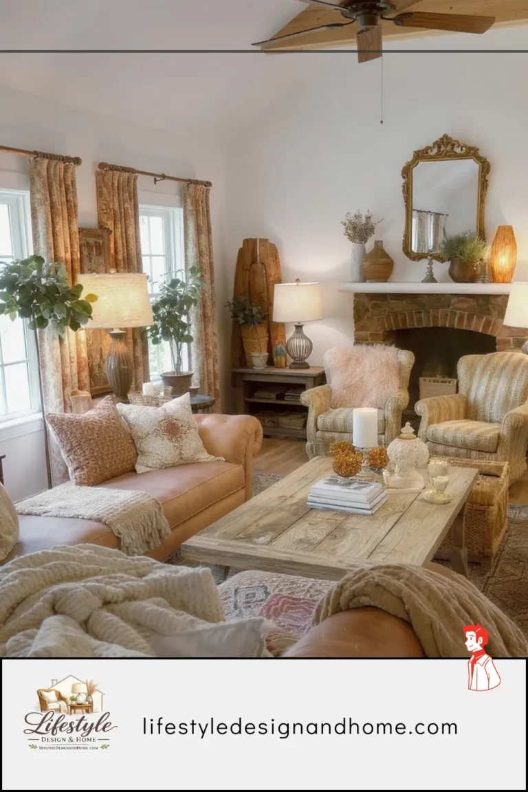
Layout 1: The Centered Anchor
Best for: Rectangular rooms with one clear long wall and a front door on a short wall.
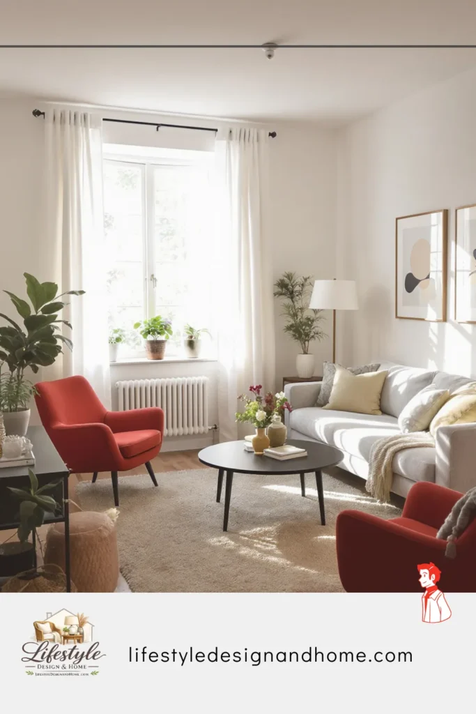
This is the layout that solved my 11-by-13 disaster, and I’m slightly embarrassed it took me eight months to try it properly.
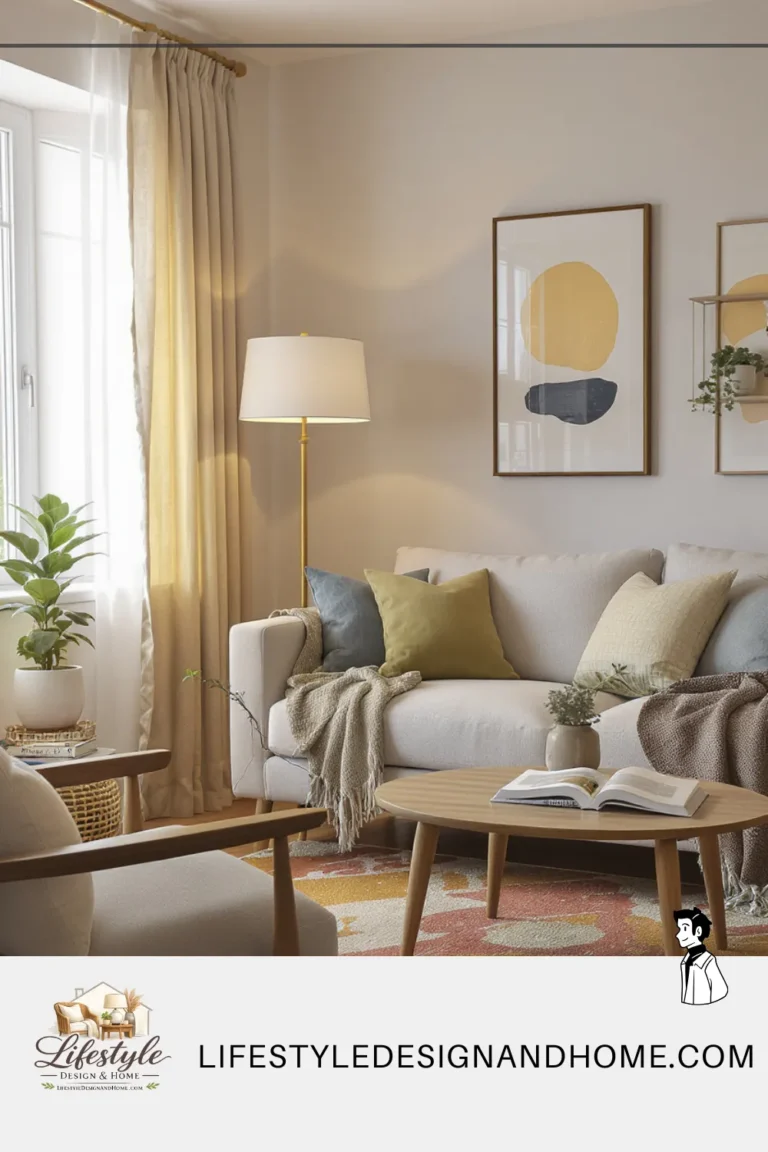
The centered anchor places the sofa as the room’s organizational spine — not against a wall, but floated in the room with its back roughly parallel to and about 18 inches from the main wall. The television or primary focal point sits on the wall the sofa faces. Two armchairs or a loveseat face the sofa across a coffee table, creating a conversational grouping that occupies the center of the room and leaves a clear perimeter for traffic.
The key insight I was missing: in a small apartment living room, the sofa doesn’t need to be against a wall for the room to feel spacious. In fact, it is often the opposite. A floating sofa creates a defined zone that the eye reads as intentional, and intentional spaces always feel larger than the same square footage used defensively.
What to do about the front door opening directly into the room: the 18-inch gap between the sofa back and the wall behind it becomes a natural arrival path. You enter, walk alongside the sofa back, arrive in the living space. This is the function a foyer performs in a house, accomplished with furniture placement in an apartment.
My neighbor pointed this out to me as if it were obvious. It was obvious. I simply hadn’t been able to see it while I was busy fighting the room.
Layout 2: The L-Shape Zone
Best for: Nearly square rooms, rooms with multiple doorways, and studio apartments where the living room shares space with another function.
The L-shape zone uses an L-shaped sofa or a sofa-plus-chaise configuration to define the living zone in rooms where a traditional facing-seating arrangement would be awkward or impossible.
The L creates its own edges. Instead of needing walls to define where the living room ends and the hallway begins, the L-shaped sofa creates that definition with furniture alone. This is extraordinarily useful in apartments where the living room bleeds into a dining area or where multiple doorways prevent any single wall from working as a furniture backdrop.
I used this layout in a studio apartment for about two years. The L-shaped sofa was simultaneously the room’s most useful piece of furniture — enormous seating capacity for a small apartment — and its most important spatial tool, creating a living zone within a room that was also bedroom, dining room, and office. Without the L to define the zone, the space felt formless. With it, the living area had edges and therefore a presence.
The practical consideration: L-shaped sofas in apartments need to be measured with exceptional care. The sofa that fits the room dimensions might not fit through the door, around the stairwell, or up the elevator. I have seen people purchase sofas that physically could not enter the apartment. Measure the entry path — door width, elevator dimensions, stair landing clearance — before you commit.
Layout 3: The Single Sofa Simplified
Best for: Very small rooms under 120 square feet, rooms with only one clear wall, and apartments where the living room is essentially a “sitting area” rather than a full room.
This is the layout most people treat as a failure state — the room too small for a proper arrangement, the single sofa stuck against a wall, the coffee table in front of it, nothing else. Done out of resignation rather than intention.
What I’ve learned is that the single sofa layout, done with genuine intention, can be genuinely excellent. The secret is treating it as a design choice rather than a constraint.
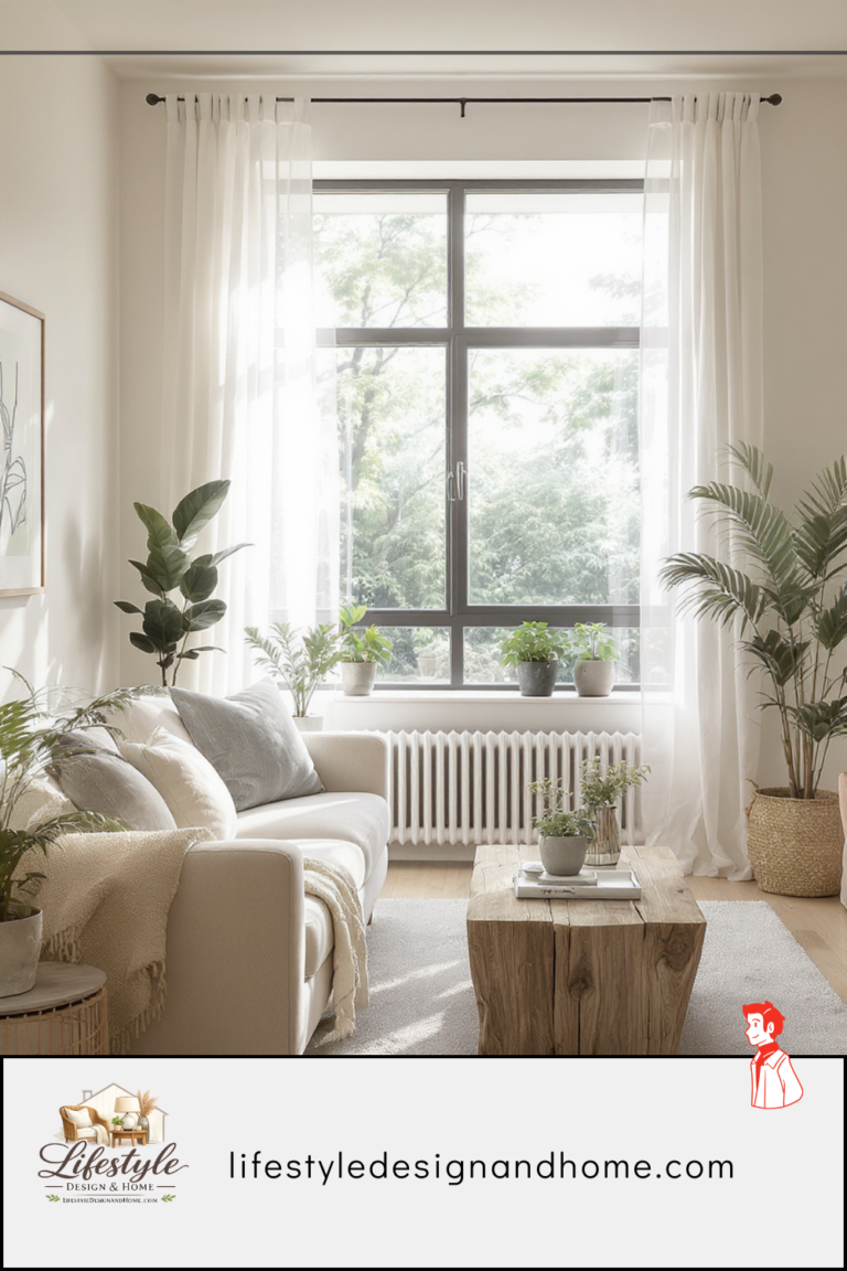
One sofa, floated slightly from the wall. One quality coffee table at the right scale — not too small, not too large. One or two side tables in lieu of a second seating piece. One excellent floor lamp in the corner that needs it most. And then: negative space. Clear floor on the perimeter. A rug that grounds the arrangement and defines the zone. One considered piece on the wall behind the sofa. Nothing more.
The rooms I have seen do this best have fewer pieces than you’d expect and better pieces than you might think were necessary. One extraordinary sofa, one beautiful coffee table, one lamp that genuinely works, one piece of art. The restraint is itself the statement. The room doesn’t try to be a full living room — it tries to be a perfect sitting room, which is a different ambition and one that a small apartment space can absolutely achieve.
Layout 4: The Dual-Purpose Zone
Best for: Apartments where the living room must also function as a home office, dining area, or sleeping space for guests.
This is the apartment layout challenge that has become almost universal in the past few years — the room that needs to do two jobs, neither of which it was designed for.
The principle I operate on: dual-purpose apartment rooms work when the two functions are spatially separated, even if the separation is slight. The eye and brain need to be able to read the room as having distinct zones — even zones without walls between them — to be able to shift mode between them.
The most effective separations I’ve used and seen:
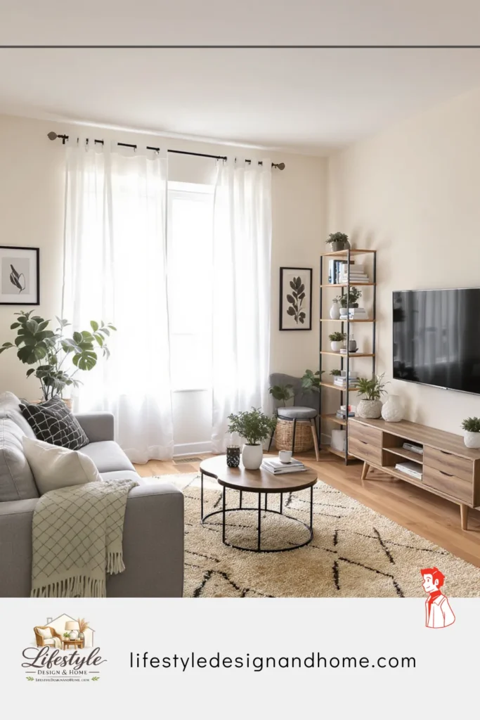
A bookshelf used as a room divider between the sitting area and the desk area — placed perpendicular to the wall, it creates two zones from one room without losing any square footage. The shelf faces the living zone on one side and the work zone on the other, serving as both storage and spatial work.
A rug that defines the living zone — the desk lives outside the rug, the sofa and coffee table live inside it. This is the most minimal separation possible, and it works surprisingly well because the brain uses floor coverings as zone indicators in a way that is real even when it isn’t fully conscious.
A curtain track installed at ceiling height — renters can use tension-rod systems that require no drilling — with a linen panel that can be drawn to conceal the desk at the end of the workday. I’ve done this and it is, in practice, more effective than it sounds. The act of drawing the curtain is a small ritual that signals to my brain that work is over, and the desk’s visual concealment prevents the low-grade background stress of a visible to-do pile.
The Apartment-Specific Decisions That Change Everything
These are the choices that apply specifically to apartment living rooms — decisions that matter in ways they simply don’t in houses, because of the constraints apartment living imposes.
Furniture on legs, always.
This is the most consistent recommendation I make to friends furnishing apartment living rooms, and it is the one most frequently dismissed and then regretted. Furniture on legs — sofas, chairs, side tables, media consoles — reveals floor. Visible floor makes rooms feel larger. It’s physics. It’s not subtle.
Furniture that sits directly on the floor — upholstered pieces without legs, solid cabinet bases that go to the floor — creates a continuous surface between the furniture and the floor that the eye reads as a single heavy mass. Remove the legs from a sofa in a small room and the room immediately shrinks. Add legs back and it opens. I have tested this in my own apartment by moving the same sofa between two versions of itself (one with legs, one without — a modular system that allowed this) and the difference was visible to everyone I asked to look.
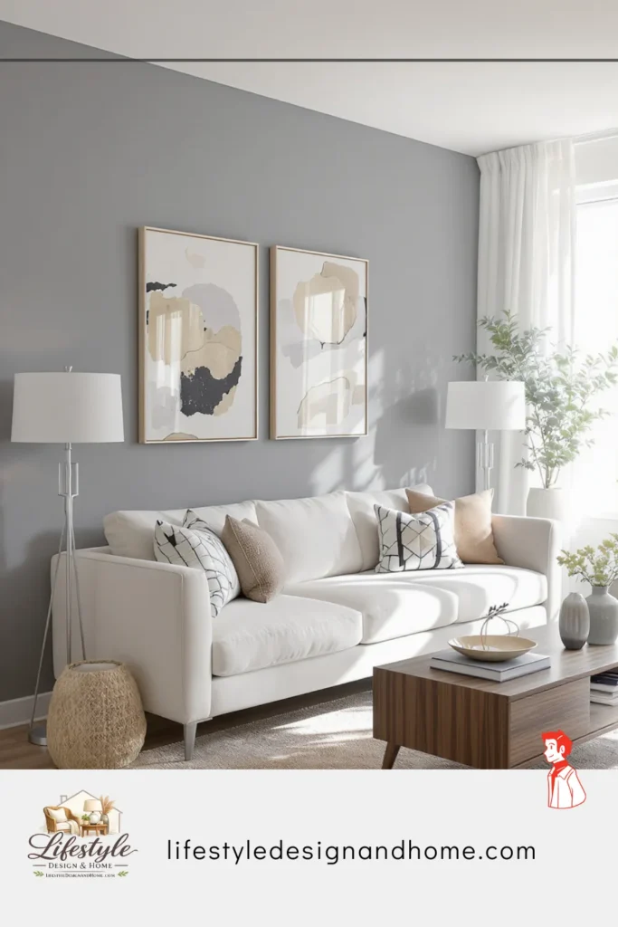
Mirrors as architecture.
In an apartment where you cannot knock down walls or add windows, a large mirror is the closest available substitute. Placed on the wall opposite a window, a mirror doubles the apparent depth of the room and reflects natural light in a way that makes the space feel genuinely larger. Not suggestively larger — measurably, visibly larger in a way that guests notice without being able to name.
The mistake most people make with mirrors in small rooms: too small. A 20-inch decorative mirror does nothing for a room’s perceived size. A 40-inch mirror makes a small room look bigger. A 60-inch mirror leaned against a wall makes a small room feel like it has a doorway into another room. Go large. Go larger than you think is reasonable. Then go a bit larger still.
Vertical space as a resource.
Apartment living rooms tend to have more vertical wall space than horizontal floor space, and most people use the horizontal and ignore the vertical. This is a significant missed opportunity.
Tall bookshelves that go to the ceiling draw the eye upward and make the room feel taller. Curtains hung at ceiling height rather than window height do the same. Art hung higher than feels instinctive — center of the piece at 60 inches from the floor rather than the 57 that feels “normal” — encourages the eye to travel up. A statement floor lamp with height. A tall, architectural plant in the corner.
Every element that draws the eye upward makes a small room feel less constrained by its floor plan, because it redirects the perception from horizontal to vertical. The room may be narrow. It is not necessarily short. Emphasizing the vertical dimension rebalances the proportion in a way that genuinely changes how the room feels.
The rug as room-maker.
In apartments where you cannot change the flooring — often the beige carpet or laminate that came with the building — a rug is not optional decoration. It is the floor of your room. It defines where your living room is within the apartment, separates it from adjacent spaces, and covers the surface that was never yours to choose in the first place.
The rule for apartment living room rugs: bigger than you think, but not so big it looks like wall-to-wall carpet. For most apartment living rooms, an 8-by-10 rug is the starting point. A 9-by-12 is often better. The rug should extend well beyond the furniture footprint — if all four legs of every seating piece can sit on it comfortably, you’re probably right-sized. If only the front legs can reach it, go bigger. If the rug ends at the furniture edge with floor visible around it, go much bigger.
The color and texture of the rug is the single most powerful tool you have for changing how an apartment living room feels. A warm, textured rug in a medium tone makes the room feel like yours. The beige carpet beneath it recedes and stops mattering. This is the fastest, most complete transformation available to apartment renters.
The Layout Killers: What to Avoid in Apartment Living Rooms
I made all of these mistakes at some point. Some of them cost me money. All of them cost me time.
Furniture that’s too large for the room. The sofa that seats five people in a 10-by-12 room. The coffee table that requires stepping over it to cross the room. The bookshelf that blocks the window. Scale is the most common and most damaging mistake in apartment living rooms. The furniture that looks proportional in the showroom is in a showroom with 14-foot ceilings and 40-foot sightlines. Measure obsessively. Then measure again.
Matching sets. Bedroom suite, living room suite — furniture purchased as a set because it’s easier than making individual decisions. Matching sets in small rooms look like a furniture showroom, not a home. The pieces all have the same visual weight, the same legs, the same finish, and they read as a collection of identical objects rather than a room that developed over time. Mix pieces. They don’t have to match. They have to work together, which is different.
Ignoring the front door sightline. In an apartment, what you see the moment you open the front door is the first impression of your home — every day, for everyone who visits. Most people treat this as an afterthought. The best apartment living rooms I’ve visited are the ones where something beautiful is visible immediately from the door: a considered piece of art on the opposite wall, a vignette on a console table, a plant in exactly the right corner. The sightline is free real estate. Use it.
Television as the only focal point. In houses, the television often shares focal point status with a fireplace or a significant window. In apartments, it frequently ends up as the only thing the room points toward, and the result is a room that feels like a viewing setup rather than a living room. In my experience, the best apartment living rooms treat the television as one element within a designed wall — gallery of art, floating shelves, some kind of considered surround — rather than as a black rectangle that the entire room faces and apologizes for.