The Argument My Partner and I Had About a Light Bulb
It started, as many of our domestic disagreements do, with something that seemed trivial.
We had just moved into a new apartment, and I was replacing bulbs — the kind of task I find oddly satisfying, going room by room with a bag of LEDs, upgrading the previous tenant’s chaos of mismatched wattages and dying halogens. I got to the kitchen and installed what I considered a sensible bulb: 2700K, warm white, the same temperature I use everywhere.
My partner walked in, looked at the ceiling, and said, “That looks yellow. It looks like a restaurant that’s trying too hard.”
I said it looked warm and inviting. She said it looked like a 1970s kitchen. I said she was wrong about lighting. She said I was wrong about everything.
We stood in the kitchen for about ten minutes having the kind of argument that is nominally about light bulbs but is actually about something more fundamental — about how different people experience the same light differently, about what “cozy” means to one person and “dingy” to another, about the gap between what looks right in theory and what feels right when you actually live in a space.
We ended up compromising on 3000K for the kitchen, which I still believe is slightly too cool and she still believes is slightly too warm. The kitchen looks fine. The argument was useful.
What I learned from it — beyond the obvious lesson about picking my battles — is that warm versus cool lighting is not a question with a single correct answer. It is a question with a correct answer for each specific room, each specific person, and each specific use. Understanding the variables is what allows you to make those decisions deliberately rather than accidentally.
This guide is everything I’ve learned about those variables, including the things I got wrong before I got them right.
The Science First, Because It Actually Matters
I want to spend real time on the science here before we get to the practical applications, because the science is not dry background information. It is the explanation for why certain light makes you feel certain ways, and once you understand it, every lighting decision you make starts to have a logic that goes beyond aesthetics.
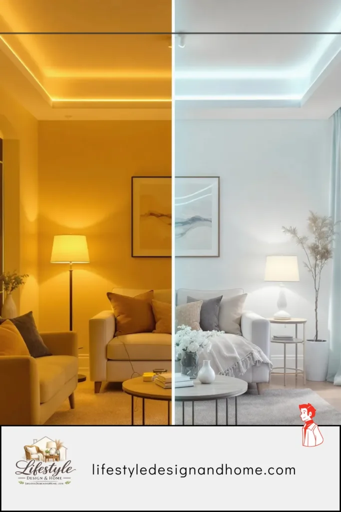
Light exists on a spectrum. At one end: blue, short-wavelength light, high energy. At the other: red, long-wavelength light, low energy. The visible portion of this spectrum — the portion human eyes can detect — runs from violet through blue, green, yellow, and orange to red. Different light sources emit different portions of this spectrum, and we perceive those emissions as “color temperature.”
Color temperature is measured in Kelvins (K). The counterintuitive thing about this measurement is that it runs backward relative to how we describe light in casual conversation: higher Kelvin numbers mean cooler, bluer light. Lower Kelvin numbers mean warmer, more amber light. This seems wrong until you understand the physics: when a piece of metal is heated to very high temperatures, it glows blue-white, and at lower temperatures it glows orange-red. The Kelvin scale describes the temperature at which a theoretical “black body” radiator would emit that particular color of light.
In practice, for home lighting:
2200–2700K is warm white to soft white — the amber range. This is the color of old incandescent bulbs, of candlelight at the higher end, of fire. It is the light most people describe as “cozy” or “warm,” and there are biological reasons for this response.
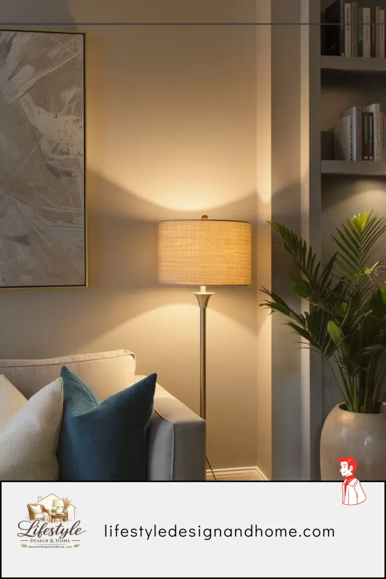
2700–3000K is the transition zone — still warm but cleaner. This is where I land for most living spaces and where most “warm white” LED packaging ends up.
3000–3500K is neutral warm — the territory my partner prefers for functional spaces. Bright enough to see clearly, warm enough not to feel clinical.
4000–5000K is cool white to daylight — the range of office lighting, retail stores, and task-oriented spaces. Energizing, revealing, slightly unforgiving.
5000–6500K is full daylight — bright blue-white, used in workshops and spaces where color accuracy and maximum visibility matter.
The Biology You Cannot Override
Here is the part that I find most interesting and most useful: the human response to light color is not a preference. It is a biological mechanism, and it operates whether you are aware of it or not.
The human circadian rhythm — the roughly 24-hour biological clock that governs alertness, sleepiness, hormone production, and dozens of other physiological processes — is regulated primarily by light. Specifically, it responds to blue-spectrum light. Blue light tells the brain that it is daytime. It suppresses melatonin production, elevates cortisol, increases alertness, and raises body temperature slightly. It says: be awake.
Warm, low-spectrum light does the opposite. Amber and red tones do not trigger the blue-light receptor (technically called melanopsin) in the eye’s retinal ganglion cells. Without that trigger, melatonin production proceeds normally, alertness decreases, and the body moves toward its natural evening state. Warm light says: be at rest.
This mechanism evolved because, for almost all of human history, daytime meant blue sky and sun (cool, blue-spectrum light) and evening meant fire and embers (warm, red-spectrum light). The body learned to use light color as a clock, and it still does — even now that we can produce any color of artificial light at any hour of the day.
The practical implication: bright, cool light in the evening works against your body’s natural sleep preparation. Warm, dim light in the evening supports it. This is not a lifestyle recommendation. It is physiology. And it means that the choice between warm and cool light in your home is not just about aesthetics — it is about how your body functions throughout the day.
Warm Lighting: What It Does and Where It Works
Warm light — anything in the 2200K to 3000K range — does several specific things in a space, and understanding what those things are helps you use it deliberately rather than just defaulting to it because it “feels cozy.”
What warm light does:
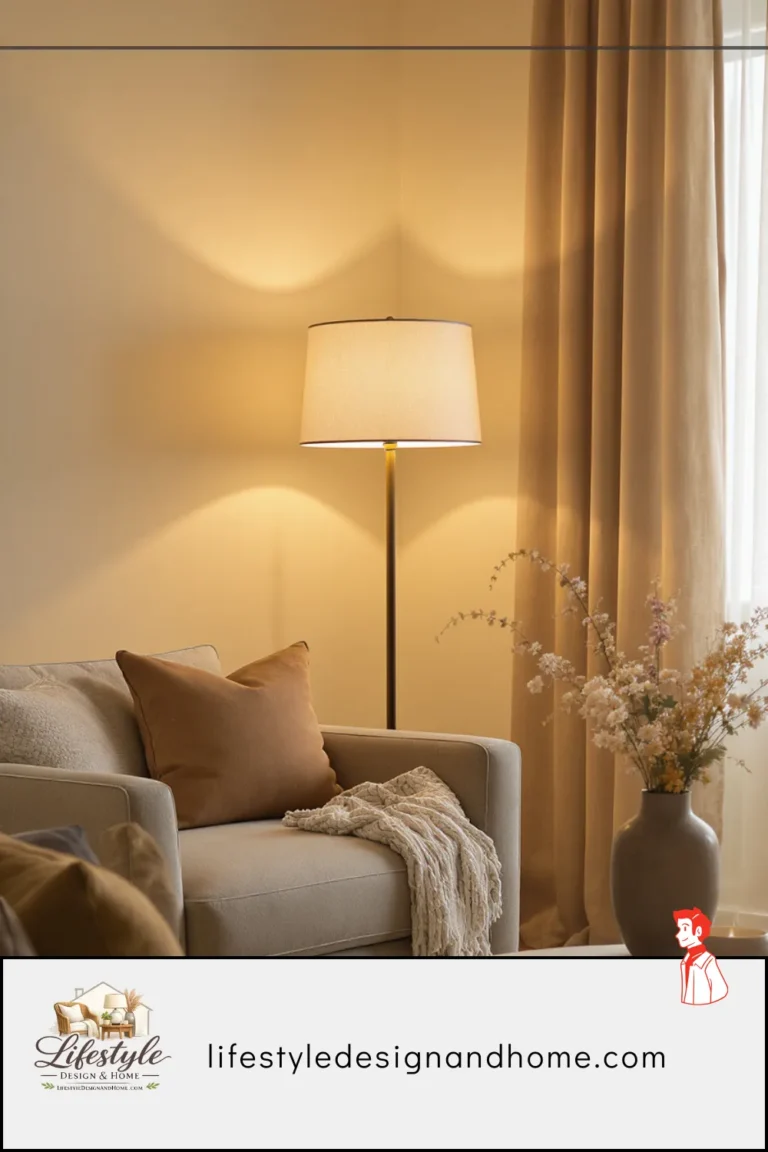
It softens surfaces. Warm light makes walls look less sharp-edged, wood grain look richer, and textures read as softer and more inviting. In a room with natural materials — wood, linen, leather, stone — warm light enhances the natural character of those materials in a way that cool light flattens.
It makes skin look better. This is not trivial. A room where people gather — a living room, a dining room — is a room where people look at each other, and warm light is flattering to human skin tones in a way that cool light is not. Cool light can make people look slightly washed out or greenish. Warm light makes people look warm.
It creates shadow and depth. Warm light sources, particularly at lower brightness levels, create more pronounced shadows than cool overhead light. These shadows add visual depth to a room — the difference between a room that looks dimensional and one that looks flat.
It supports evening rest. As described above, warm light does not trigger the alerting response that blue-spectrum light does. In spaces used in the evening — bedrooms, living rooms, dining rooms — this biological effect is real and relevant.
Where warm light works best:
Bedrooms — without qualification. The bedroom is where warm light is most important and most often gotten wrong. If there is one room in the house that should be exclusively warm-lit, it is the bedroom. I explained this at length in the bedroom lighting article in this series, and the reasoning is the same: bedrooms are for rest, rest requires a supportive biological environment, and warm light provides that environment while cool light actively undermines it.
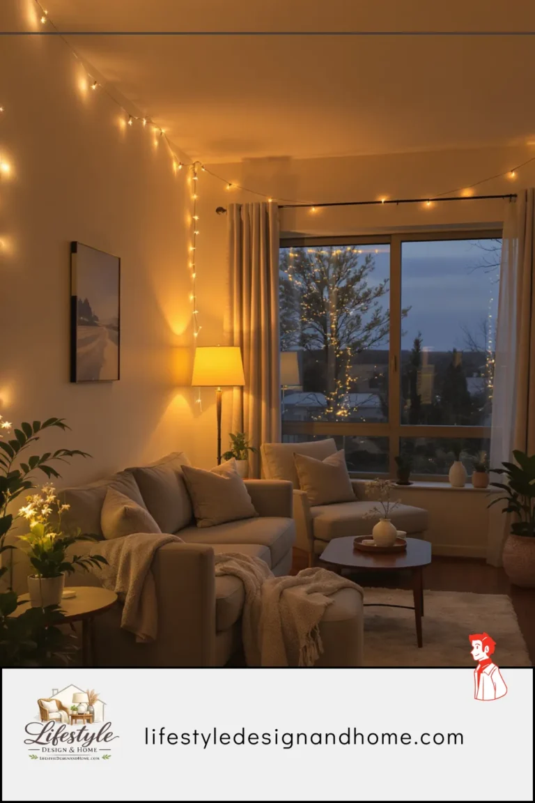
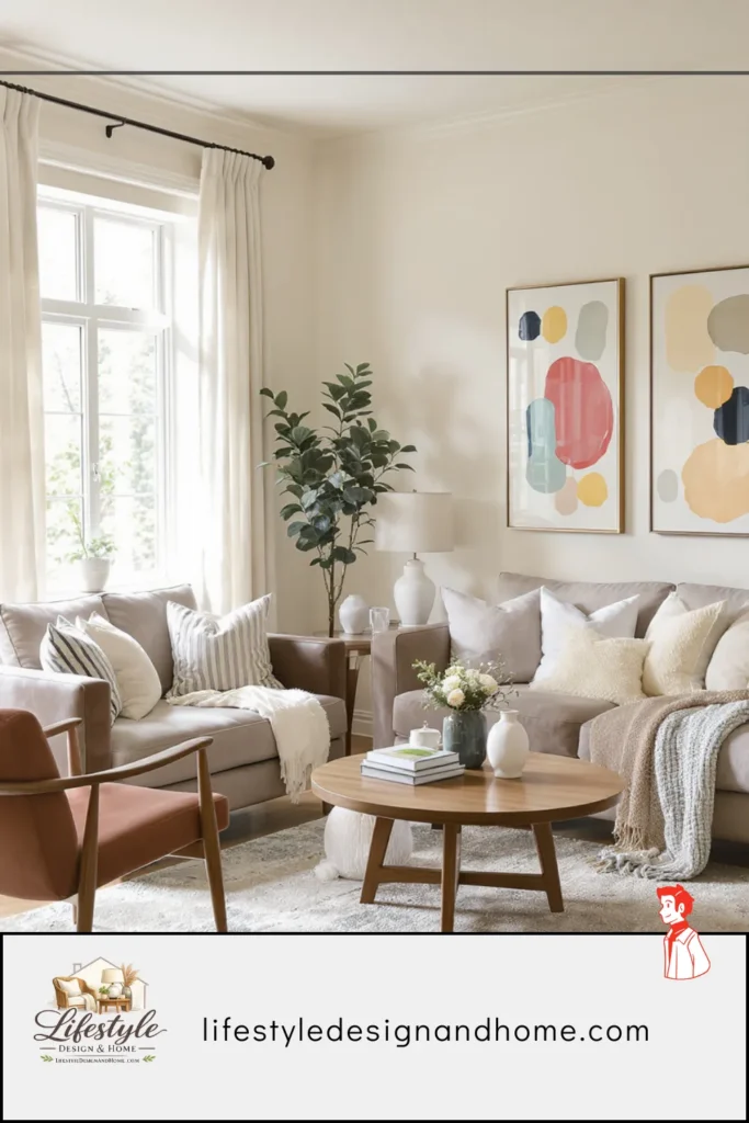
Living rooms — in the evening hours. Living rooms in my experience work best with flexible warm lighting rather than fixed warm lighting. During the day, more light is often needed and slightly cooler temperatures (2700-3000K) are fine. In the evenings, warm dimmed sources at 2700K and below create the atmosphere that makes people stay and relax rather than feeling alert and ready to leave.
Dining rooms — almost always. The dining table is a place of gathering, conversation, and the consumption of food and drink. All three of these activities are enhanced by warm light. Food looks more appetizing in warm light — the colors of roasted, caramelized, and browned food are in the amber range, and warm light enhances them rather than flattening them. Conversation feels more intimate. The experience of eating together feels more like an occasion and less like a transaction.
Bedside and reading nooks — specifically. A reading lamp at 2700K provides enough light to read comfortably while staying in the warm spectrum that supports rather than disrupts evening rest. A 4000K reading lamp gives better visual acuity but at the cost of suppressing melatonin and making sleep harder to fall into afterward.
Where warm light struggles:
Tasks requiring color accuracy. If you are applying makeup, matching paint colors, cooking something that requires visual assessment of doneness, or doing detail work of any kind, warm light misrepresents colors. Red tones are enhanced. Blue and green tones are suppressed. What looks like the right shade of foundation or the right color of paint under warm light may look wrong in natural daylight.
Spaces that feel small and need visual expansion. Warm light, particularly at lower brightness levels, can make small dark rooms feel smaller and darker. A room that struggles with feeling cave-like — a basement, a north-facing room with small windows, a room painted in a deep color — can feel oppressive under very warm dim light. In these rooms, slightly cooler and brighter light during the day helps the space feel open and livable.
Cool Lighting: What It Does and Where It Works
Cool light — anything in the 3500K to 6500K range — gets a bad reputation in home lighting conversations that it only partially deserves. There are spaces where cool light is not just acceptable but genuinely the right choice, and treating the entire spectrum above 3000K as wrong for homes is an overcorrection.
What cool light does:
It reveals. Cool light is unforgiving and honest — it shows surfaces, colors, and details clearly without the flattering softening effect of warm light. This is exactly what you need in spaces where you need to see accurately.
It energizes. Blue-spectrum light triggers alertness and reduces fatigue. In spaces used for focused work, this effect is genuinely useful. The reason office buildings use cool light is not purely economic — it keeps people alert.
It makes spaces feel larger and cleaner. Cool bright light expands the apparent size of a room by illuminating corners and reducing shadow. In small rooms that need to feel larger, or in spaces where cleanliness is the primary value, this quality is an advantage.
It represents colors accurately. If color fidelity matters — makeup application, art studios, spaces where you’re selecting paint or fabric colors — cool light or daylight-equivalent light shows colors as they will actually appear in natural light.
Where cool light works best:
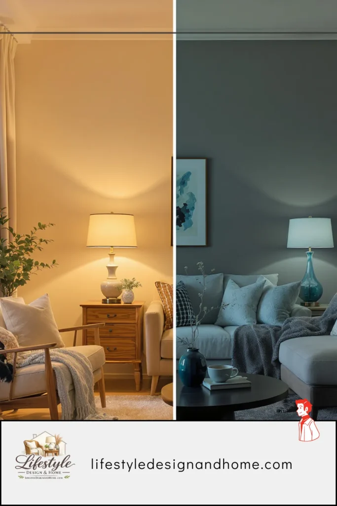
Kitchens — with nuance. This is where my kitchen argument with my partner lives. Kitchens require task lighting for food preparation, and task lighting benefits from being bright and slightly cooler than pure warm light. My position is that the cooking zone — the area above and around the stovetop and counter work surfaces — benefits from 3000K to 3500K light for accurate color rendering and visibility, while the dining area of a kitchen (or kitchen island where people sit) benefits from warmer 2700K light. The solution: two circuits with different color temperatures, or pendant lights above the island at 2700K while undercabinet task lighting at 3000K to 3500K. My partner accepted this compromise eventually.
Bathrooms — specifically vanity lighting. Applying makeup or shaving under warm light produces results that look wrong in daylight. Vanity lighting should be close to natural daylight in color temperature — 3000K to 4000K — and positioned to light the face from the sides rather than from above, which creates unflattering shadows.
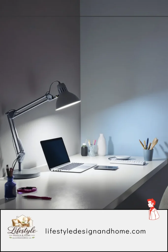
Home offices and study spaces — during working hours. A home office used during the day benefits from cooler, brighter light that supports alertness and focus. The caveat: if the office is also used in the evening, the lighting should be adjustable. Cool bright light in a home office at 10 PM is exactly the wrong thing for sleep preparation, and many people’s work-from-home setups create this problem without realizing it.
Laundry rooms, utility spaces, and garages — where visibility is the only value. These are spaces where the emotional atmosphere is irrelevant and clear visibility is everything. Cool bright light is correct here with no reservations.
Art studios and craft rooms — where color accuracy is professional-level important. Anyone doing visual art, textile work, or any craft where color decisions matter should use daylight-equivalent light (5000K to 6500K) with high CRI (Color Rendering Index — a measure of how accurately a light source represents colors) for the working area.
Where cool light fails:
Bedrooms — categorically. I have never encountered a compelling argument for cool light in a bedroom, and I have encountered plenty of bedrooms damaged by it. The biology is clear: cool light suppresses melatonin and disrupts sleep. A bedroom is a sleep environment. These two things are incompatible.
Evening living spaces — particularly the hour before sleep. A living room used primarily in the evenings, for winding down after work, should not have cool overhead lighting as its primary source. The alerting effect of cool light is the opposite of what an evening in a living room is supposed to produce.
Spaces with warm natural materials. Cool light is an aesthetic mismatch for rooms built around wood, leather, stone, and natural textiles. These materials are warm in color and character, and cool light desaturates their warmth and makes them look slightly wrong — less rich, less alive, less themselves.
The Room-by-Room Guide to Getting It Right
Rather than a definitive pronouncement, think of this as a starting framework — and then adjust based on how your specific space, your specific natural light, and your specific preferences interact.
Bedroom: 2700K, Non-Negotiable
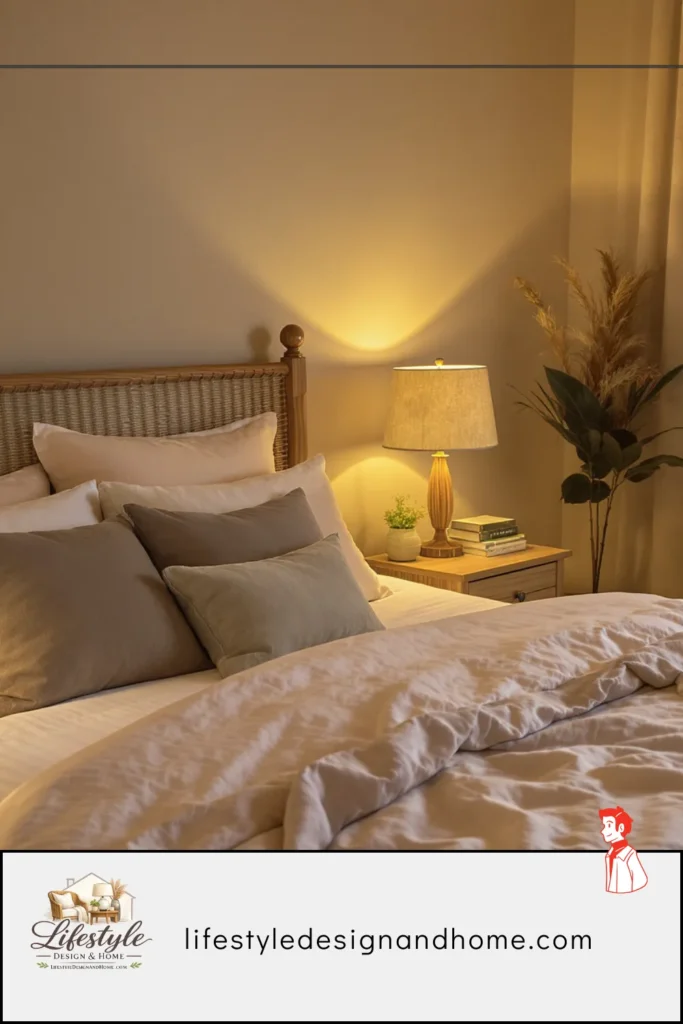
I have said this across multiple articles in this series and I will say it again because I keep encountering bedrooms lit at 4000K by people who then wonder why they can’t sleep. The bedroom is a 2700K room. All sources, all the time. Dimmer switches throughout. No cool light, no exceptions.
The one nuance: if the bedroom also contains a vanity where makeup is applied, that specific task zone can have a 3000K to 3500K light for accuracy. But it should be a separate circuit from the general bedroom lighting and should be off by the time the bedroom transitions to its evening mode.
Living Room: 2700K with Daytime Flexibility
My current living room setup: all lamps and accent sources at 2700K, overhead on a dimmer with a 2700K bulb. During the day, the overhead goes to 60-70 percent and the room is bright enough for work and practical tasks. In the evenings, the overhead goes to 20-30 percent and the lamps take over. The room is warm and inviting.
If the living room is also used as a home office during the day, I’d consider installing a separate overhead circuit at 3000K for daytime task use, switchable independently from the general lighting. This is a slightly more complex electrical project but solves the problem of a room that needs to be simultaneously good for daytime work and good for evening relaxation.
Kitchen: 2700K Ambient, 3000–3500K Task
This is the compromise I landed on after the great light bulb argument. Pendant lights or a central fixture at 2700K for the room’s general character. Undercabinet task lighting or focused fixtures over the cooking zone at 3000K to 3500K for food preparation visibility. The kitchen feels warm when you’re standing in it. It’s accurate when you need to see what you’re cooking.
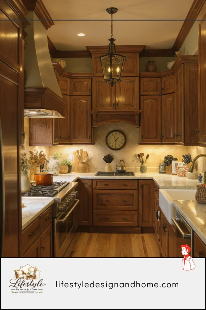
If the kitchen has a dining area or island seating, the light over that area should match the room’s ambient temperature — 2700K — rather than the task temperature. The distinction matters: eating at a kitchen island under 3500K task lighting does not feel like a meal. It feels like a bright functional transaction.
Bathroom: Split by Function
Main bathroom lighting at 3000K to 3500K for the general environment. Vanity lighting specifically — the lights that illuminate the face for grooming — at 3000K to 4000K for accuracy. If the bathroom is also used as a relaxation space (a soaking tub, a place you go to decompress), consider a separate warm circuit at 2700K for that zone that can be used independently.
I installed a separate dimmer-controlled warm lamp on the vanity counter specifically for bath evenings. At 2700K and 20 percent brightness, the bath becomes a genuinely different room than it is at 7 AM under task lighting. Same bathroom. Two completely different experiences.
Home Office: Adjustable
A home office with fixed cool light is problematic for anyone who uses the space in the evenings. My solution: smart bulbs throughout that can shift from 4000K at 100 percent for daytime focus work to 2700K at 40 percent for evening use. This is the single most impactful smart home technology for people who work from home, and it is relatively inexpensive.
If smart bulbs feel like overkill, the manual version is two separate lamps: a cool-toned task lamp used during work hours, switched off in the evening in favor of a warm-toned ambient lamp. The switching is a ritual that also signals the transition from work mode to home mode — which is, for people who work at home, a distinction that is worth reinforcing physically.
Dining Room: 2700K, Dimmed
Dining rooms are easy: warm, dimmable, placed where the light falls on the table and the people around it rather than the ceiling. A pendant or chandelier over the table at 2700K on a dimmer is the complete answer for most dining rooms. Side sources — a buffet lamp, sconces on the walls — add layered warmth and eliminate the single-source problem.
The dimmer is particularly important in dining rooms because the appropriate light level shifts dramatically between everyday family dinner and a dinner party. Everyday: brighter, more functional. Dinner party: dimmed to the point where the table and its people are the brightest elements in the room and everything else recedes. That shift transforms the atmosphere of the same room from practical to celebratory.
The Color Rendering Index — The Number Nobody Mentions
Color temperature is not the only number that matters on a light bulb package, and this section exists because most home lighting guides never mention the other one.
CRI stands for Color Rendering Index. It measures how accurately a light source represents colors compared to natural sunlight, on a scale from 0 to 100. A CRI of 100 means perfect color accuracy. Sunlight has a CRI of 100. Old incandescent bulbs had a CRI of about 100. Many cheap LED bulbs have CRIs in the 70s or 80s, which means they represent colors with meaningful inaccuracy even at the “correct” color temperature.
The practical effect of low CRI: a 2700K bulb with a CRI of 75 will produce warm light that makes colors look slightly off — flesh tones that seem slightly greenish, blues that seem slightly dull, reds that seem slightly flat. You might buy a warm bulb and still feel like something is subtly wrong with the light, without being able to identify what. Often, it is the CRI.
For living spaces, I recommend looking for bulbs with a CRI of 90 or above. They cost slightly more — sometimes twice as much as low-CRI alternatives at the same color temperature — and they are worth it. The quality of light from a high-CRI warm bulb is noticeably better than from a low-CRI warm bulb, in a way that is immediately apparent if you ever have them side by side.
For spaces where color accuracy is critical — art studios, craft rooms, spaces where makeup is applied — look for CRI 95 or above, sometimes labeled “high fidelity” or “full spectrum.”
The Compromise Framework (For People Who Share Spaces)
I want to return, at the end, to the kitchen argument — because I think the lesson of that argument is more useful than any specific recommendation about color temperature.
Different people experience light differently. My partner is not wrong that 2700K can look yellow in certain spaces under certain conditions. I am not wrong that 4000K is too cold for a space used for meals and morning coffee. Both of these things are true simultaneously, which means neither of us was entirely right.
The framework I use now when lighting decisions involve more than one person:
Identify the room’s primary use and the time of day that use happens. A kitchen used primarily in the morning for task-oriented cooking can tolerate cooler light than one used primarily in the evening for relaxed cooking and casual gathering. The primary use at the primary hour should dictate the baseline.
Use layered lighting to accommodate secondary uses. Task zones and ambient zones can have different color temperatures if they’re on separate circuits. The cooking zone and the eating zone of the same kitchen don’t have to be identically lit.
Make it adjustable. Dimmers and smart bulbs allow the same fixture to serve different needs at different times. The kitchen at 3000K for breakfast becomes the kitchen at 2700K for a late-evening glass of wine. Adjustability resolves most disagreements because the room doesn’t have to be permanently optimized for one person’s preference.
Let the most physiologically significant space win. In the bedroom, warm light is not just a preference — it is a sleep health recommendation. In that specific room, in that specific context, the case for warm light goes beyond taste. For rooms where the choice is more genuinely aesthetic, compromise is reasonable. For the bedroom, 2700K should not be negotiated away.
We still have our kitchen at 3000K. I still prefer 2700K. The kitchen is fine. Our sleep, which is at 2700K throughout the bedroom, is good.
Your Warm vs Cool Lighting Quick Reference
2200–2700K — Warm White/Soft White:
Best for: Bedrooms, living rooms (evening), dining rooms, reading nooks, bathrooms (bath-time ambiance)
Avoid for: Task work requiring color accuracy, vanity lighting, home office daytime use
2700–3000K — Warm to Neutral Warm:
Best for: Kitchen ambient lighting, living rooms (all-day use), most general residential applications
Avoid for: Bedrooms if you have sleep sensitivity, spaces where color accuracy matters
3000–3500K — Neutral White:
Best for: Kitchen task zones, bathroom vanity lighting, laundry rooms, home office task lighting
Avoid for: Bedrooms, dining rooms, spaces intended primarily for relaxation
4000–5000K — Cool White:
Best for: Garages, workshops, utility spaces, home offices (daytime only)
Avoid for: Any space used in the evening if sleep is a priority, any space with warm natural materials
5000–6500K — Daylight:
Best for: Art studios, craft rooms, spaces requiring maximum color accuracy
Avoid for: Any living space used in the evening, bedrooms under all circumstances
CRI Guidance:
- General living spaces: CRI 90+
- Color-critical spaces: CRI 95+
- Budget minimum: Never below CRI 80 for any living space
The Bulb That Changed My Kitchen
We eventually replaced the 3000K bulbs in our kitchen with a setup that satisfied both of us: undercabinet LED strip lights at 3500K for task illumination, and pendant lights above the island at 2700K on a dimmer for ambiance.
The kitchen now has two modes. Morning mode: undercabinet lights on, pendants bright — functional, clear, good for making breakfast and reading the news. Evening mode: undercabinet lights off, pendants dimmed to 30 percent — warm, inviting, good for the glass of wine and the conversation that happens while someone is finishing cooking.
My partner now says the kitchen is her favorite room in the apartment. I don’t remind her that she called 2700K a restaurant trying too hard. Some arguments are better archived than relitigated.
The kitchen looks warm in the evening and functional in the morning, which is exactly what a kitchen should be.
That’s all warm versus cool lighting is, ultimately: matching the light to the moment. The rest is just numbers.