The Surface I Rearranged Every Week for Two Years
For a long time — embarrassingly long, given how much I think about interior spaces — my coffee table looked wrong every single day, and I could not figure out why.
Not wrong in a dramatic way. The table itself was good: a solid oak rectangle, simple construction, visible grain, the right scale for the sofa it served. The objects on it were individually fine: a ceramic bowl I’d bought from a potter at a market, a stack of books I was either reading or intended to read, a candle in a simple vessel, occasionally a small plant. These were reasonable objects. They were the kinds of things that appear on styled coffee tables in every design publication I had ever read.
And yet every time I looked at the table it felt unsettled. The arrangement seemed slightly arbitrary. The objects seemed to be sharing a surface rather than composing an arrangement. The table looked like a surface where things had been placed rather than a surface that had been considered.
I rearranged it probably once a week for two years. New configurations, different groupings, objects added and removed and added again. The table never quite arrived at the quality I was reaching for — that specific quality of styled surfaces in designed rooms where the objects seem to belong to each other and to the table and to the room simultaneously.
The breakthrough came from an unexpected source: I was looking at a photograph of a well-designed room and I noticed, for the first time, that I could describe exactly why the coffee table in the photograph worked. Not “it looks good” but the specific geometry and logic of the arrangement — why those particular objects were in those particular positions in those particular relationships. Once I could see the logic, I could apply it.
What I saw was a set of rules. Not arbitrary rules. Rules that emerged from the specific visual and functional requirements of a coffee table as a surface in a room — rules that, once understood, make every styling decision obvious rather than iterative.
Those rules are what this article is about.
Why the Coffee Table Is the Hardest Surface to Style
Before the rules, a moment on why the coffee table is specifically difficult — because understanding the difficulty helps you understand why the rules are what they are.
The coffee table is the most viewed surface in the living room. It sits at the center of the seating arrangement, in the visual field of everyone on the sofa or the adjacent chairs, at a height that means it is seen from above rather than at eye level. This last point matters enormously and is almost never discussed: most decorative surfaces — mantles, shelves, console tables — are viewed at eye level or above, which means you see them as a composition from the front. The coffee table is viewed from above, which means you see it as a floor plan. The arrangement must work as a layout, not just as a composition.
The coffee table is also, unlike a mantle or a shelf, a functional surface. Things are put on it — drinks, books, remotes, phones, the various objects of active daily life — and those things compete with the styled arrangement for the surface’s available space. A styled mantle can stay styled indefinitely because nobody puts their coffee cup on it. A styled coffee table is in constant negotiation with its own use.
And the coffee table is the room’s most central object — the piece that the eye finds when it enters the room and moves toward the seating area. This gives it visual importance beyond its size. A coffee table styled poorly is not a small mistake in a corner. It is a mistake at the center of the room, visible from everywhere, affecting the impression of every space it is part of.
These three specific challenges — the overhead view, the functional competition, the centrality — are what the rules are designed to address.
Rule #1: The Triangle Principle
This is the rule that unlocked everything for me, the one I could see in the photograph that I couldn’t see before: the objects on a well-styled coffee table are arranged in a triangle.
Not a literal triangle — not three objects positioned at the vertices of a geometric shape with nothing between them. A visual triangle: a grouping of objects that, when viewed from above, traces a triangular path from the largest element to the medium element to the smallest, with the eye moving naturally between them.
Why a triangle rather than a line or a square? Because a triangle is the simplest asymmetrical shape. A line of objects reads as a display — a row, something sequential and slightly rigid. A square or symmetrical arrangement reads as paired — correct and slightly static. A triangle reads as dynamic and complete: three points of visual interest that the eye moves between in a circuit, with no point so dominant that the others disappear and no point so small that it fails to register.
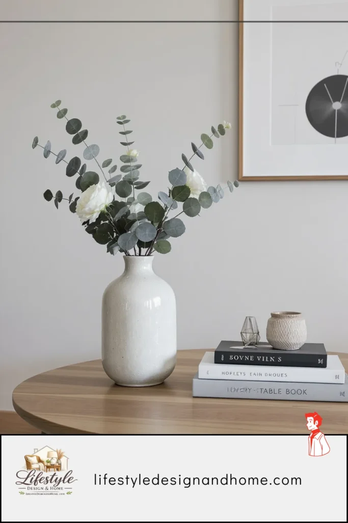
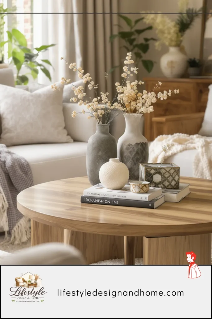
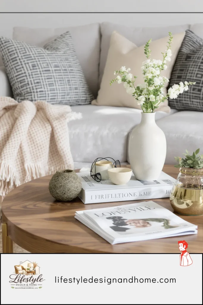
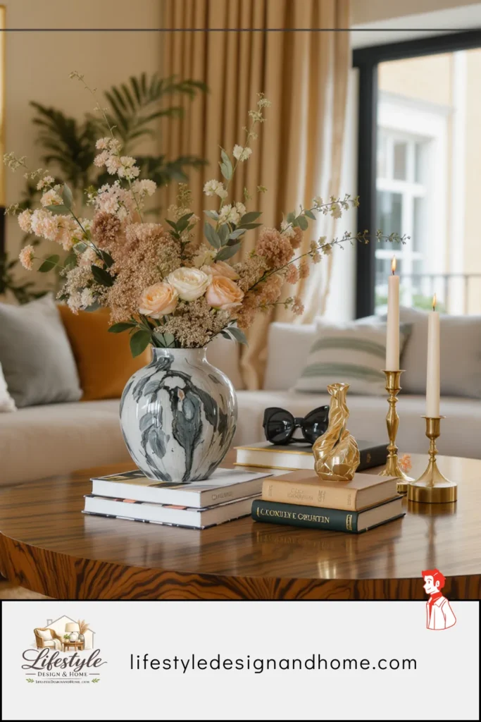
The practical application: group your coffee table objects in threes. Not three individual objects scattered across the table — three objects arranged so they read as a group from above. The largest object establishes the group’s anchor. The medium object creates the second point of the triangle, set slightly closer to one side. The smallest object completes the triangle, often the closest element to the viewer.
In my ceramic bowl/books / candle combination, the rule told me: the stack of books is the anchor (largest, most visual weight). The ceramic bowl is the medium point (second-largest, set to the side and slightly behind). The candle is the small point (closest to the viewer, completing the triangle toward the front of the table). The arrangement I’d been circling for two years was one logical application of this rule. Once I placed the objects correctly in their triangle, the table looked settled.
Rule #2: Vary the Height
The overhead view problem means that height is the coffee table’s primary source of visual complexity. On a shelf or mantle, objects at different heights create a silhouette — the variation is readable from the front. On a coffee table, the silhouette is less visible because you’re looking down. Height variation on a coffee table doesn’t create a dramatic silhouette. What it does is create the impression that the arrangement has been considered rather than flat — that the objects are in dialogue rather than simply coexisting on a surface.
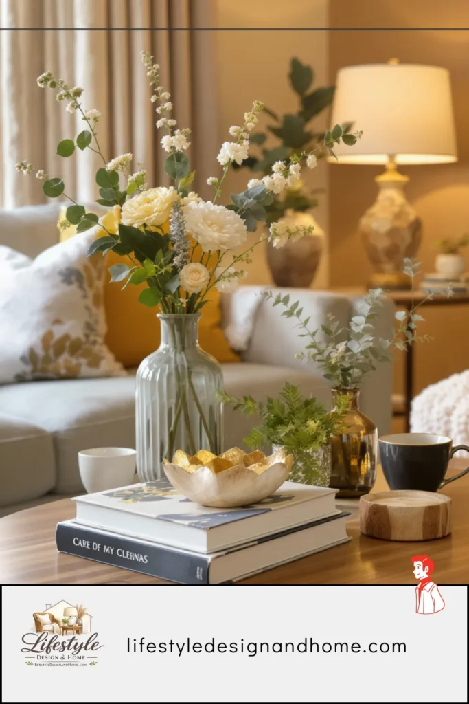
The rule: no two objects in a grouping should be the same height. The stack of books is taller than the bowl. The bowl is taller than the candle. The small vase with a single stem is taller than everything else, which gives the arrangement a vertical element that the overhead view doesn’t flatten.
The most common height mistake on coffee tables: a stack of books with objects placed on top of the stack versus objects placed beside it. Objects placed on top of the book stack extend the stack’s height further and create a single tower-like element. Objects placed beside the stack at a different height create the variation. The beside placement is almost always better than the on-top placement.
The specific height relationships that work: a range of approximately 3 to 4 inches between the shortest and tallest objects in a grouping feels natural and provides visible variation without dramatic contrast. Less than 2 inches of range reads as flat — the objects all appear the same height from above. More than 6 inches of range reads as disconnected — the tall element floats above the arrangement rather than belonging to it.
The one object that always adds height effectively: a small vase with a single tall stem. Even a simple sprig of eucalyptus or a dried branch adds vertical interest that no solid object on a coffee table can replicate, because the stem extends above the arrangement and creates a visual element that the overhead view cannot flatten.
Rule #3: The Surface Coverage Rule — Approximately One-Third
How much of the coffee table surface should be covered by styled objects?
This is the question that most people answer incorrectly in both directions. Too much: the table becomes a curated collection of objects that looks like a display cabinet, leaving no room for the functional use that a coffee table exists to support. Too little: a single object on a large table looks stranded and the table reads as empty rather than considered.
The rule I’ve arrived at through observation and experimentation: styled objects should cover approximately one-third of the table’s surface area, organized toward the center or one end, leaving the remaining two-thirds available for functional use.
One-third is not a precise measurement — it’s a principle of restraint. The objects should occupy enough surface that they read as an arrangement rather than a single lonely item, but not so much that the table looks full rather than styled. Full tables look like storage. Styled tables look considered.
The organizational logic matters as much as the coverage. Objects grouped toward the center of the table read as a centerpiece — they belong to the whole seating arrangement equally. Objects grouped toward one end of the table read as belonging to the side of the arrangement where they sit — useful if one end of the sofa is where someone primarily reads or uses the table more actively.
My preference is a grouping toward the center but offset slightly to one side — not perfectly centered, which reads as geometric and slightly stiff, but close enough to the center that it reads as belonging to the whole arrangement rather than one seat position. This slight asymmetry within the overall center placement is one of those small details that make an arrangement feel designed rather than placed.
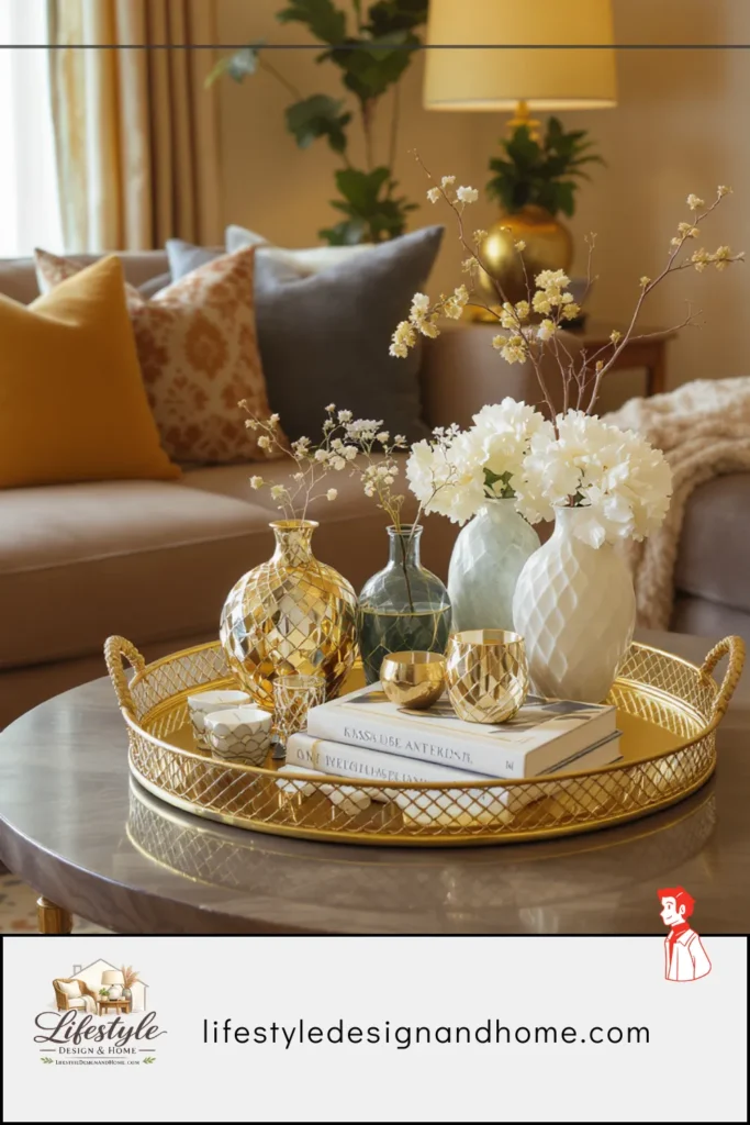
Rule #4: The Tray as Container and Editor
The tray is the most useful styling tool available for coffee tables, and it is the tool I avoided for years because trays seemed like a decorating cliché — the coffee table tray appeared in so many design articles as a solution to styled surfaces that it felt like a shorthand for conventional thinking.
I was wrong about this. The tray serves a function that no other object can serve simultaneously: it acts as a container for a grouping of objects, making them read as a single composed element rather than multiple separate items, while also acting as a functional surface within the surface — objects on the tray can be moved together, clearing the coffee table for use without requiring the arrangement to be disassembled and rebuilt.
The specific things a tray does:
Visual containment. A tray creates a boundary around the objects within it. The eye reads the tray and its contents as one unit rather than as multiple separate items. This means a grouping of three or four small objects — a candle, a small bowl, a few stones, a small plant — that would look scattered if placed directly on the table reads as a deliberate composition within the tray. The tray provides the visual coherence that the grouping otherwise lacks.
Functional practicality. When someone needs to clear the coffee table — for a board game, for a large gathering, for any reason — the tray and everything in it can be moved as a unit. This is not a small thing. A styled coffee table that cannot be quickly cleared of its styling is a table that competes with its function. A tray-contained arrangement can be lifted and set on the floor or another surface in one motion.
Scale anchoring. A large tray on a large coffee table fills some of the surface in a way that reads as intentional rather than as an object sitting alone. The tray itself has visual weight that contributes to the arrangement without requiring additional objects.
The size rule for coffee table trays: the tray should be large enough to contain its grouping with comfortable visual breathing room — not so tight that the objects look crammed, not so large that the objects look lost. A 14-by-20-inch tray for a grouping of three to four small objects is typically about right. Larger for larger groupings, smaller for more minimal ones.
The material rule: the tray’s material should relate to other materials in the room rather than introducing a new one. A wooden tray in a room with wooden furniture. A marble or stone tray in a room with stone or ceramic elements. A lacquered tray in a room with lacquered or high-finish elements. The tray should feel like it belongs to the room rather than being a separate decorating purchase.
Rule #5: The Natural Element
Every well-styled coffee table arrangement I have observed — in person, in photographs, in the homes of designers and people with genuine visual taste — has at least one natural element. Something that came from the natural world rather than being manufactured: a plant, a stem, a branch, a stone, a piece of driftwood, a dried botanical, a cluster of seed pods.
The natural element does something specific to a coffee table arrangement that no manufactured object can do regardless of how carefully chosen: it introduces a quality of genuine organic variation. A plant’s leaves are not identical to each other. A branch does not have a right angle anywhere. A stone found on a beach has a surface that was shaped by water over years. These qualities — the asymmetry, the unique surface, the visible natural process — create a note of authenticity that manufactured objects, however beautiful, cannot replicate.
I have noticed in my own arrangements that the natural element is often the thing that makes the rest of the arrangement read as chosen rather than purchased. The ceramic bowl and the books and the candle are all fine objects individually. Add a small plant or a sprig of something from the garden and the arrangement feels like it belongs to someone rather than to a style guide.
The natural element doesn’t need to be alive, though living plants have additional benefits. Dried botanicals — dried grasses, preserved leaves, seed pods, dried flowers in natural tones — last indefinitely and maintain the organic quality. A single large stone from somewhere meaningful. A piece of driftwood used as a resting surface for a small bowl. A branch in a small vase.
The scale principle for natural elements: the natural element should be proportional to the rest of the arrangement. A large sprawling plant in a grouping of small objects overwhelms. A single tiny stem in a grouping of substantial objects disappears. The natural element should feel like it belongs to the scale conversation of the other objects.
In my own arrangement: a small ceramic pot with a single succulent — chosen because succulents require minimal maintenance and maintain their quality without regular replacement. The pot relates to the other ceramic elements on the table. The plant adds height and organic quality. The arrangement is complete in a way it wasn’t before the natural element was present.
Rule #6: Odd Numbers Only
This rule applies to the number of objects in any grouping on the coffee table, and it applies because of a specific visual phenomenon that makes odd-numbered groupings read more naturally than even-numbered ones.
Even numbers create pairs. Two objects are a pair. Four objects are two pairs. Six objects are three pairs. The brain reads pairs as matched — as symmetrical, as intentional, as slightly formal. This formal reading is correct for certain surfaces (matching candlesticks flanking a mantle fireplace, for example) and wrong for coffee tables, which should read as curated and considered rather than as formal or matched.
Odd numbers — three, five, seven — resist being read as pairs. Three objects cannot form a symmetrical pair. They create a triangle. Five objects create a more complex arrangement that the eye reads as interesting rather than as two pairs plus one leftover. The grouping has movement rather than stillness.
The rule in practice: group objects in threes. Three is the most versatile odd number for coffee table styling — large enough to create an arrangement, small enough to maintain breathing room on the surface. Five is appropriate for larger tables or more complex arrangements. One is appropriate for very minimal styling where a single significant object is the statement. Two and four should be avoided in direct groupings.
The one exception I’ve found: books stacked in twos or fours can work because the stack reads as a single unit rather than as individual objects. Two books stacked read as “a book stack,” not as “two books.” The pair is subsumed into the object category of “stack.” The stack itself is one object in the odd-number grouping.
Rule #7: Relate Objects to the Room, Not Just to Each Other
This is the most advanced rule and the one that distinguishes coffee table styling that looks good in isolation from coffee table styling that makes the whole room feel more cohesive.
The objects on a coffee table should not be chosen solely because they look good together. They should be chosen because they relate to the room — its palette, its materials, its proportions, its mood. A coffee table arrangement that is internally beautiful but uses materials, colors, and scales that don’t appear elsewhere in the room looks like an installation rather than a part of the room’s design.
The specific relationships to look for:
Material echo. If the room has a significant wooden element — a wooden floor, a wooden shelving unit, a wooden side table — a wooden object on the coffee table creates a visual connection between the table arrangement and the room. The eye follows the wood from the floor to the shelf to the coffee table and reads the room as composed rather than assembled.
Color echo. The dominant color of the coffee table arrangement should appear somewhere else in the room. Not match — appear. If the room has a dusty sage throw on the sofa, a small sage-green ceramic on the coffee table creates a connection. The sage appears twice, and the coffee table becomes part of the room’s color story rather than an independent color moment.
Scale relation. A coffee table arrangement should be in proportion to the room’s overall scale. A very large room with substantial furniture can accommodate larger, more dramatic coffee table objects. A small room with modest furniture needs smaller, quieter objects on the coffee table — large statement pieces that look impressive in a design photograph can overwhelm a room that is actually small.
In my own living room: the ceramic bowl on the coffee table relates to the ceramic lamp base on the side table. The oak tray relates to the oak coffee table below it and the oak shelf across the room. The books’ covers have tones that appear in the rug beneath. The arrangement is not just internally composed — it is part of the room’s composition.
Rule #8: The Functional Reserve
This rule is about what should not be on the coffee table rather than what should, and it is the rule most often violated by people whose styling instincts are otherwise correct.
The coffee table should have a functional reserve — an amount of clear, unoccupied surface that is available for actual use without requiring the arrangement to be disturbed. Drinks can be put there. Books can be set down. A phone or remote can rest there. The table should be usable without having to move the styled arrangement.
The proportion I’ve found works: two-thirds of the table available, one-third styled. This is the flip side of the surface coverage rule — the styled area should be one-third, which means the functional reserve is two-thirds. In practice, the styled arrangement occupies one zone of the table and the rest of the table is clear.
The mistake: arranging objects across the full table so that every zone is occupied and every drink requires moving something. A fully occupied coffee table produces a specific low-grade frustration — the room looks perfect in photographs and is slightly irritating to actually use. The functional reserve resolves this without sacrificing the arrangement.
The positioning that makes the reserve most useful: the styled arrangement toward one end of the table or in the center with clear zones at both ends. The functional reserve zones should be the parts of the table most accessible from the primary seating positions — the center and the ends that are within arm’s reach from the sofa.
Rule #9: Edit Until You’re Uncertain, Then Remove One More Thing
This is the rule I learned latest and use most consistently. It addresses the specific tendency of styled surfaces to accumulate — to add objects because they seem to work, to keep objects because removing them seems like a loss, to end up with arrangements that contain two or three more objects than they need.
The edit process for a coffee table arrangement: arrange what you have. Look at it. Remove the object that contributes the least — the one that the arrangement could survive without. Look again. If the arrangement looks better, consider removing one more. If it looks worse, return the removed object.
Continue until you are uncertain whether removing the next object would improve or worsen the arrangement. Then remove it anyway.
Almost always — and I have tested this enough times to say it with confidence — the arrangement that remains after the uncertain removal looks better than the one before it. The object that felt necessary in the arrangement was preventing the remaining objects from reading clearly. Its absence gives the arrangement breathing room that makes each remaining object more visible and more considered.
The specific thing that over-arranged coffee tables lose is breathing room. The objects compete for visual attention in the same way that competing focal points in a room prevent any single thing from being genuinely seen. Removing the extra object allows the remaining ones to be themselves — fully present rather than jostling for position.
My current coffee table has three objects in a tray and one object outside the tray. The tray contains a small ceramic bowl, a flat stone, and a votive candle. Outside the tray, to the left, a small plant in a terracotta pot. I arrived at this arrangement by starting with seven objects and removing four of them, one by one, until each removal felt like a genuine loss and the one after it felt like it might be a loss. The current arrangement is what remained.
It is the best the table has ever looked.
Rule #10: The Living Element Changes Everything
I have mentioned plants in the natural element rule, but the living element deserves its own rule because its contribution to a coffee table arrangement is distinct from and greater than the contribution of any other object category.
A living plant on a coffee table does something that no dried botanical, no stone, no carefully chosen object can replicate: it signals that the room is inhabited and cared for. A healthy plant is evidence of attention — someone waters it, someone notices whether it is thriving, someone has maintained a relationship with a living thing in this space. That evidence of care changes how the room reads at a level below conscious decoration.
I have observed this effect across many different rooms and many different styling approaches. Rooms with a healthy plant on the coffee table read as more alive — more genuinely inhabited, more warmly human — than the same rooms without one. The plant is not just a visual element. It is a signal.
The practical considerations for a coffee table plant: it should be small enough not to dominate the arrangement or block sightlines across the table. It should be durable enough to survive the conditions of a living room — typically lower light than a plant might prefer and irregular watering. And it should relate in some material way to the arrangement — a terracotta pot that relates to the warm tones of other ceramic objects, a green that relates to other natural elements in the room.
The plants I have found work best for coffee tables: small succulents in simple pots (durable, low-maintenance, good proportion), a small fern in a ceramic pot (adds organic movement and texture), a single stem in a small vase (the simplest version, replaced regularly with whatever is seasonal or available). The last option is the most maintenance-intensive but also the most alive — a fresh stem changed weekly is a regular act of attention to the space that the room seems to register.
Putting It Together: What a Correctly Styled Coffee Table Looks Like
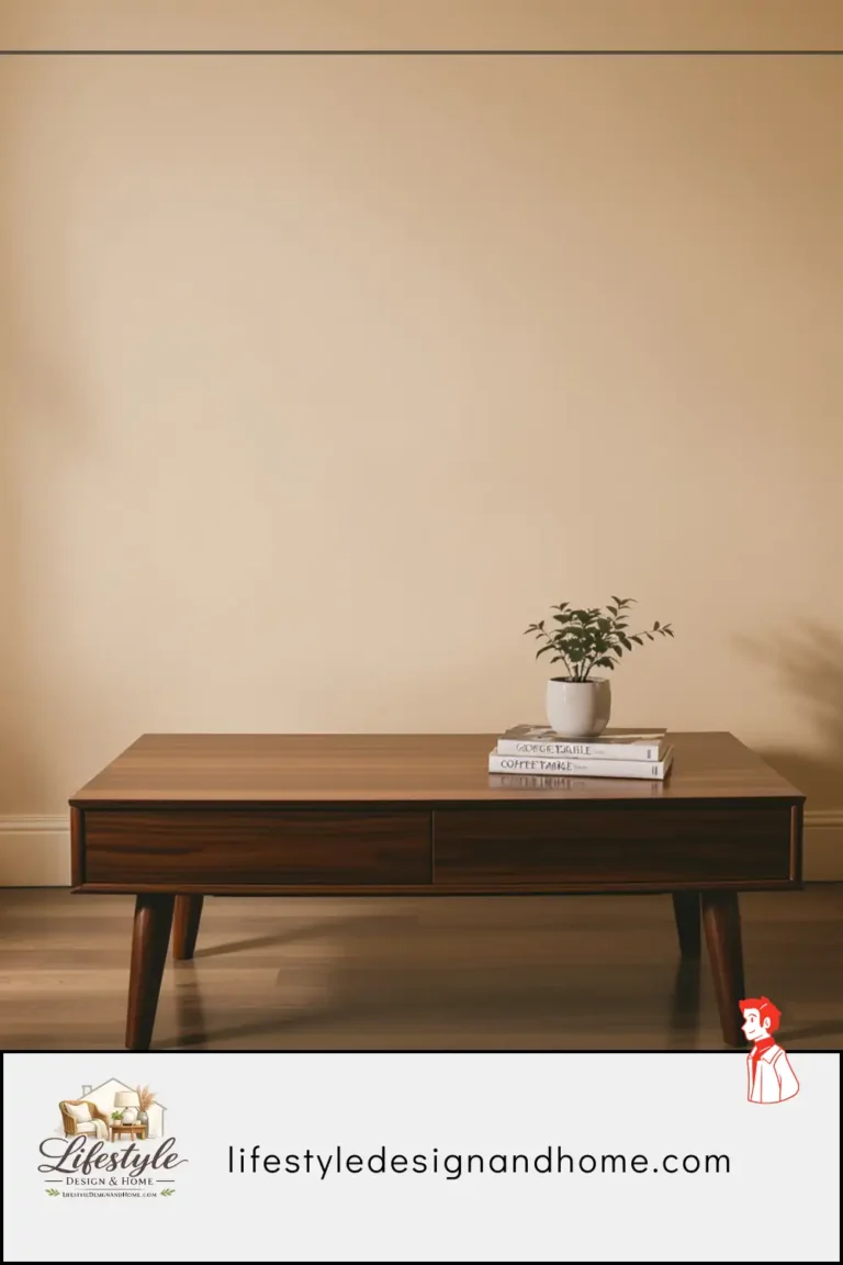
Rather than a theoretical description, let me describe the specific arrangement I currently have on my coffee table, and map it to the rules.
The table: oak, 48 inches long, 22 inches wide, 17 inches tall. Standard proportions, appropriate scale for the 90-inch sofa it serves.
The arrangement:
A wooden tray, 14 by 20 inches, positioned toward the center of the table, slightly offset to the right. Within the tray: a small ceramic bowl (the anchor, 4 inches tall, irregular rim, warm grey glaze), a flat river stone beside the bowl (medium element, 2 inches tall, darker grey), and a votive candle in a clear glass holder (the smallest element, completing the triangle, 2.5 inches tall). Three objects in the tray, odd number, triangle arrangement, varied heights within a comfortable 2-inch range.
To the left of the tray: a small terracotta pot with a succulent, 5 inches tall — the tall natural element that extends above the tray arrangement and adds the vertical note the tray objects can’t provide. Positioned outside the tray to give it independence from the tray grouping while relating to it by proximity.
Total objects on the table: four. One tray containing three objects, one plant outside the tray. The remaining approximately 60 percent of the table surface is clear.
The rules it satisfies: Triangle arrangement (objects within the tray). Varied height (bowl at 4 inches, stone at 2 inches, candle at 2.5 inches, plant at 5 inches). One-third coverage. Tray as container. Natural element (the succulent). Odd number (three objects within the tray; four total but the tray-and-contents read as one unit). Room relation (the ceramic bowl relates to the ceramic lamp base on the side table; the tray material relates to the coffee table material). Functional reserve (60 percent of table clear). Edited to uncertainty (started with more, arrived at this by removal).
The table has looked like this for about four months. It is the longest I have gone without rearranging it, which I take as evidence that it is finally right.
Your Coffee Table Styling Checklist
The Arrangement:
- [ ] Objects arranged in a triangle when viewed from above
- [ ] Three objects minimum in the primary grouping — odd number throughout
- [ ] Height variation across all objects — no two at the same height
- [ ] One natural or living element present
The Scale:
- [ ] Primary grouping covers approximately one-third of the table surface
- [ ] Approximately two-thirds of table surface clear and available for use
- [ ] Objects scaled to the room — not larger than the room’s proportions support
The Tray:
- [ ] Tray used to contain primary grouping if more than two objects
- [ ] Tray material relates to room materials
- [ ] Tray sized to contain grouping with breathing room — not tight, not oversized
The Edit:
- [ ] Arrangement reviewed — least contributing object identified and removed
- [ ] Process repeated until uncertain — then one more object removed
- [ ] Final arrangement feels resolved rather than in progress
The Room Relation:
- [ ] At least one material echo between table objects and room elements
- [ ] At least one color echo between table objects and room palette
- [ ] Scale appropriate to room size — not oversized for the space
The Table, Finally Right
After two years and approximately one hundred different configurations, the coffee table in my living room looks settled.
Not dramatically styled. Not impressive in the way that styled rooms in design publications are impressive. Just settled — the specific quality of a surface that has found the right objects in the right relationships, where nothing is competing and nothing is missing and the arrangement supports the room without dominating it.
The rules didn’t arrive all at once. The triangle principle came first, from observing that photograph. The edit rule came last, from the experience of removing what felt like the wrong number of objects and discovering that one more removal was always available and always helpful.
But together they describe something I couldn’t articulate when I was rearranging the table once a week: a coffee table is not a display surface. It is not a shelf or a mantle or a gallery wall. It is a surface in the center of a living room that is used and looked at and lived around every day, and its styling should serve both the use and the looking simultaneously.
When it does — when the objects are right and the relationships are right and the functional reserve is maintained — the table stops being something you notice and becomes something the room benefits from without your being aware of the benefit.
That is when the rearranging stops.