The Room That Humbled Me Into Finally Paying Attention
I have spent a significant portion of my adult life thinking carefully about interior spaces. I have moved furniture more times than I can count, replaced light bulbs with the specific evangelical conviction of someone who has discovered the difference between 2700K and 4000K and cannot believe it took them so long, and read enough about interior design to have opinions about things most people would consider extremely optional opinions to have.
And then I moved into a 10-by-12-foot living room and all of it became insufficient.
The room had good bones, which is what people say about rooms that are structurally sound but practically difficult. One large window, east-facing, which gave me beautiful morning light and useless afternoon light. A doorway on one of the short walls and a hallway opening on one of the long walls, which meant two of the four walls were significantly interrupted. A radiator under the window that prevented anything useful from being placed on the most prominent wall in the room.
I had accumulated a lot of knowledge about living room design. That knowledge told me what a living room should have: a sofa, a coffee table, at least one additional seating piece, some storage, a rug, adequate lighting. The room looked at all of that knowledge and said: you have approximately 120 square feet, and the radiator gets 16 of them, and the doorways get another 20, so actually you have about 84 usable square feet in which to make a room that functions like a living room while also feeling, somehow, like somewhere a person would choose to be.
I failed at it for three months. I tried every configuration I could think of — every placement of the sofa, every orientation of the rug, every possible position for the one additional chair I was determined to have. The room either felt cramped or felt sparse. It felt like a small room either way, which is the specific frustration of small room design: the room tells you what it is regardless of what you try to make it.
What I eventually learned — not from three more months of moving furniture, but from stepping back and actually thinking about the problem rather than trying configurations at random — is that making a small room look and feel bigger is not a furniture arrangement problem. It is a perception problem. The room is not going to get bigger. The question is whether the room can be designed so that the brain consistently overestimates its size rather than accurately reads it.
These are the seven ideas that made the 10-by-12-foot room work. Not comfortable-for-its-size work. Actually work, for an actual living room, in a way that guests noticed and commented on without knowing why.
Idea #1: Commit to One Seating Piece and Do It Properly
This was the hardest lesson and the first one, and it required giving up something I was not ready to give up.
For the first three months in the 10-by-12-foot room, I was trying to fit a sofa and an additional chair. The chair was a good chair — the kind of chair that looks right in the corner of a living room, that gives the space a sense of having been considered, that makes the room feel like it can accommodate a guest without asking them to sit on the floor. I wanted it in the room because living rooms have more than one seating piece and I was not willing to have a living room that didn’t work like a living room.
The room disagreed.
Every configuration that included both pieces created either a traffic problem (the path from the doorway to the window was blocked), a scale problem (the room looked like a showroom where furniture had been squeezed in to demonstrate inventory), or a spatial problem (there was nowhere for a coffee table that didn’t require carefully choreographed movement around it). I kept trying to solve a problem that couldn’t be solved by adding things.
The breakthrough: I removed the chair. Temporarily, I told myself. Just to see.
The room exhaled.
With one sofa — the right sofa, sized correctly for the space, positioned correctly relative to the doorways and the window — the room had clearance and coherence and the specific quality of a small room that knows what it is rather than a small room trying to be larger than it is. The coffee table fit correctly. The rug fit correctly. There was a clear path to the window. There was visible floor.
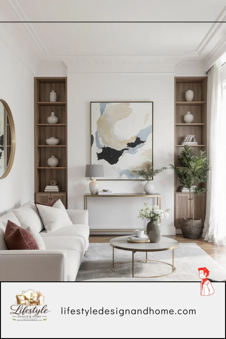
I have since learned that the principle here is called appropriate scale, and it applies to every element in a small room: the furniture should be sized and numbered for the space rather than for an aspirational larger space. One well-chosen sofa in a 10-by-12-foot room is not a compromise. It is the correct furniture decision for the room’s actual dimensions.
If you genuinely need additional seating capacity in a small living room, the solutions that don’t compromise the room’s spatial quality are: a bench at the coffee table that slides under when not in use, floor cushions stored elsewhere when not in use, or an accent chair so lightly scaled — open legs, narrow arms, minimal visual weight — that its presence reads as a considered addition rather than an attempt to fill the room.
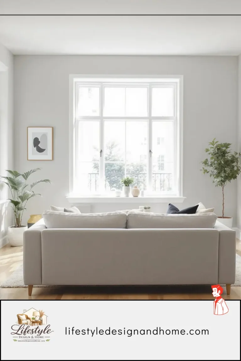
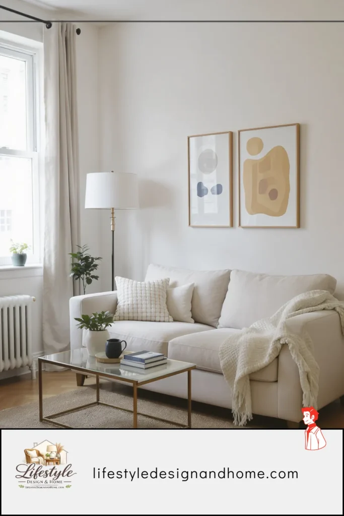
Idea #2: Float the Sofa and Create a Defined Center
I have written about floating the sofa in several articles in this series, and I will write about it here again because in the specific context of a 10-by-12-foot room it produced a result so counterintuitive that I stood in the doorway for a full minute trying to understand what I was seeing.
Floating the sofa — pulling it away from the wall behind it by 14 inches — made the room look larger than it had when the sofa was against the wall.
I understand why this seems wrong. Against-the-wall means more open floor in the center. More open floor means more apparent space. More apparent space means larger room. The logic is sound. The result is not.
Here is what actually happens when a sofa is against the wall in a small room. The sofa is at the perimeter. The center is open but purposeless — not a usable space, just the void between a sofa-against-the-wall and whatever is across from it. The room reads as a perimeter with a void, which is how the brain processes defensive, unconfident spatial arrangement. Defensive arrangement reads as small.
When the sofa floats — when there is visible space between the sofa back and the wall, when the sofa occupies the room’s interior rather than its edge — the room has a center. The brain reads a room with a center as organized and complete. Organized and complete rooms read as larger than their dimensions because the spatial logic is legible. The room makes sense, and rooms that make sense feel more generous than rooms that are just trying to get furniture out of the way.
The 14 inches behind my sofa — the gap between the sofa back and the wall — was not wasted space. It was the depth that made the room feel like it had layers rather than edges. Layers read as space.
The additional move that completed this: centering the sofa on the room’s primary axis rather than on the wall’s length. The sofa was not pushed to one side to create passage around it. It was centered on the room’s organizational logic — facing the window, accessible from both ends, the coffee table precisely positioned in front of it. The room had a center and the center was intentional. The intention was visible. The room felt bigger because it felt designed.
Idea #3: Use a Rug That’s Almost Too Large
In the 10-by-12-foot room I initially had a 5-by-7-foot rug. It was the rug I’d chosen because it seemed appropriately modest — a small rug for a small room, not trying to take over.
The rug looked like a postage stamp on a large envelope.
The sofa sat behind it. The coffee table sat on it. The rug was occupying the center of the room without connecting to anything around it, which made it read not as a defining element but as a floating island of texture that had no relationship to the furniture and therefore no relationship to the room.
I replaced it with an 8-by-10-foot rug.
The room looked larger.
This is one of those counterintuitive small room principles that requires experiencing to believe: a larger rug in a small room makes the room feel bigger, not smaller. Here is why. The rug’s job in a small living room is to create a floor plane — a defined territory that the furniture belongs to and that the brain reads as the room’s spatial logic. When the rug is too small, there is no floor plane. There is just furniture on a floor and a rug somewhere nearby.
When the rug is large enough that the front legs of the sofa sit on it, that the coffee table sits on it, that any additional seating has its front legs on it — the rug becomes the room’s floor. The furniture belongs to the rug and the rug belongs to the room and the room has a coherent floor plan. Coherent floor plans read as larger than incoherent ones.
The 8-by-10-foot rug left approximately 12 inches between the rug edge and the wall on the long sides of the room and about 8 inches on the short sides. It was close to wall-to-wall. It looked, when I laid it out, like it was going to overwhelm the space.
It didn’t. It made the floor make sense. The room became the size it actually was rather than a smaller room within a larger floor.
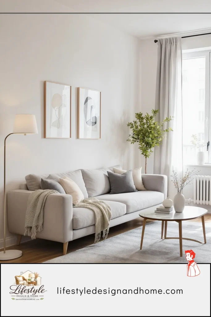
Idea #4: Hang Curtains at Ceiling Height and Go Wide
The window in my 10-by-12-foot room was the room’s best feature and I had diminished it thoroughly by the time I understood what I was doing wrong.
The curtains were hung at window height — the rod mounted at the top of the window frame, the panels ending at the sill. The window was 36 inches wide and approximately 48 inches tall, which is a standard window and a modest one. The curtains were covering approximately 80 percent of the window when closed and, when open, were stacked on the glass rather than on the wall beside it, which reduced the visible glass area and made the window look smaller than it was.
I moved the curtain rod to within 4 inches of the ceiling. I replaced the existing panels with floor-length ones. I extended the rod 8 inches past the window frame on each side. The curtains, when open, stacked entirely on the wall beside the window rather than on the glass itself.
The window went from appearing to be 36 inches wide and 48 inches tall — 1,728 square inches of apparent glass — to appearing to be approximately 52 inches wide and 84 inches tall — 4,368 square inches of apparent glass. The same window, through curtain repositioning, appeared to be more than twice as large.
And the room appeared to have higher ceilings. The curtains running from 4 inches below the ceiling to the floor created a continuous vertical element that the eye followed from ceiling to floor, which the brain read as ceiling height rather than curtain height. The room felt taller. A taller room feels less compressed. A less compressed room feels larger.
The combination of wider, taller window plus higher perceived ceiling height added spatial generosity to the room that the window itself, hung correctly, simply provided.
Cost: new curtain rod ($22), new curtain panels ($45), two hours of work. Perceived spatial difference: significant enough that the first person to visit after the change said, without prompting, that the room looked bigger.
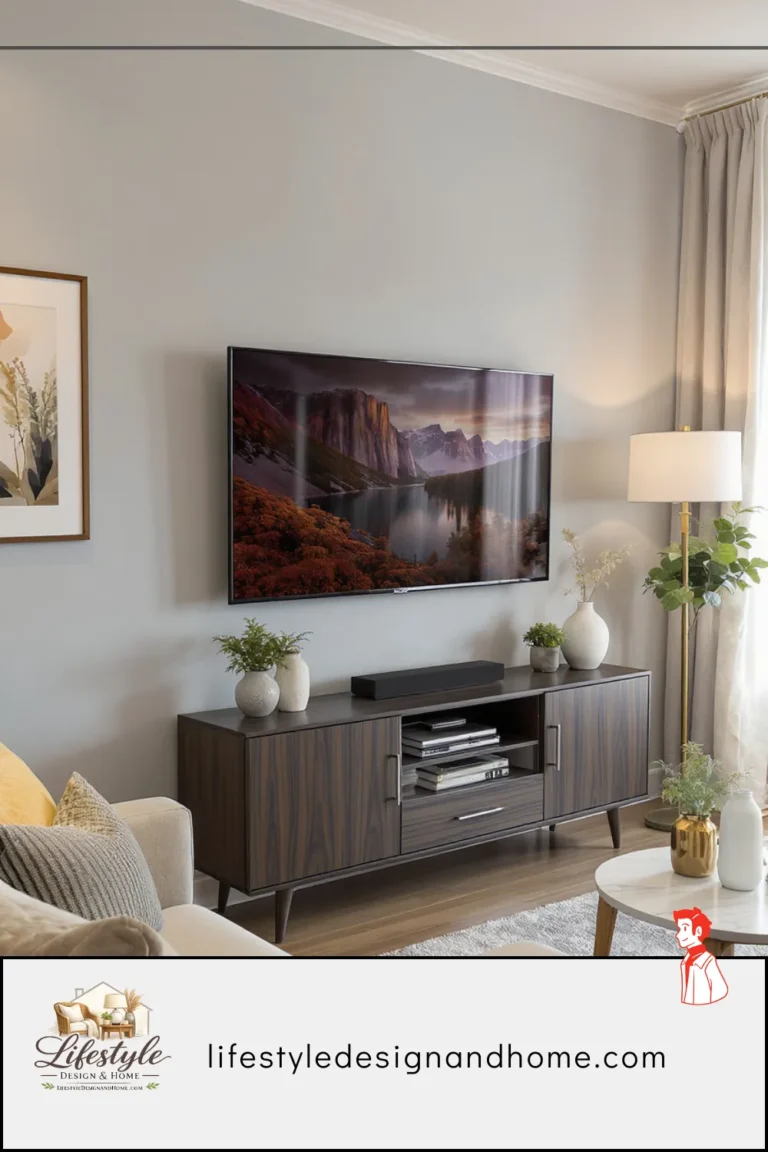
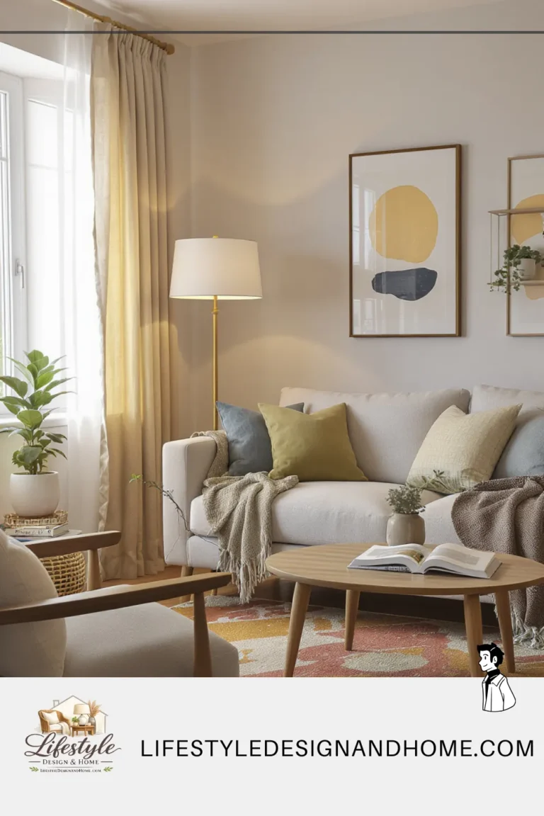
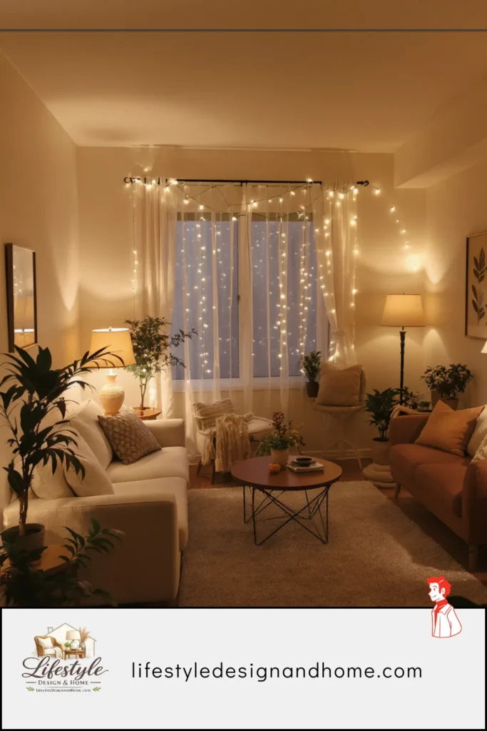
Idea #5: Replace the Single Overhead With Layered Warm Sources
My 10-by-12-foot room came with a ceiling flush mount in the center of the room — the standard fixture in an apartment that no one has specifically thought about lighting. It produced even, slightly cool, flat illumination that revealed every edge of every wall with equal clarity and made the room feel precisely as large as it was.
Precisely as large as it was meant exactly the size the brain calculated when it saw every wall clearly defined and every corner clearly visible. The room felt like its square footage because the light gave the brain all the information it needed to calculate its square footage.
I replaced this with layered warm sources. Not replaced the fixture — I kept it, on a dimmer, used at 20 percent in the evening as background ambient light. What I added was a floor lamp in the corner farthest from the window (warm shade, torchiere style, 2700K bulb), a small table lamp on the side table beside the sofa (cream shade, 2700K), and candles on the coffee table on evenings when the room was being used for anything beyond passing through.
Three sources instead of one. Warm instead of neutral-cool. Multiple heights — ceiling at 8 feet, floor lamp at 68 inches, table lamp at 52 inches, candles at 18 inches — rather than one height.
The corners softened. The ceiling receded slightly. The walls became less precisely defined because the light was coming from multiple low sources rather than from one overhead source, which meant the upper portions of the walls were in relative shadow compared to the lower, warmer, lamp-lit portions.
Shadow is perceived depth. Perceived depth is perceived space. The room that had felt like its exact square footage felt, with layered warm lighting, like a room that might have more space than its exact square footage. Not dramatically. But consistently, every evening, in a way that made the room a different experience at 8 PM than it was at noon under the overhead.
The dimmer switch for the overhead cost $25 and took fifteen minutes. The floor lamp cost $65 at a secondhand shop. The table lamp was one I already owned moved from another room. The candles were candles. The transformation happened for under $100, including the dimmer.
Idea #6: Eliminate Everything From the Floor
In its difficult months — the months of failed configurations and three months of not quite working — my 10-by-12-foot room had the following objects on the floor that were not furniture: a yoga mat rolled against one wall (I used it twice a month), two stacks of books that hadn’t found shelf space, a basket of throw blankets beside the sofa, a small plant stand, the cord for the floor lamp running visibly from the lamp to the outlet in the wrong wall, and a decorative bowl I’d put on the floor because every surface was full.
None of these objects were dramatically wrong. Each of them made sense as an individual decision. Collectively they were consuming approximately 15 percent of the floor’s visible surface area and making the room read as 15 percent smaller than it was.
I cleared them. Not all permanently — the throw blankets basket moved inside the sofa’s end table with a lid, the books found homes on a shelf I mounted on the wall, the plant stand became the plant-on-a-shelf, the yoga mat went to a hook on the back of the closet door. The cord was managed with a flat baseboard cord cover that took twenty minutes to install and disappeared into the architecture.
The floor became visible.
Visible floor is the most underappreciated space-making tool in small room design. The brain uses visible floor area to estimate room size. Covered floor — covered by objects, by low-profile furniture bases, by anything that reduces the visible expanse of the floor — makes the room read as smaller than its actual square footage. Visible floor reads as room. Objects on the floor read as room consumed.
After clearing, my 10-by-12-foot room had approximately 35 square feet of visible floor beyond the rug — not a lot, but enough that the room’s actual dimensions were readable rather than obscured. The room felt like its 120 square feet rather than like a smaller room within its 120 square feet.
The additional floor-visibility move: choosing a sofa with legs rather than a sofa with a solid base that sat to the floor. The 6 inches of clearance beneath the sofa revealed floor that would have been obscured by a base-to-floor upholstered piece. Six inches of clearance across 90 inches of sofa length is 45 square inches of visible floor that a floor-contact sofa would have obscured. Small number. Visible contribution. The sofa appeared to float rather than to sit heavily, which made the room feel lighter and more spacious.
Idea #7: Create One Strong Focal Point and Let Everything Else Support It
The room had no focal point in its failing months. It had a window, a sofa, and a television on a small stand — three elements each making a claim on where you looked when you walked in, none of them dominant, the eye moving between them without settling anywhere.
A room without a focal point is a room without spatial logic. The eye enters, looks for a place to land, finds multiple competing claims, and reads the room as disorganized. Disorganized rooms feel smaller than organized ones because the brain cannot find the room’s logic and defaults to a low-confidence estimate of its size.
The focal point I chose was the window. Not the television — the television became something the room accommodated rather than organized around, mounted on the wall beside the window at the correct seated-eye-level height, present and functional without being the room’s primary claim on attention. Not the sofa wall — the sofa wall was the room’s main surface but not its most visually interesting one.
The window. Because the window had the light and the east-facing view and the floor-to-ceiling curtains I’d hung that made it the room’s most dramatic vertical element. I organized everything toward it: the sofa faced the window rather than facing parallel to it. The rug was positioned to anchor the sofa in that orientation. The single piece of art I had on the wall was on the wall beside the window rather than opposite it, which kept the focal point wall clean and let the window do its work.
The room had one thing it was organized around. The brain read the organization and found it legible. Legible rooms feel complete. Complete rooms feel appropriately sized rather than compressed.
The focal point also gave me the decision rule I’d been missing for every object in the room: does this support the focal point, or does it compete with it? The television mounted beside the window rather than opposite it: supports. The plant on the windowsill that the morning light came through: supports. The additional decorative objects I’d had on every surface that created visual noise: complete. They left.
The room became simpler. Simpler rooms read as larger rooms because the brain can process them without working. Easy processing feels like generous space.
The Room, After
The 10-by-12-foot living room has been working correctly for about two years now.
I don’t think about it the way I thought about it in the first three months — don’t lie in bed designing configurations or stand in the doorway measuring imaginary placements. The room is just the room. It does what living rooms do: holds the sofa, holds the people who sit on the sofa, holds the conversations and the evenings and the occasional long afternoon with a book.
Guests don’t know it’s 10 by 12 feet. I haven’t told them and the room doesn’t tell them. What the room tells them — if I am reading their experience correctly, based on where they sit and how long they stay and the absence of the restless quality that uncomfortable rooms produce — is that this is somewhere to be for a while.
That is all I was trying to achieve. It took three months to fail at it and one clear-eyed afternoon to understand why, and the seven changes I’ve described in this article to implement.
The room is not large. It will never be large. But it is no longer telling anyone how small it is, which turns out to be exactly the same thing.
Your Small Living Room Checklist
Furniture:
- [ ] Number of pieces appropriate to the room’s actual size — one well-chosen sofa beats sofa plus overcrowding
- [ ] Sofa floated from walls — 12 to 18 inches of clearance behind it
- [ ] Sofa centered on room’s primary axis — not pushed to one side
- [ ] All pieces on legs — floor visible beneath furniture
The Rug:
- [ ] Sized for front legs of all seating to sit on it — 8-by-10 minimum for most configurations
- [ ] Creates a coherent floor plane — not a decorative island in the center
The Window:
- [ ] Curtain rod mounted 4 to 6 inches below ceiling
- [ ] Panels falling to the floor
- [ ] Rod extending 6 to 8 inches past frame on each side
- [ ] Panels stacking on wall when open — full glass visible
The Light:
- [ ] Overhead on dimmer — not the primary evening source
- [ ] At least two additional warm sources at different heights
- [ ] All bulbs at 2700K — not cool or neutral white
- [ ] Dark corners addressed — no corner unlit
The Floor:
- [ ] Zero objects on floor without a permanent specific home
- [ ] Cords managed — not crossing visible floor
- [ ] Visible floor maximized — furniture footprints minimized
One More Thing
The yoga mat is still here. It lives on the back of the closet door on a hook, rolled and velcroed, accessible in thirty seconds when I use it and invisible the other twenty-nine and a half days of the month when I don’t.
The room doesn’t know about the yoga mat. The room only knows about the floor, which is clear, and the sofa, which floats, and the window, which is the focal point, and the warm light in the evening that makes the corners soft and the ceiling feel higher than it is.
The room thinks it’s bigger than it is.
That’s the whole idea.