The Rules I Didn’t Know I Was Breaking
About five years ago I helped a friend furnish her first apartment.
She had good taste and a reasonable budget and a living room that was actually a decent size — about 14 by 16 feet, which is not small, which should have been manageable. We spent a Saturday picking furniture, and another Saturday assembling and arranging it. At the end of the second Saturday we stood in the doorway and looked at what we’d done.
Something was wrong.
Not dramatically wrong. The individual pieces were good. The colors worked. The rug was the right style. But the room felt unsettled in a way neither of us could immediately identify — like a sentence with correct words in the wrong order. We both sensed it and neither of us could name it, and after about twenty minutes of standing there trying to figure it out we gave up and concluded that the room needed more time, more accessories, more something. We went to dinner and tried not to think about it.
It took me another year and a lot of reading and observing to understand what was wrong with that room. When I went back to help her again, I walked in and saw it immediately: the sofa was against the wall, the rug was too small, the coffee table was the wrong height, the art was hung too high, there was no focal point, the lighting was one overhead fixture, and the traffic paths through the room were technically clear but felt awkward because nobody had thought about where people actually walk.
Seven things. All seven of them correctable. None of them was visible to either of us the first time because we hadn’t known what to look for.
These are those seven things — articulated as the rules interior designers apply before they make any other decision, the foundational principles that determine whether a room works or whether it is a room of good individual pieces arranged in a way that produces collective wrongness.
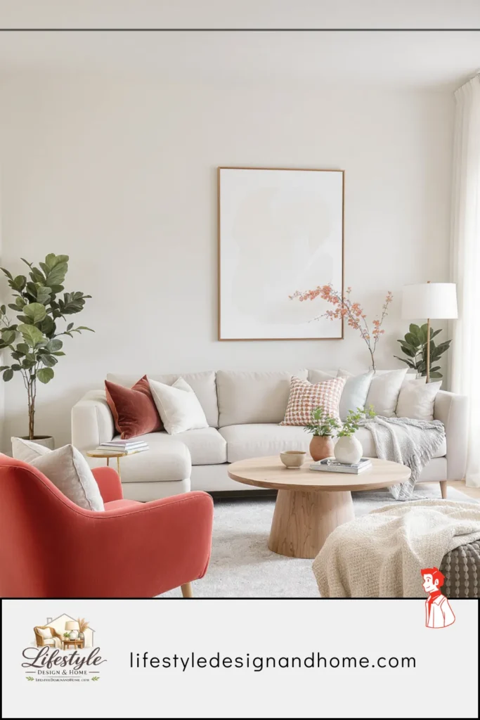
Rule #1: Every Room Needs One Dominant Focal Point
A focal point is the element a room is organized around — the thing the eye naturally finds when entering the space, the thing the furniture arrangement points toward, the thing that gives the room a reason for its logic.
Without a focal point, a room has no center of gravity. The eye enters and moves around, looking for somewhere to land, finding multiple elements each making an equal claim on attention. The brain reads this as spatial disorder. Spatial disorder reads as cramped and unsettled regardless of the room’s actual dimensions.
My friend’s room had three candidates for focal point: the television, the window, and a large piece of art on the side wall. None of them dominated. The seating arrangement didn’t commit to any of them — the sofa was positioned to face neither the television nor the window with any particular intention, and the art on the side wall was being viewed from an awkward angle by anyone on the sofa. The room had three competing claims and no winner.
The designer’s first move in any room is to identify or establish the dominant focal point before placing a single piece of furniture. In most living rooms this is one of three things: a fireplace (the historic organizing element of the living room, the thing rooms have been designed around for centuries), a significant window or view, or the television if it must be present. One of these becomes the room’s anchor. Everything else responds to it.
The furniture arrangement communicates the focal point by facing it. The sofa faces the focal point. The chairs angle toward it. The coffee table sits between the seating and the focal point. The room tells every person who enters it: this is what this room is for, and this is where to look.
My friend’s room, on the second visit, got the television mounted on the wall opposite the sofa at the correct seated-eye-level height and everything organized toward it. The same furniture. The room worked. The focal point was established and the room had a logic it had been missing.
Rule #2: Float the Furniture Off the Walls
Every designer I have spoken to about furniture arrangement identifies this as the most consistently violated rule in residential interiors. It is the rule most people break first, break confidently, and feel most certain about breaking — because the logic for breaking it seems so sound.
The logic: pushing furniture against the walls opens up the center of the room, creates more walkable space, makes a small room feel larger. The result: a room where the furniture looks like it has been stored at the perimeter, the center is a purposeless void, and the arrangement communicates defensive space-saving rather than intentional design.
Furniture against walls does not make rooms feel larger. It makes them feel like waiting rooms — like the furniture is trying to get out of the way of an event that hasn’t happened yet rather than being the reason the room exists.
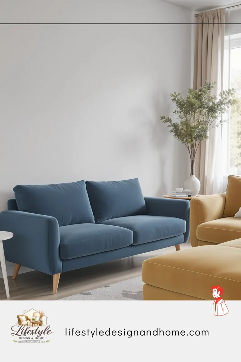
Floating furniture — pulling the sofa 12 to 18 inches from the wall behind it, grouping the seating in a conversational cluster in the room’s interior rather than around its edges — creates rooms with centers. Rooms with centers have spatial logic. Spatial logic reads as larger than spatial randomness.
The specific objection everyone raises: “But I don’t have room to float the furniture.” In most rooms, this is incorrect. The 12 to 18 inches behind the sofa is not usable floor space when the sofa is against the wall — it is a gap too narrow to walk through and too narrow to use for anything. Converting that gap from dead space to visible breathing room is a net gain.
I pulled my friend’s sofa 14 inches from the wall on the second visit. She said it looked like it was going to fall over. It looked, within five minutes, like it had always been there. The room had a center it had been missing. The center made the room feel organized. Organized rooms feel larger.
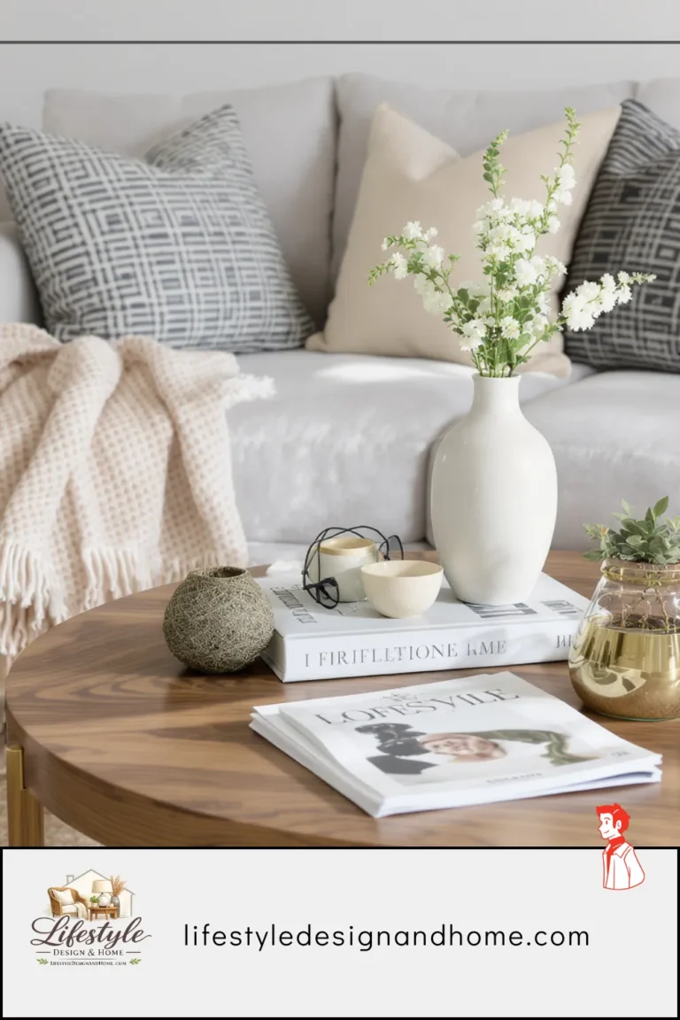
Rule #3: Size the Rug Correctly Larger Than You Think
The rug rule is the rule I encounter most consistently in rooms that feel almost right and don’t quite get there. The rug is sized for the floor area rather than for the furniture, which produces a rug that sits in the center of the room disconnected from the furniture around it, making the furniture look like it’s floating on a bare floor with a decorative mat nearby.
The correct function of a living room rug: it defines the floor plane of the seating arrangement. It creates the territory that the furniture belongs to. It tells the room, and the people in it, that this is the living area — this defined zone is where the living room happens.
To perform this function, the rug needs to be large enough that the front legs of every primary seating piece sit on it. Not the back legs — the front legs. Front legs on the rug means the furniture belongs to the rug’s territory. Front legs off the rug means the furniture is adjacent to the rug’s territory but not part of it. The difference is visible and consequential.
For most living room configurations with a standard 90-inch sofa and two chairs, this means a rug of 8 by 10 feet at minimum. Many rooms benefit from a 9 by 12. The 5-by-7 and 6-by-9 rugs that most people choose for living rooms are almost always too small.
The counterintuitive result: a larger rug in a small room makes the room feel bigger. The floor plane is defined, the furniture is anchored, the room has a coherent spatial logic that reads as more generous than the same room with a small rug creating a floating island of texture in the center.
My friend’s original rug was 6 by 9 — the sofa and chairs were all on bare floor, the rug was under the coffee table only, and the room looked like a well-dressed room that had been furnished in the wrong sequence. The replacement 8-by-10-foot rug cost her about the same as two of the accessories she’d bought to try to fix the room. The rug fixed it. The accessories had not.
Rule #4: Create Clear Traffic Paths Through the Room
Traffic flow is the rule that operates below conscious awareness most of the time and above it the moment it’s violated.
When traffic flow is correct — when the paths people naturally walk through a room are clear and wide and unobstructed — nobody notices. The room feels comfortable and navigable in a way that registers only as general satisfaction with the space.
When traffic flow is wrong — when there is a path that requires turning sideways, stepping over something, navigating around furniture that should not be in the way — it registers as discomfort. Not always consciously identified as a traffic flow problem. Sometimes experienced as the room feeling cramped or hard to move through or slightly wrong in a way nobody can quite name.
The minimum clearances interior designers maintain:
36 inches for primary traffic paths — the routes people use to move through a room from one entry point to another, or from the room to the kitchen or hallway. This is the minimum comfortable width for two people to pass each other without one of them stepping aside.
30 inches for secondary paths — routes around specific pieces of furniture, access to seating from the side rather than the primary approach. Less comfortable than the primary minimum but navigable without conscious effort.
18 inches around the coffee table — the clearance between the coffee table edge and the nearest seating, allowing a person to stand from the sofa without contacting the table and to walk between them without turning sideways.
The specific traffic failure in my friend’s room: the path from the front door to the kitchen doorway passed between the end of the sofa and the side table, a gap of approximately 22 inches. Fourteen inches narrower than comfortable. Nobody said anything about it. Everybody had a slightly awkward moment navigating it, every time they moved through the room. Accumulated over an evening, that slight awkwardness produced the vague discomfort that makes rooms feel smaller and less welcoming than they actually are.
Moved the sofa 6 inches toward the center of the room and the side table 4 inches in the other direction. The gap became 32 inches. The path became comfortable. The room felt more spacious having made no other change.
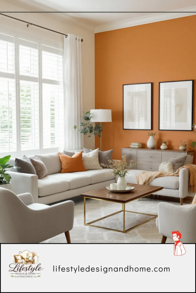
Rule #5: Match the Scale of Furniture to the Scale of the Room
Scale is the silent quality of rooms — the thing that operates without being seen, that makes rooms feel either right or effortful. When scale is correct, furniture seems to belong to its room in a way that cannot be precisely articulated. When scale is wrong, furniture seems either too large for the space (overwhelming, cramped) or too small (sparse, unresolved).
Scale has two components: the individual piece in relation to the room, and the pieces in relation to each other.
Individual scale: a sofa that is sized for a 20-by-20-foot room will dominate a 12-by-14-foot room regardless of how it’s arranged. A coffee table that is appropriately sized for a sectional will look lost beside a standard 72-inch sofa. The furniture should be sized for the actual room and the actual pieces it will accompany, not for an aspirational room or a Pinterest configuration that was photographed in a larger space.
The designer’s check: after placing a piece of furniture in a room, there should be adequate clearance on all sides — not just for traffic, but for the piece to read as an element within the room rather than a room filled with a piece. A sofa that leaves 12 inches on each side is in a room too small for it. A sofa that leaves 4 feet on each side in a room that calls for 18 inches is in a room too large for it.
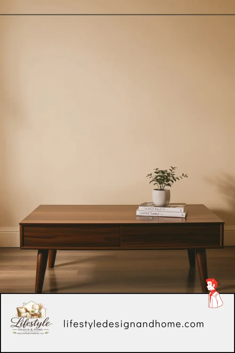
Relative scale: pieces in a room should be in proportional relationship to each other. A large sofa calls for a substantial coffee table — approximately two-thirds the sofa’s length. A substantial coffee table calls for side tables of complementary scale. A large piece of art calls for a surface below it (console, sofa, shelf) that relates to its width. The eye reads proportional relationships as considered and reads disproportional ones as accidental.
The scale problem in my friend’s room: a coffee table approximately one-third the length of the sofa, which looked like a sample placed for scale reference rather than a piece chosen for use. Replaced with a table at two-thirds the sofa’s length. The relationship between the pieces became legible. The room became more cohesive without any other change.
Rule #6: Layer the Lighting Three Sources Minimum
Single-source lighting is the most universally present problem in residential interiors and the easiest to fix and the one most consistently addressed last or not at all.
Most rooms — particularly living rooms in apartments and standard-built houses — have one ceiling fixture and nothing else. The fixture is on or off. The room is either fully and flatly lit or dark. There is no gradation, no warmth, no ability to shift the room’s character between daytime functionality and evening atmosphere.
Interior designers never finish a room with one light source. The minimum is three: ambient (the overhead, for general illumination), task (directed light for specific activities — reading, working), and accent (atmospheric sources that add warmth and visual depth). These three sources at different heights produce the layered quality of light that makes rooms feel warm and dimensional rather than flat and institutional.
The specific reasons single-source overhead lighting makes rooms feel smaller: uniform illumination reveals every edge of every wall with equal clarity. The brain processes the evenly lit room at its exact dimensions — every boundary visible, every corner defined, every surface equally bright. The room feels like its square footage because nothing is hidden and nothing implies additional depth.
Multiple warm sources at lower heights do the opposite. The corners soften. The ceiling recedes slightly. The walls become less precisely defined because the light comes from multiple low points rather than one overhead point. The room implies more space than is there — not dramatically, but consistently, in a way that changes the experience of the room at every hour of the evening.
The practical minimum: the overhead on a dimmer (one circuit, $25, fifteen minutes), a floor lamp in the room’s darkest corner (warm shade, 2700K bulb), a table lamp at seated height near the primary seating. These three together, with the overhead dimmed to 20 percent and the other two at moderate brightness, transform the same room from flat and institutional to warm and dimensional.
My friend’s room had one overhead fixture on a standard switch. I added a dimmer, moved an existing floor lamp from her bedroom, and put a table lamp from her office on the side table. The room that evening looked like a different room. Not a better-decorated room — a different category of room. The light was doing work the furniture couldn’t do alone.
Rule #7: Hang Art at the Right Height — Lower Than You Think
Art hung too high is one of the most reliably present mistakes in residential interiors, and it is made consistently because the intuition about where to hang art is consistently wrong.
The intuition says: hang art at eye level. Eye level when standing is approximately 65 to 68 inches from the floor. Most people hang art with the center of the piece at approximately that height, which means the art is positioned for the room’s occupants when they are standing and looking at it from across the room.
Gallery standard — the height used by professional gallery installers specifically because it produces the most comfortable and natural viewing experience — is 57 to 60 inches to the center of the piece. This is lower than standing eye level and approximately right for a room where people move between sitting and standing, and where art should be in comfortable relationship to both positions.
The specific effect of art hung too high: the piece floats above the room’s furniture, disconnected from the pieces beneath it. A sofa at 30 inches with art at 70 inches has a 40-inch gap between the top of the sofa back and the center of the art. The art is not in conversation with the sofa. It belongs to the ceiling zone rather than to the furniture zone. The room feels as though the art was added after the room was furnished rather than chosen for it.
Art at the correct height — 57 to 60 inches to center — sits in visual relationship with the furniture below it. The gap between the sofa back and the bottom of the art is approximately 8 to 12 inches — close enough that the art and the sofa read as a composed wall rather than two separate elements at different heights.
The additional rule for art above furniture: the art should be approximately two-thirds the width of the piece below it. Art significantly narrower than the sofa looks lost. Art significantly wider than the sofa overwhelms it. Two-thirds creates the proportional relationship that reads as intentional.
Every piece of art in my friend’s room was hung at 68 to 72 inches to center — correct for an empty gallery, wrong for a furnished room. I moved each piece down 10 to 12 inches. The relationship between the art and the furniture beneath it changed entirely. The walls looked like they had been considered rather than installed.
The Saturday That Fixed a Year of Wrong
I spent about four hours at my friend’s apartment on the second visit. I didn’t buy anything. I didn’t move anything out of the room. I identified the focal point and organized the furniture toward it. I pulled the sofa off the wall. I relocated the coffee table to the correct distance and confirmed that the rug’s front-legs rule was met by the new arrangement. I found the traffic path obstruction and moved two pieces slightly to resolve it. I established a three-source lighting configuration from existing lamps. I rehung the art at gallery standard height.
Seven changes. Mostly free. About four hours.
My friend stood in the doorway when I was done and said: “It looks like a different room.”
It was the same room. Same furniture. Same walls. Same floor. Same window in the same position with the same light coming through it.
The difference was the rules — seven principles that interior designers apply before they consider any other decision, that determine whether a room’s elements work together or merely coexist, that are the difference between a room of good furniture and a room that works.
I wish I’d known them the first Saturday. I didn’t. I do now. And having written them down clearly enough that my friend could apply them herself, I am hopeful that you won’t need the second Saturday.
The Seven Rules: Quick Reference
Rule 1 — Establish one dominant focal point.
Identify it before placing any furniture. Orient the entire arrangement toward it.
Rule 2 — Float furniture off the walls.
Sofa 12 to 18 inches from the wall behind it. Furniture arranged in the room’s interior, not at its perimeter.
Rule 3 — Size the rug larger than instinct suggests.
Front legs of all primary seating on the rug. 8-by-10-foot minimum for most configurations.
Rule 4 — Create and maintain clear traffic paths.
36 inches for primary paths. 30 inches for secondary. 18 inches around the coffee table.
Rule 5 — Match furniture scale to room scale.
Pieces sized for the actual room. Coffee table at two-thirds the sofa’s length. Art at two-thirds the width of the furniture below it.
Rule 6 — Layer the lighting with three sources minimum.
Ambient (overhead on dimmer), task (directed light for activities), accent (atmospheric warmth). All sources at 2700K warm white.
Rule 7 — Hang art at gallery height.
Center of art at 57 to 60 inches from floor. Art in a visual relationship with the furniture below it, not floating above it.
One Last Thing
My friend applied these rules to her bedroom last year, then her dining room, then spent a weekend at her parents’ house applying them room by room while her parents watched with the specific combination of amusement and slight offense that means the rooms looked wrong before and the owners are not entirely comfortable having it confirmed.
She texted me from her parents’ house: “The living room had the same seven problems. Every single one.”
Every room does, in some combination. The rules are consistent because the problems are consistent — the same instincts produce the same errors, in the same rooms, for the same reasons.
Fix the seven things. The room tells you when you’ve gotten it right — it settles, it feels resolved, it stops being the thing you notice and starts being the place you’re in.
That’s the whole project.