The Room That Taught Me What Balance Actually Means
I used to think balanced rooms were symmetrical rooms.
For a long time — embarrassingly long, given how much time I’ve spent thinking about interior spaces — I believed that balance in a room meant matching nightstands, identical lamps on either side of the sofa, artwork centered precisely on walls, furniture arranged in mirror-image pairs. I thought balance was a visual equation: equal weight on both sides, like a scale that sits level.
Then I visited a designer’s home for the first time.
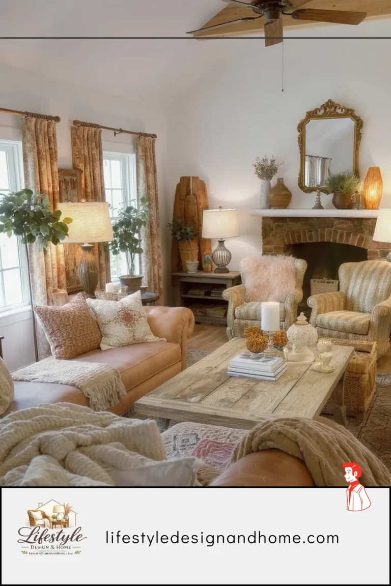
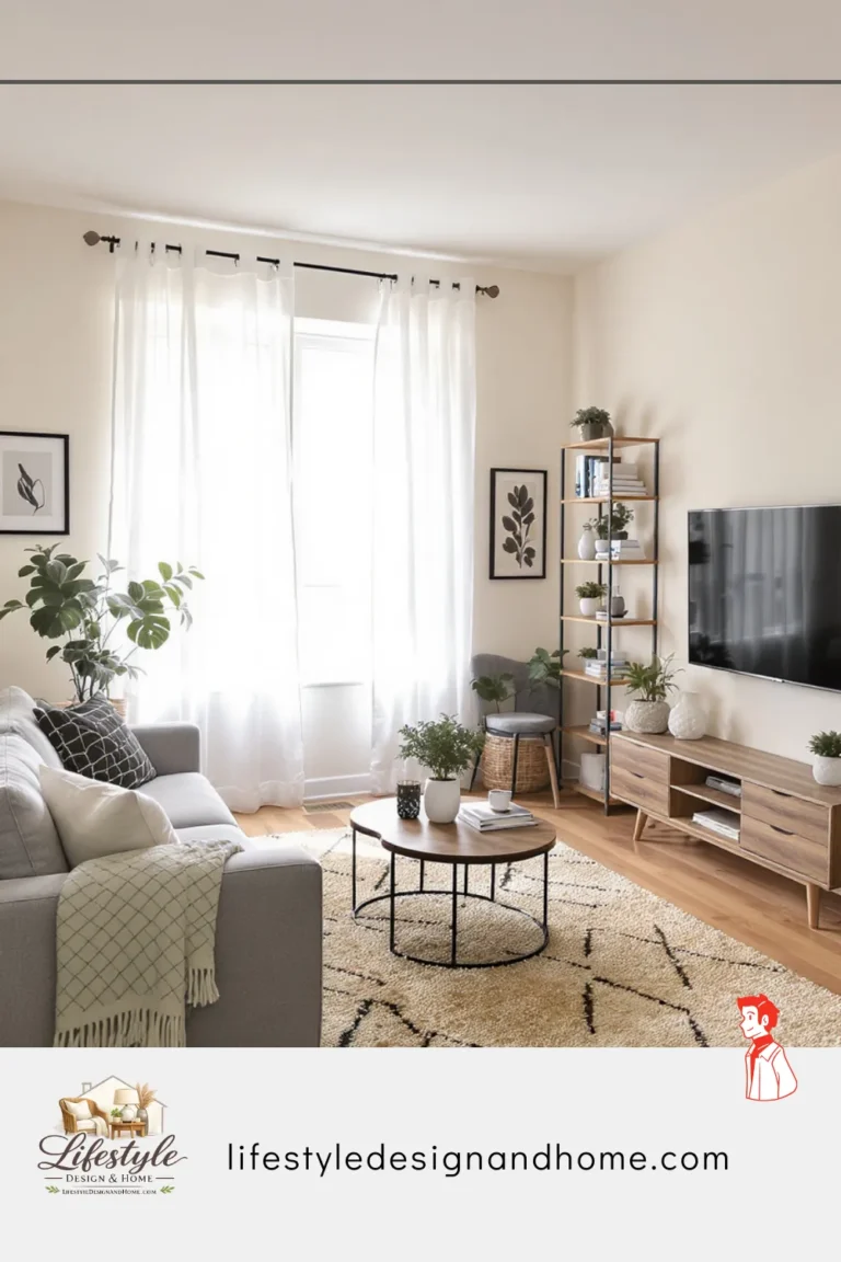
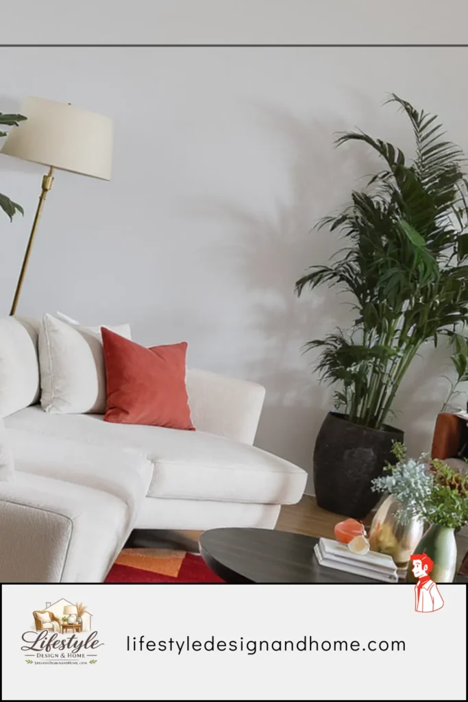
The living room had nothing matching in it. The sofa was on one side of the room with a single large floor lamp beside it. On the opposite side, instead of a matching sofa, there was a cluster of three mismatched chairs arranged around a low ottoman. The art on the walls was hung asymmetrically — a large canvas on one end, two smaller pieces on the other. The rug was offset slightly from center. By every rule I thought I understood, the room should have felt chaotic.
It felt completely calm.
I stood there trying to figure out why. The room wasn’t symmetrical. But it was — I was searching for the word — settled. Every part of it felt considered. Nothing felt like it was fighting for attention or apologizing for its existence. The eye moved around the room smoothly, landing in one place and then moving naturally to the next, never jarring or confused.
I finally asked the designer about it. She said something I’ve been thinking about ever since: “Symmetry is one way to achieve balance. It’s just the most obvious way, and usually the least interesting.”
That conversation reoriented how I think about room design entirely. This article is about what I’ve learned since.
What Balance Actually Is (And What It Isn’t)
Before we get into how designers create it, we need to establish what we’re actually talking about — because balance in interior design is one of those terms that gets used constantly and explained almost never.
Balance in a room is not symmetry. Symmetry is a specific type of balance — the most obvious one, the one that requires the least judgment, and the one that can produce rooms that feel correct but slightly lifeless, like a hotel lobby rather than a home.
Balance is something more fundamental: it is the quality of a room where no single element feels disproportionately heavy, loud, or insistent relative to everything else around it. A balanced room is one where the visual weight — the amount of attention each element demands — is distributed around the space in a way that feels comfortable to inhabit. The eye moves. Nothing jams.
Visual weight is the key concept here, and it’s worth understanding properly because it drives every design decision I’m about to describe.
Visual weight is not the same as physical weight. A large dark sofa has more visual weight than a small light one. A bold piece of art has more visual weight than a blank wall. A cluster of objects has more visual weight than a single object. Texture and pattern add visual weight. Dark colors add visual weight. Large scale adds visual weight. Strong contrast adds visual weight.
Balance is achieved when the visual weight on one side of a room — or in one area — is counterbalanced by appropriate visual weight elsewhere. That counterbalancing doesn’t require matching. A large sofa on one side can be balanced by a grouping of three chairs on the other. A single large painting can be balanced by a cluster of smaller ones at the same visual height. A dark piece of furniture can be balanced by a dark rug or a dark-framed mirror across the room.
This is the insight that changed how I read rooms: I stopped looking at what the pieces were and started looking at how much visual weight each piece carried — and whether the distribution of that weight made the room feel settled or restless.
The Three Types of Balance Designers Actually Use
Designers work with three distinct types of balance, and understanding which type is being used — and why — is the key to understanding why some rooms feel instantly right, and others never quite get there.
Type 1: Symmetrical Balance
This is the one everyone knows. Matching furniture on either side of a central axis. Identical lamps flanking the sofa. A fireplace centered on a wall with matching chairs equidistant on either side. Art hung with geometric precision.
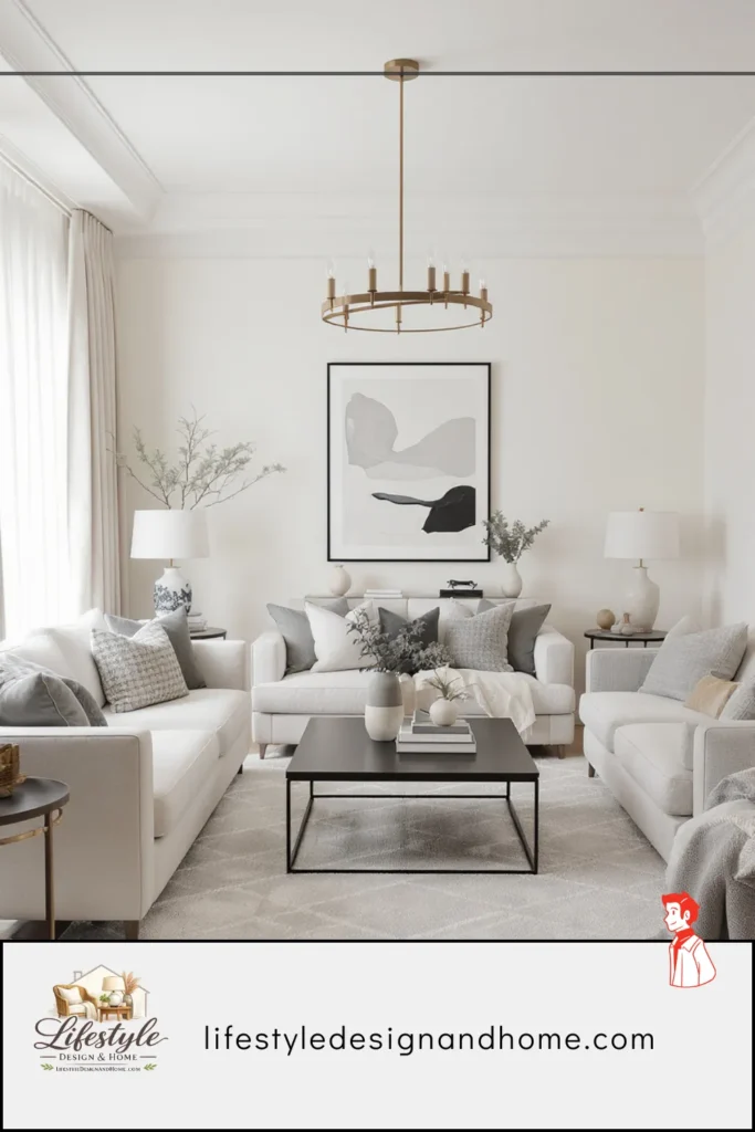
Symmetrical balance has real virtues. It is inherently calm — the eye reads both sides simultaneously, finds them equivalent, and relaxes. It is legible — even in a complex room, a symmetrical arrangement is immediately understandable. It conveys formality and order, which is exactly right for some rooms and some clients.
The limitation — and this is why pure symmetry can feel slightly flat — is that it requires matching, and matching objects have less character than related-but-distinct ones. Two identical nightstands are symmetrically balanced. Two nightstands of similar visual weight but different design are asymmetrically balanced and frequently more interesting.
I use symmetrical balance as a starting point, not a destination. Begin symmetrically, then deliberately break the symmetry in one or two places. The breaks make the symmetry more visible by contrast, and they prevent the room from feeling staged rather than lived in.
Type 2: Asymmetrical Balance
This is what the designer’s living room had. This is what most well-designed contemporary interiors use. This is the type most people find hardest to achieve because it requires judgment rather than formula.
Asymmetrical balance creates equilibrium between elements of different sizes, types, and visual weights by distributing them around the room in a way that produces overall stability without requiring matching pairs.
The mental model that helped me most: think of the room as a scale, but one with many arms extending in multiple directions rather than just two. Every object in the room has weight. Your job is to distribute that weight so the scale sits level — which doesn’t mean equal on both sides, it means distributed without any single point being disproportionately heavy.
A large sofa on one side of the room has significant visual weight. To balance it, the opposite side needs visual weight too — but not necessarily a matching sofa. A pair of armchairs has equivalent visual weight to a sofa while taking a completely different physical form. A large piece of art plus a tall floor lamp might balance the same sofa. A bookshelf full of books plus a statement armchair might do the same.
The reason asymmetrical balance is harder to achieve is that it requires you to look at the room as a whole rather than solving each wall or zone separately. A decision on one side of the room has implications for the other side. This is why designers walk through rooms constantly while working — they’re checking the overall weight distribution from multiple angles, not just evaluating individual pieces.
Type 3: Radial Balance
This one is less commonly discussed but genuinely useful in specific situations. Radial balance organizes elements around a central point, radiating outward like spokes from a hub.
The most common example is a round dining table with chairs arranged equidistantly around it. The table is the center; the chairs radiate. The arrangement is balanced from every angle because the axis is vertical (through the center of the table) rather than horizontal.
In living rooms, radial balance shows up in conversation groupings arranged around a circular coffee table — the coffee table is the center, the seating pieces radiate. It can also appear in the way lighting is distributed around a central overhead fixture or fireplace.
Radial balance works best as a local principle — governing a specific zone within a room — rather than as the organizing principle of an entire room. A full room designed on purely radial principles tends to feel static and slightly dizzying. But a seating arrangement with radial balance within a room that uses asymmetrical balance overall is a combination that works very naturally.
The Seven Tools Designers Use to Create Balance
Understanding what balance is theoretically is useful. Understanding the specific tools designers use to create it is what actually changes how you design a room. These are the seven I’ve come to rely on most.
Tool 1: Anchor With One Large Piece on Each Wall
Every wall in a living room should have one piece that reads as its primary element — the anchor that other things can relate to. This doesn’t mean every wall needs the same type of anchor or the same scale of anchor. But without an anchor, a wall reads as incomplete and the room feels unsettled.
The anchors don’t need to match each other. In fact, they usually shouldn’t. The sofa is an anchor on one wall. A large piece of art is an anchor on the facing wall. A significant bookshelf or media console anchors a third wall. A mirror or console table anchors the fourth.
I realized I was making this mistake in my own living room when I identified one wall that had nothing larger than a small decorative object on it. The wall felt like it was waiting for something. The room felt lopsided in a way I hadn’t been able to name until I understood the anchor principle. Adding a single tall, substantial plant to that wall — architectural in its scale — resolved the imbalance immediately.
Tool 2: Use Visual Weight Deliberately
Once you start seeing visual weight, you can’t stop seeing it. And once you can see it, you can manage it.
Every design decision in a balanced room is, at some level, a visual weight decision. Dark colors add weight — use them where you need more, avoid them where you already have too much. Large-scale objects add weight. Clustered objects add weight equivalent to a single larger object. Texture and pattern add weight. Negative space reduces weight.
The practical application: when a room feels lopsided — when one side feels heavy and the other feels thin — the fix is usually adding visual weight to the thin side rather than removing it from the heavy side. Removing weight often leaves a room feeling sparse. Adding weight in the right place brings the room into balance while keeping it full.
In my own living room, I had a heavy side (dark sofa, gallery wall, large rug) and a thin side (one chair, blank wall). Instead of dismantling the heavy side — which was working beautifully on its own — I added a tall bookshelf on the thin side, filled with books and a few objects, and placed a tall lamp beside the chair. The visual weight equalized. The room settled.
Tool 3: Create Vertical Balance, Not Just Horizontal
Most people think about balance horizontally — left side versus right side. Designers think about it in three dimensions, and the vertical dimension is where many rooms fail without their owners understanding why.
A room where all the furniture is low — sofa, coffee table, low side tables, all at similar heights — and the walls are bare above that height has a bottom-heavy quality that reads as unfinished and vaguely uncomfortable. The visual weight is all at floor level. The upper half of the room is empty in a way that doesn’t read as intentional negative space — it reads as vacancy.
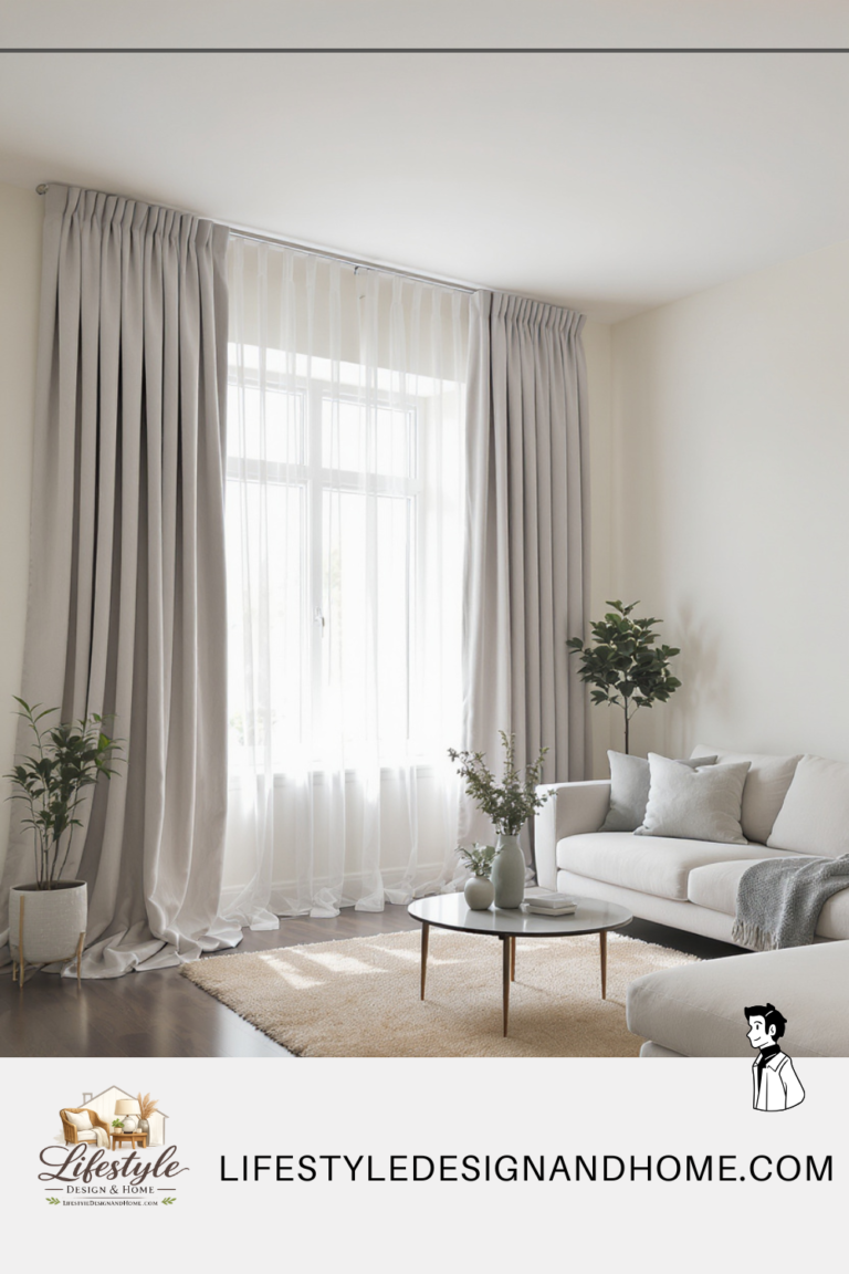
Vertical balance introduces elements at multiple heights: furniture at seating height, objects on surfaces, art at wall height, taller pieces like bookcases or floor lamps that bridge floor and ceiling, plants with height, curtains that draw the eye from floor to ceiling.
The curtains point is worth emphasizing specifically. Ceiling-height curtains do double duty: they add visual weight at a height where rooms often need it, and they draw the eye from floor to ceiling, which activates the vertical dimension of the room in a way that makes the whole space feel more complete. I’ve watched this transformation happen in real time — in rooms where curtains were changed from window-height to ceiling-height, the vertical balance of the room shifted immediately and the room felt finished in a way it hadn’t before.
Tool 4: Balance Color and Pattern Across the Room
Color is visual weight. A concentrated area of strong color on one side of the room — a bold sofa, a dark accent wall, a vivid piece of art — needs a corresponding point of color weight on the other side to feel balanced.
This doesn’t mean the colors need to match. In fact, matching colors across a room can feel calculated and slightly artificial. What it means is that strong color should appear in more than one location — distributed around the room in a way that no single area feels like it’s where all the color lives.
The classic designer technique: take the dominant color in your room and introduce it in at least three places. If the sofa is deep blue, the room needs deep blue elsewhere — a pillow in the opposite corner, a throw on a chair across the room, a vase on the opposite wall’s console. The sofa is no longer where the color lives. The color circulates. The eye moves around the room following it, and the room feels unified rather than spotted.
Pattern works the same way. One pattern in one location reads as an accent — or reads as an error, depending on how it’s used. A pattern that appears in two or three locations, even in different scales or colorways, starts to feel intentional. The pattern belongs to the room rather than being a foreign element in it.
Tool 5: Anchor the Floor Plane With a Properly Sized Rug
The rug is the floor plan of your living room — the visible boundary that defines where the living space is within a larger room. And a rug that’s the wrong size creates an imbalance that affects everything above it.
A rug too small for the arrangement reads as a floating island unconnected to the furniture. The furniture sits on the floor — bare, unanchored — while the rug sits in the center looking decorative but not functional. The room feels assembled from separate unrelated pieces.
A correctly sized rug pulls all the furniture into a shared territory. The front legs of every seating piece sit on the rug. The coffee table sits on the rug. The rug becomes the floor of the conversation zone, and everything within it feels like it belongs to each other.
The balance function of a correctly sized rug is this: it establishes the room’s visual center of gravity. A room with a large, well-placed rug has a center. A room without one — or with a too-small rug — doesn’t. And a room without a center is a room without balance, regardless of how well the furniture is arranged.
Tool 6: Control Scale Relationships Between Pieces
One of the most consistent mistakes I see in otherwise well-intentioned rooms is a failure of scale — pieces that are individually fine but wrong in relation to each other.
A very large sofa with a very small coffee table. A massive artwork above a tiny console. A substantial dining table with delicate chairs that look like they were borrowed from a different room. These scale mismatches create a specific type of imbalance that is immediately felt even when it’s not immediately identified.
Designers control scale by thinking about the relationship between pieces rather than the pieces themselves. The coffee table should be two-thirds the length of the sofa. The artwork above a sofa should be approximately two-thirds the sofa’s width. The lamp beside an armchair should be tall enough that the bottom of the shade is at approximately seated eye level. These aren’t arbitrary rules — they’re relationships that produce proportional harmony, which is a specific kind of visual balance.
The one scale principle I find most useful in daily application: when two pieces are adjacent, they should differ in scale by enough to read as intentionally different rather than accidentally mismatched. Two side tables of almost the same height but not quite the same height look like a mistake. Two side tables of clearly different heights — one tall and narrow, one low and wide — look like a decision. The same principle applies to artwork groupings, lamp pairs, and any cluster of objects on a surface.
Tool 7: Use Negative Space as a Balancing Element
Empty space has visual weight too — just negative visual weight. A wall with nothing on it is lighter than a wall with objects on it. A clear floor is lighter than a cluttered one.
Designers use negative space deliberately to counterbalance heavy areas. If one wall carries a lot — a gallery, a large bookshelf, a bold piece of art — the adjacent wall or the wall opposite might be kept intentionally spare. The restraint on the spare wall makes the full wall feel more intentional rather than overwhelming. The room breathes in one place because it’s exhaling in another.
This is why the impulse to fill every surface and every wall — which most people feel strongly, and which I have felt strongly at various points in my decorating life — works against balance rather than toward it. A room that is equally full everywhere has no light side to balance the heavy side. Everything is equally weighted, which produces not balance but uniformity, which is a different and less satisfying thing.
How Designers Walk a Room: The Method I Now Use Myself
After spending time talking to designers and observing how they move through spaces, I’ve identified a specific process they use when evaluating or creating balance — and it’s one I now use myself whenever a room feels off and I can’t immediately identify why.
Stand in the doorway and look at the room as a whole for thirty seconds without moving. Don’t look at individual pieces. Look at the room. Notice where your eye goes first and whether it moves naturally afterward or gets stuck. A balanced room draws the eye in and moves it around. An unbalanced room either has one area that dominates completely — the eye goes there and doesn’t want to leave — or multiple areas fighting for dominance simultaneously.
Walk to the center of the room and turn slowly through 360 degrees. From the center, evaluate each wall in turn. Does each wall have an anchor? Does each wall have appropriate visual weight relative to the others? Is there one wall that feels significantly heavier or lighter than the rest?
Look at the room from a diagonal. Stand in one corner and look at the diagonally opposite corner. This view often reveals balance problems that straight-on views miss — particularly in the vertical dimension and in the distribution of color and pattern around the room.
Squint. This sounds silly but it works. Squinting reduces the room to light and dark areas and removes the distraction of individual objects. What you see when you squint is the distribution of visual weight in its most basic form. Dark areas are heavy. Light areas are light. If all the dark is on one side, the room is visually unbalanced regardless of what specific objects are producing that darkness.
Photograph the room on your phone and look at the thumbnail. This is the version of squinting that I find most useful. The thumbnail is small enough that individual objects become hard to distinguish and the overall composition becomes visible. A balanced room has an even-ish distribution of light and dark in the thumbnail. An unbalanced room has clear concentration on one side.
I use the thumbnail test every time I make a significant change to a room. It takes thirty seconds and has caught imbalances I would have lived with for months.
The Four Most Common Balance Mistakes (That Are Easy to Fix)
All the pattern in one area. One patterned rug, patterned throw, patterned pillows — all on the sofa side of the room — while the rest of the room is solid. The solution: distribute pattern. Move one patterned pillow to the chair on the other side. Add a small patterned object to the opposite wall’s shelf. Let the pattern circulate.
All the color on one wall. A bold art piece, a colored sofa, a statement rug all on the same side of the room, with nothing of equivalent color weight across from them. The solution: echo the dominant color in at least two other locations. Not match — echo. A small ceramic in the same color family on the opposite shelf. A throw pillow that picks up the tone. The color starts to belong to the whole room rather than one corner of it.
Furniture all at the same height. A room where every piece of furniture is within a few inches of the same height — all sofa-level, all table-level — has a flat profile that reads as one-dimensional. The solution: introduce height variation deliberately. A tall floor lamp. A tall plant. A bookshelf that goes higher than the sofa. Art hung higher than feels instinctive. Something in the room should be significantly taller than the seating level.
Ignoring the room’s corners. Corners are the rooms’ most neglected real estate, and empty corners read as voids that pull balance toward the middle of the room and away from its edges. The solution: address each corner deliberately. A floor lamp. A tall plant. A small chair. A stack of books with an object on top. Something in each corner that has enough visual weight to anchor that part of the room.
The Room That Finally Made Sense
I went back to that designer’s house a few months after the first visit, this time with the vocabulary to understand what I was looking at.
The large sofa on one side was balanced by the cluster of three chairs on the other — equivalent visual weight, completely different form. The single large canvas on one wall was balanced by two smaller pieces on the adjacent wall — the two smaller pieces together had approximately the same visual weight as the single large one, which I could now see clearly. The rug was offset from the geometric center because the furniture arrangement called for it — the visual center of the room wasn’t the geometric center, and the rug followed the visual center rather than the measured one.
Every decision in that room was a balance decision. Not a matching decision. Not a symmetry decision. A weight decision — how much visual attention does this element demand, and is it appropriately counterbalanced somewhere else in the room?
That is what designers are doing when they create rooms that feel immediately right. They are not following formulas. They are managing weight. And once you start seeing rooms through that lens — as distributions of visual weight rather than collections of furniture — every room you look at makes a different kind of sense.
Including the ones that don’t work yet. Especially those.