The Afternoon a Designer Walked Through My Apartment and Said Nothing Good
I invited a designer friend over for coffee about three years into living in my current apartment.
I want to be clear: I did not ask for her opinion. I was not looking for feedback. I had spent considerable time and not-inconsiderable money on that living room, and I was reasonably proud of it. The furniture was good. The colors were intentional. I had read enough about interior design by that point to feel confident I hadn’t made any obvious errors.
She walked in, set her bag down, accepted the coffee I offered, and then stood in the middle of the room for a long moment without saying anything.

“What?” I said.
She tilted her head slightly, the way a doctor looks at an x-ray. “Nothing,” she said. “It’s nice.”
The way she said “nice” told me everything. Nice is what designers say when they are being kind. Nice is the word that lives just before “but.”
Over the next two hours — partly because I pressed her and partly because she eventually couldn’t help herself — she walked me through ten specific things she had noticed within sixty seconds of entering the room. Not dramatic failures. Not expensive disasters. Small, specific, correctable things that were working against every good decision I had also made.
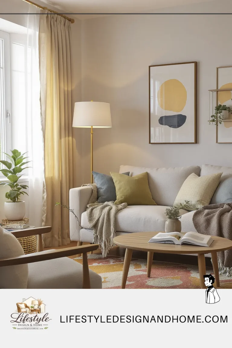
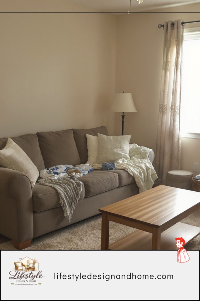
The rug was too small. The curtains were hung at the wrong height. The sofa was pushed against the wall, which she described with a pained expression as “the most common mistake in every small apartment in every city.” The coffee table was too large for the arrangement but also somehow too low for the sofa. The television was mounted six inches too high. The art was hung at the wrong height. There was no layered lighting — just one overhead fixture that made everything look flat. The room had no clear focal point because I had tried to give it three. One corner was empty in a way that she described as a “dead zone.” And the throw pillows — my proudest purchase, a set of four I had agonized over — were, she said gently, “a couple too many.”
I fixed seven of the ten things that weekend. The room looked different. Not dramatically, not in a way I could easily photograph and compare. Just better. Quieter. More settled. The way rooms look when they stop fighting themselves.
This article is those ten mistakes, explained properly — not as a list of rules to memorize, but as an understanding of why each one makes a room feel worse than it should.
Mistake 1: The Sofa Against the Wall
She said it with a pained expression, and I understand why. This is the mistake designers encounter most consistently, in most small living rooms, across every budget and every taste level. It is also the mistake that makes the least sense once you understand what it actually does to a room.
The logic behind it is sound: push the sofa against the wall, the center of the room opens up, the room feels bigger. This logic is wrong. I know, because I believed it for years and my room felt wrong the entire time.
Here is what actually happens when you push a sofa against the wall in a small room. The sofa looks defensive — like furniture that is trying to get out of the way of the room rather than being the reason the room exists. The center of the room becomes a void — not open and airy, but empty and purposeless, a void that the eye reads as wasted space rather than breathing room. And the conversation between the sofa and any other seating piece becomes awkward because the distance is wrong — either too far for genuine intimacy or, if you’ve tried to compensate by pushing chairs closer, weirdly tight on one side and cavernous on the other.
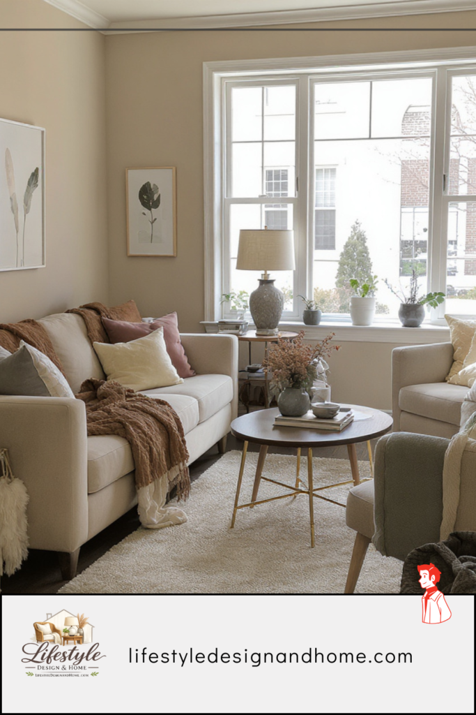
Floating the sofa — even just pulling it 12 to 18 inches from the wall — does something that seems like it should make the room feel smaller and actually makes it feel larger. The gap between sofa and wall creates depth. The room has layers. The furniture looks like it was placed intentionally rather than stored against the perimeter.
My designer friend pulled my sofa out herself, without asking, the moment she identified the problem. She stood back and said: “Now the room has a center.”
She was right. It did. It hadn’t before, and I hadn’t known what I was missing.
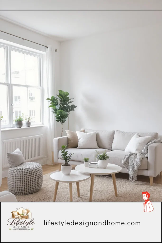
Mistake 2: The Rug That’s Too Small
The rug mistake is so universal that I’ve started to think there must be a psychological mechanism behind it — some deep human instinct that says a smaller rug is safer, less committed, easier to recover from if it’s wrong.
Whatever the cause, the result is consistent: too-small rugs in too many living rooms, and too many living rooms that feel fragmented and unfinished as a result.
My rug, when my friend saw it, had the coffee table on it and nothing else. The sofa legs were on the bare floor. The armchair legs were on the bare floor. The rug was an island in the center of the arrangement, visually disconnected from every piece of furniture around it.
She described this as “a rug that doesn’t know it’s a rug.” I wrote that down afterward because it was such a precise description of what I was seeing but couldn’t name. The rug’s job is to define the floor plane of the living space — to create a territory that the furniture lives within. When the rug is too small to include the furniture, it fails that job completely. It becomes decoration rather than architecture.
The rule: the front two legs of every seating piece should sit on the rug, minimum. All four legs is better. The rug should extend beyond the furniture arrangement on all sides — not flush with it, beyond it. In most small living rooms, this means going significantly larger than your instinct suggests. An 8-by-10 is the starting point for most configurations. A 9-by-12 is frequently the right answer even in rooms where it sounds too large.
I replaced my rug. The room looked like it had a floor for the first time.
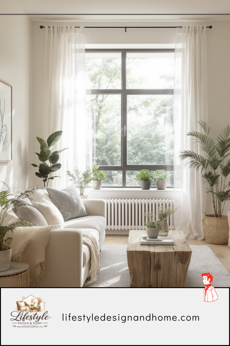
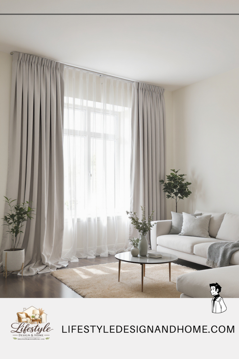
Mistake #3: Curtains Hung at Window Height
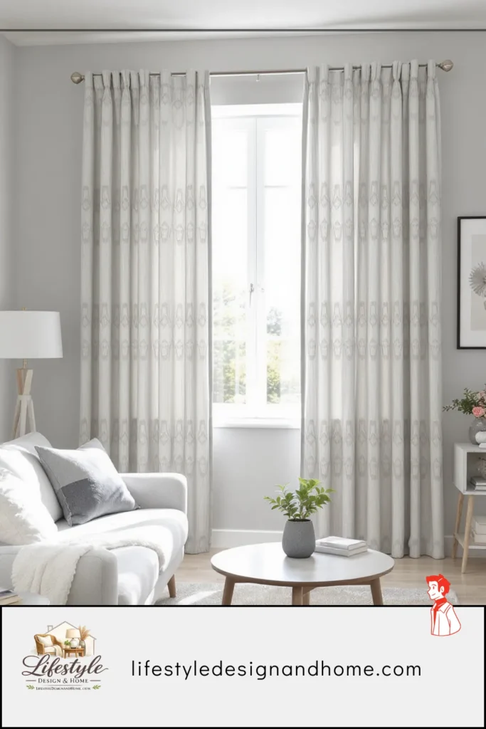
My curtains were hung at window height. This is how most people hang curtains because it is the most intuitive placement — the curtain covers the window, which is what curtains are for.
My designer friend stood in front of my window for a moment and then said: “Your ceiling is nine feet and your curtains end at six and a half. You’ve cut the room into sections.”
Once she said it I couldn’t unsee it. The curtain rod created a strong horizontal line at window height that the eye read as a ceiling. Below the line: the room. Above the line: orphaned wall space that belonged to neither the window nor the room proper. The space felt lower than it was. The window felt smaller than it was. The whole wall felt unresolved.
Ceiling-height curtains — rod mounted four to six inches below the actual ceiling, panels falling to the floor — fix all three problems simultaneously. The eye follows the fabric from floor to ceiling and reads the full height of the room. The window appears larger. The wall becomes a coherent vertical element rather than a chopped-up surface.
The additional detail she pointed out: my rod was the same width as the window. This meant the curtains, when open, covered part of the glass. Moving the rod out six to eight inches past the window frame on each side, and using panels long enough to stack on the wall rather than on the glass, would reveal the full window and let in significantly more light.
I rehung the curtains the same afternoon. The room gained approximately two feet of perceived ceiling height. Same room. Same curtains. Different rod placement.
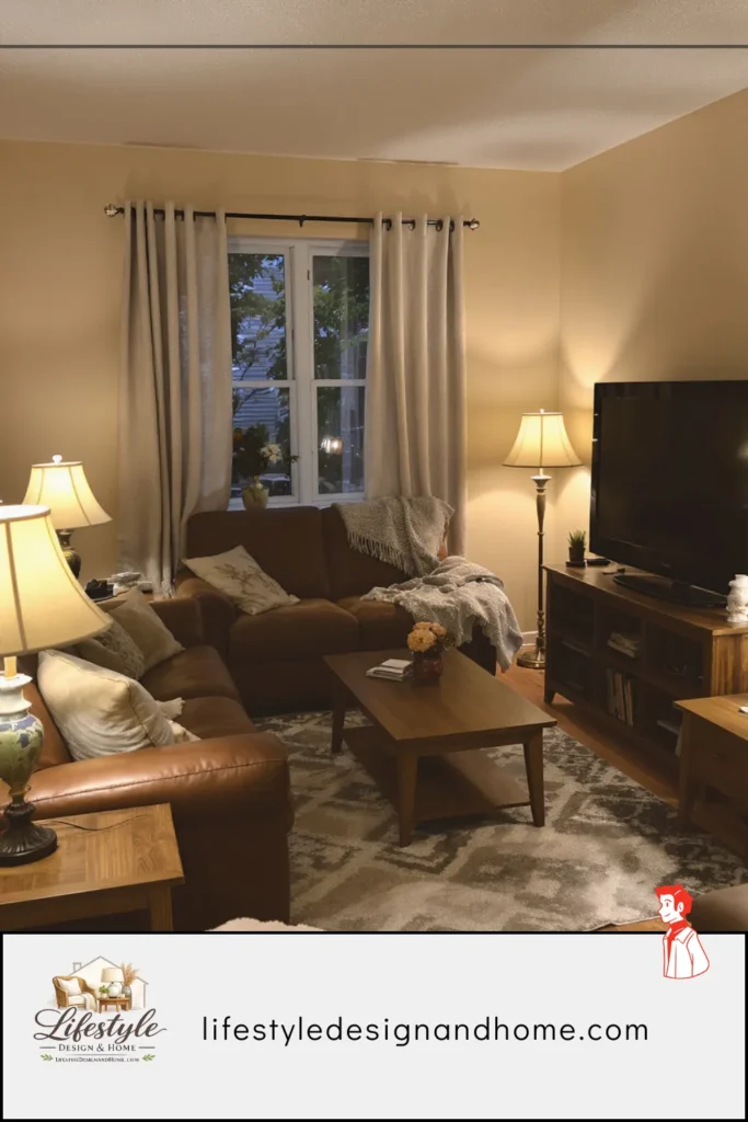
Mistake 4: The Television Mounted Too High
The television was mounted at a height I had determined by looking at the wall and thinking about what seemed “right” — which is to say, at roughly standing eye level, which is where most people instinctively mount televisions and which is, for seated viewing, wrong.
My designer friend stood in front of my sofa, sat down, and looked at the screen. Then she said: “You’re watching television like you’re watching a presentation. Your neck is going to hurt.”
The standard recommendation for television mounting height is that the center of the screen should be at approximately seated eye level — about 42 to 48 inches from the floor for most sofa heights. In practice, this means the television is lower than most people mount it. Often significantly lower. It looks wrong when the room is empty and you’re standing looking at the wall. It looks exactly right when you’re sitting on the sofa watching something.
The reason people mount televisions too high is the same reason they push sofas against walls: it seems like it should work, it looks clean from a standing perspective, and the error only reveals itself in the act of use. A television at standing eye level is unwatchable for sustained viewing without neck strain. A television at seated eye level feels natural and disappears into the experience.
I had my television remounted about three inches lower. Three inches. The difference in viewing comfort was immediately apparent.
Mistake 5: No Focal Point (Or Too Many)
This is the mistake I was most surprised to hear about, because I thought I had a focal point. I had a television on one wall. I had a bookshelf on another. I had a view from the window on the third. I thought I had three focal points, which seemed generous.
My designer friend explained that three focal points is the same as no focal point. A focal point is the thing the room is organized around — the element that the furniture arrangement points toward, that the eye naturally goes to when you enter the space. If the room has three competing claims on that role, the eye doesn’t know where to go and the room never settles.
In my room, the television, the bookshelf, and the window were all asserting themselves simultaneously. The sofa faced the television but the chairs were angled toward the window. The room felt like it couldn’t decide what it was for.
The fix: choose one. In most living rooms, this is the television, a fireplace, or a significant piece of art or furniture. Everything else supports rather than competes. Secondary elements — the bookshelf, the view — can be present and beautiful without being focal points. A focal point requires the furniture arrangement to point toward it and the room to orient around it.
I repositioned the chairs to face the same direction as the sofa. The room suddenly had a logic it had lacked. Both my friend and I agreed that the bookshelf, newly positioned as a supporting element rather than a competing focal point, actually looked better — more interesting, more considered — than it had when it was fighting for attention.
Mistake 6: The Coffee Table That’s Wrong in Two Ways Simultaneously
My coffee table, according to my designer friend, was both too large and too low. These seemed like contradictory problems until she explained them.
Too large: the table extended well beyond the two-thirds-of-sofa-length guideline, and the clearance between the table edge and the sofa was about nine inches — close enough that standing up required careful choreography. The table was creating a physical barrier in the center of the room that affected how freely people moved through the space.
Too low: the table surface was significantly below the sofa seat height, which meant that reaching for anything on it required a noticeable forward lean. Not uncomfortable for brief contact, but noticeable enough that over a long evening of reaching for drinks and snacks, the lean accumulated into a mild but real physical irritation.
The ideal coffee table sits within one to two inches of sofa seat height and maintains 14 to 18 inches of clearance between table edge and sofa edge. The length should be approximately two-thirds of the sofa’s length. My table was zero for three.
I replaced it with a smaller table at the correct height. The room immediately felt more generous—not because it was larger, but because the center was no longer occupied by an oversized barrier. And the reaching stopped being something I noticed, which is the correct state for furniture: invisible, present, serving its function without demanding attention.
Mistake 7: Flat Lighting From a Single Source
My living room had one overhead light. It was on a standard switch — either fully on or fully off. I used it for everything.
My designer friend turned it on, looked at the room, and said: “Everything looks the same. Nothing is emphasized. The room has no depth.”
She was describing something I had sensed but never articulated. The overhead light flattened everything. The texture of the rug, the grain of the wooden coffee table, the depth of the bookshelf — all of it disappeared under uniform overhead illumination. The room looked like a furniture showroom under fluorescent lights: technically well-lit, experientially flat.
Layered lighting — multiple sources at different heights — does the opposite. A floor lamp in the corner creates shadow that gives the room depth. A table lamp at sofa level puts warm light where people sit and read. An accent light highlighting the bookshelf makes the bookshelf interesting rather than just present. The room becomes dimensional.
She pointed out that my overhead fixture wasn’t even wrong for what it was — the problem was that it was the only thing. A single overhead source, however good, cannot do what multiple sources at multiple heights can do.
I added a floor lamp in the empty corner, a table lamp on the side table, and had a dimmer installed on the overhead. That weekend, my living room felt different in the evening for the first time since I’d moved in — genuinely warm and dimensional rather than brightly and flatly illuminated.
Mistake 8: The Dead Corner
Every room has corners. Most rooms have at least one corner that nobody has thought about — that sits empty and slightly cold, neither functioning as anything nor contributing anything to the room’s visual economy.
My room had one in the corner diagonally opposite the window. It wasn’t ugly. It wasn’t a problem exactly. It was just nothing — a right angle of wall that the room’s logic had never extended to.
My designer friend stood in that corner for a moment and said, “The room ends here instead of including this space. Every corner should feel like the room reaches it.”
The fix is simpler than the diagnosis suggests. A floor lamp in an empty corner doesn’t just add light — it claims the corner for the room. A tall plant does the same with organic warmth. A small chair pulled into the corner with a side table beside it turns dead space into a secondary seating position. Even a stack of books on a low stool with something on top addresses the corner and makes it feel considered.
My corner got a floor lamp and a tall plant. The room gained a fourth dimension it had been missing. Guests now sit near that corner. The space that had been nothing became somewhere.
Mistake 9: Art Hung at the Wrong Height
My art was hung at a height I had determined by finding the center of each piece and putting it at what felt like eye level — which, when standing, is about 65 to 68 inches from the floor.
Gallery standard is 57 to 60 inches to the center of the work. This is lower than most people hang art, and it is correct because galleries are designed around viewing, not around the height at which art looks “right” when you’re walking past it.
My designer friend stood in front of my main wall piece — a large print I was particularly fond of — and said: “It’s floating. It’s not connected to the furniture beneath it.”
She was right, and I could see it immediately once she said it. The art was high enough that it seemed to belong to the ceiling more than to the room. The gap between the top of the sofa and the bottom of the frame was so large that they existed in different visual registers — the sofa down here, the art up there, nothing connecting them.
Art hung at gallery height — center of the piece at 57 to 60 inches — sits in visual relationship with the furniture beneath it. The gap between the top of a sofa and the bottom of a frame is appropriate rather than cavernous. The art belongs to the room rather than floating above it.
There is an exception: in rooms with very high ceilings, art can be hung higher because the ceiling height changes the proportions. But in a standard-height room — eight to nine feet — 57 to 60 inches is almost always right.
I rehung everything. It took an hour and a handful of new picture hooks. The walls looked like they belonged to the same room as the furniture for the first time.
Mistake 10: Two Too Many Throw Pillows
My designer friend’s comment about my throw pillows—”a couple too many”—stung the most. I had thought carefully about those pillows. I had bought four of them as a set, in coordinating but not matching fabrics, in colors that complemented the sofa. I had arranged them with care.
She was right. The four pillows were two too many.
This is the most subjective mistake on this list, and also the one most worth explaining carefully because the principle is broadly applicable.
Every additional object in a room — every pillow, every decorative item, every accessory — adds visual weight and complexity. Up to a point, this complexity adds richness and life to a room. Past that point, it tips into noise — a room that is working too hard, where the eye has too many competing claims on its attention and never fully relaxes.
The right number of throw pillows for a sofa is not four. It is not two. It is the minimum number required to make the sofa look intentional and complete. For most sofas, this is two or three. For some minimally upholstered sofas, one or none. Four is almost always one or two too many, and the effect of those extra pillows is a sofa that looks overthought — like someone tried very hard to make it look casual, which is the opposite of casual.
I removed two pillows and put them in a closet. The sofa looked better. Then, feeling bold, I removed a third and kept only one, positioned slightly off-center. My designer friend would probably approve. My sofa looks like a sofa rather than a styling exercise.
The broader principle: when something in a room feels “almost right,” the answer is more often subtraction than addition. One fewer object. One less layer. More breathing room. The room settles when it stops straining.
The Afternoon, Continued
My designer friend stayed for four hours. She drank two coffees. She rearranged my furniture twice, once to demonstrate a point and once because she couldn’t help herself.
Before she left, she stood in the doorway of the living room and looked at it for a long moment. The sofa was floating. The curtains were scheduled to be rehung on the weekend. She had already pulled the rug forward six inches and declared it somewhat better.
“It’s a good room,” she said.
Not nice. Good.
I’ll take good
The Quick Reference: 10 Mistakes and Their Fixes
Mistake 1 — Sofa against the wall
Fix: Pull it out 12 to 18 inches. Float it. The room gains a center.
Mistake 2 — Rug too small
Fix: Front legs of all seating on the rug, minimum. Go larger than instinct suggests.
Mistake 3 — Curtains at window height
Fix: Mount rods 4 to 6 inches below ceiling. Panels to the floor. Rod extends 6 to 8 inches past frame on each side.
Mistake 4 — Television too high
Fix: Center of screen at 42 to 48 inches from floor — seated eye level.
Mistake 5 — No focal point, or too many
Fix: Choose one. Orient furniture arrangement toward it. Let everything else support rather than compete.
Mistake 6 — Coffee table wrong in size and height
Fix: Two-thirds the sofa’s length. Within one to two inches of sofa seat height. Fourteen to eighteen inches of clearance from sofa edge.
Mistake 7 — Single flat overhead light
Fix: Add floor lamp in least-lit corner, table lamp at sofa level, dimmer on overhead.
Mistake 8 — Dead corner
Fix: Claim it — floor lamp, tall plant, small chair, or stacked books with an object. Every corner should feel like the room reaches it.
Mistake 9 — Art hung too high
Fix: Center of artwork at 57 to 60 inches from floor. Art should relate to the furniture beneath it.
Mistake 10 — Too many throw pillows
Fix: Remove one. Then consider removing another. The minimum required is almost always fewer than you think.