You’re Not Bad at Decorating. You’re Just Fighting Physics — and Losing.
Here’s a moment you probably know too well.
You’ve just spent a Saturday rearranging your living room. You pushed the sofa against the wall. You found a spot for the coffee table that doesn’t make people trip. You hung some art, fluffed the throw pillows, stood back — and felt absolutely nothing. The room still looks cramped. It still feels like you’re living inside a shoebox someone tried to decorate on a budget.
You scroll through Pinterest for the hundredth time. The rooms there look airy, open, effortlessly spacious. But those are apartments in Milan. Lofts in Brooklyn. Not your 12-by-14-foot box with one awkward window and a radiator you can’t move.
What if I told you it’s not the square footage that’s the problem?
Interior designers have known for decades that the perception of space is almost entirely psychological. What your eye sees, your brain interprets as either claustrophobic or expansive — and a handful of very deliberate layout decisions are the difference between a room that feels like a prison cell and one that feels like a magazine spread. You don’t need to knock down walls. You don’t need a renovation budget. You need a formula.
This is that formula.
Why Small Living Rooms Feel So Much Smaller Than They Actually Are
Before we fix anything, we need to understand what’s actually broken.
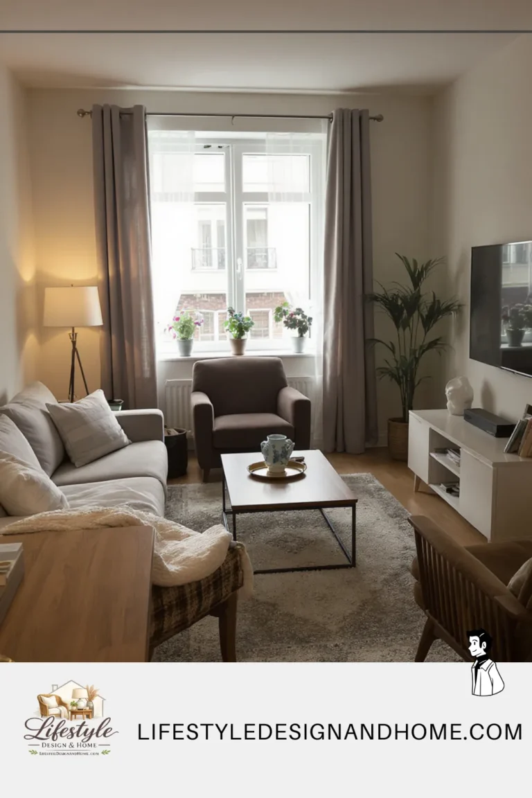
Most people make the same five mistakes in small living rooms — and they make them with the best intentions. They push furniture against walls because they think it creates more open floor space. It doesn’t; it creates a hollow, awkward void in the center of the room and makes the furniture look like it’s huddling in fear. They buy a coffee table that’s too small because they’re afraid of “taking up too much room” — which actually makes everything look more cluttered and disconnected, not less. They hang curtains at window height instead of ceiling height, which visually chops the room in half. They use too many small rugs, or worse, no rug at all. And they light the room with a single overhead light that casts flat, shadowless illumination that makes the space feel like a waiting room at a doctor’s office.
Every one of these instincts makes complete common sense. Every one of them makes the room look smaller.
There’s a deeper issue too: the brain reads complexity as smallness. When there’s too much visual noise — too many competing patterns, too many different wood finishes, too many objects sitting at different heights without any logic — the eye doesn’t know where to rest. A room the brain has to work hard to “read” always feels more cramped than a room it can scan smoothly. This is why a minimalist space with nothing on the walls can still feel warm and inviting, while a room stuffed with carefully curated objects feels chaotic. Visual flow is everything.
The good news: once you understand these principles, you can apply them systematically. The formula I’m about to give you addresses each problem in sequence, starting with the decisions that have the biggest impact and working down to the finishing details.
The Formula: Seven Moves That Change Everything
Move 1: Float Your Furniture Off the Walls
This is the most counterintuitive move in the entire formula — and the one clients resist the most.
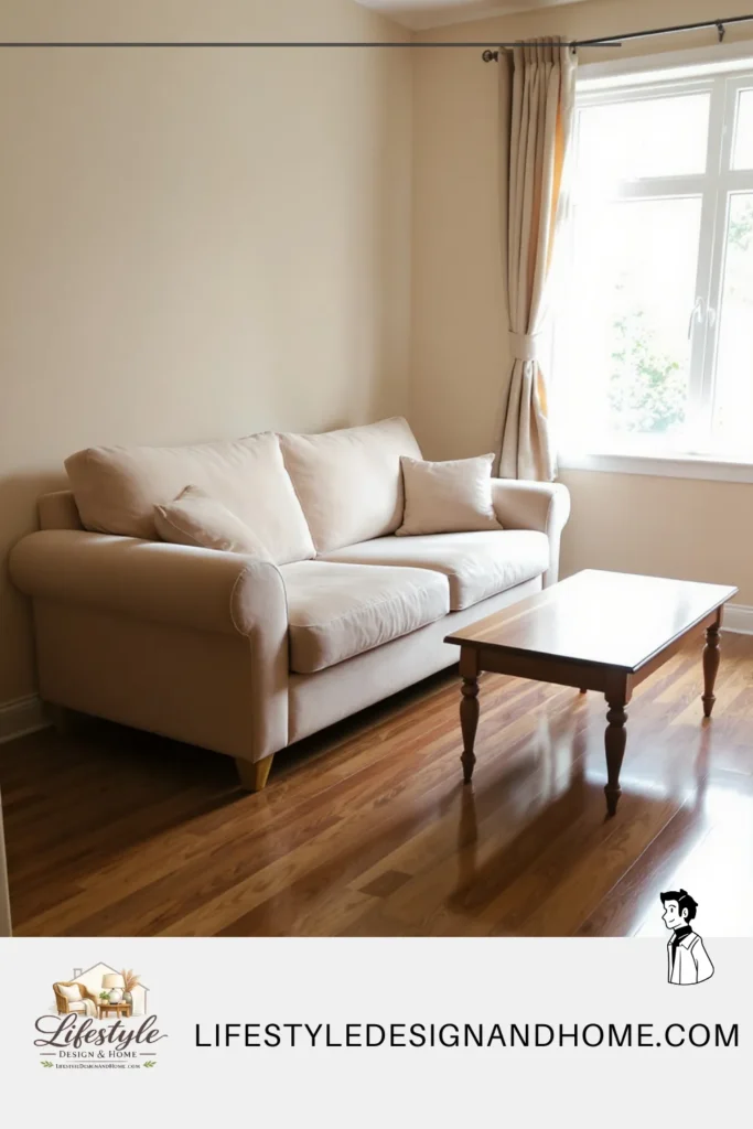
When I redesigned my own first 12-by-14 rental living room, I did what everyone does: I pushed the sofa flat against the wall to “save space.” The room felt tight, awkward, unfinished. Out of frustration, I pulled it forward about eight inches just to test the theory.
The difference was immediate. The room finally had depth.
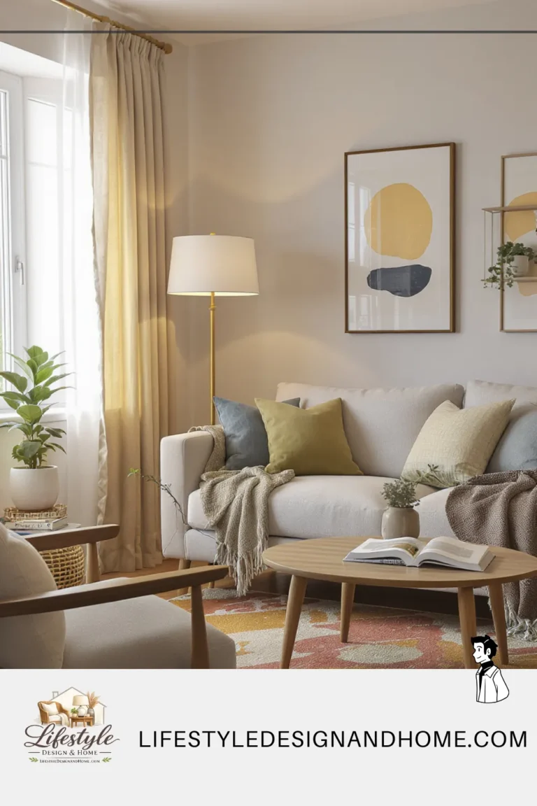
Pull your sofa at least 6 to 12 inches away from the wall behind it. Yes, this technically uses more floor space. No, it will not make the room feel smaller — it will make it feel significantly larger. When furniture floats, it creates a sense of breathing room behind it. The eye reads that gap as intentional negative space, not wasted space.
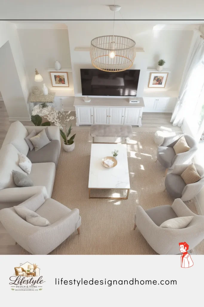
In nearly every small rectangular room I’ve worked with, a floating conversation grouping works best: sofa facing one or two chairs, coffee table anchoring the center. Once the furniture forms a defined “zone,” the room stops feeling like scattered pieces along a perimeter and starts feeling composed.
The surprising part? Traffic flow actually improves. When furniture is shoved against walls, you create strange empty voids and awkward walking paths. When it’s floated properly, movement becomes more natural and deliberate.
It feels wrong at first.
It works every time.
Move 2: Choose One Large Rug and Go Bigger Than You Think
The number one rug mistake in small rooms is buying a rug that’s too small.
A rug that only fits under the coffee table, floating in the middle of an arrangement with all four sofa legs sitting on bare floor, is one of the most reliable ways to make a room look smaller and more confusing. The rug becomes just another competing object rather than a unifying element.
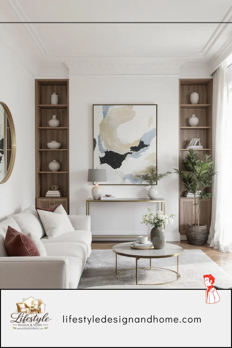
The rule is this: in a small living room, your rug should be large enough that at least the front two legs of every major seating piece can sit on it. If you can get all four legs on the rug, even better. A standard 8-by-10 rug is the starting point for most living rooms; a 9-by-12 is frequently the better choice even in rooms that seem too small for it.
A large rug does something remarkable to a room — it tells the eye where the “room” is. It creates a defined floor plane that the furniture sits within, and that containment paradoxically makes the space feel more generous, not less. It’s the same reason a well-drawn map of a small country still communicates scale and geography clearly: boundaries, when placed correctly, create the impression of controlled, confident space.
Color matters here too. A light or medium-toned rug will reflect light and open up the floor plane. A very dark rug will anchor the space dramatically but can feel heavy if the room doesn’t have enough light. In most small living rooms, erring lighter is the safer choice.
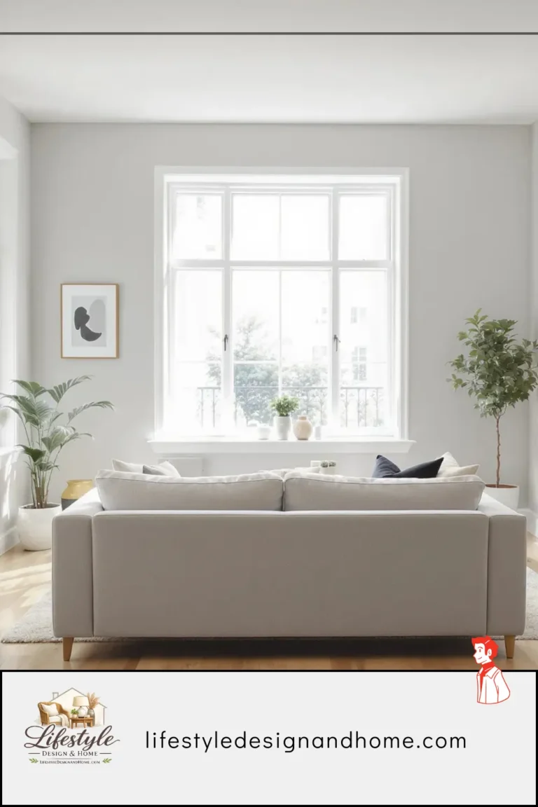
Move 3: Hang Your Curtains at Ceiling Height (Even If the Window Doesn’t Reach)
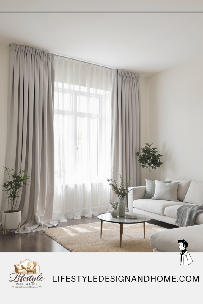
If you have window treatments that start at the top of the window frame and end at the sill, you are visually cutting your room into sections. The eye follows the curtain line, reads it as a horizontal boundary, and interprets the room as shorter and wider than it actually is.
The fix is almost free: move your curtain rod to within four to six inches of the ceiling and let the panels fall all the way to the floor. If you can’t afford new longer panels right now, you can add curtain extenders or simply hem your existing curtains longer if they’re a versatile fabric.
What ceiling-height curtains accomplish is powerful. They draw the eye upward, emphasizing the full vertical height of the room. They make windows look dramatically larger than they are. They make the ceiling feel higher. And in a small room, perceived ceiling height is one of the most important levers you have — a room that feels tall automatically feels less cramped, even if its footprint hasn’t changed by an inch.
One more detail: hang the rod wider than the window by at least six to eight inches on each side. When the curtains are open, the fabric stacks outside the window frame, revealing the full glass and making the window appear significantly wider. Light floods in without obstruction. The room opens up.
Move 4: Pick a Dominant Color and Build From There
Visual noise kills small rooms. And one of the biggest sources of visual noise is color chaos — walls that fight with the sofa, pillows that clash with the rug, artwork that belongs in a different house.
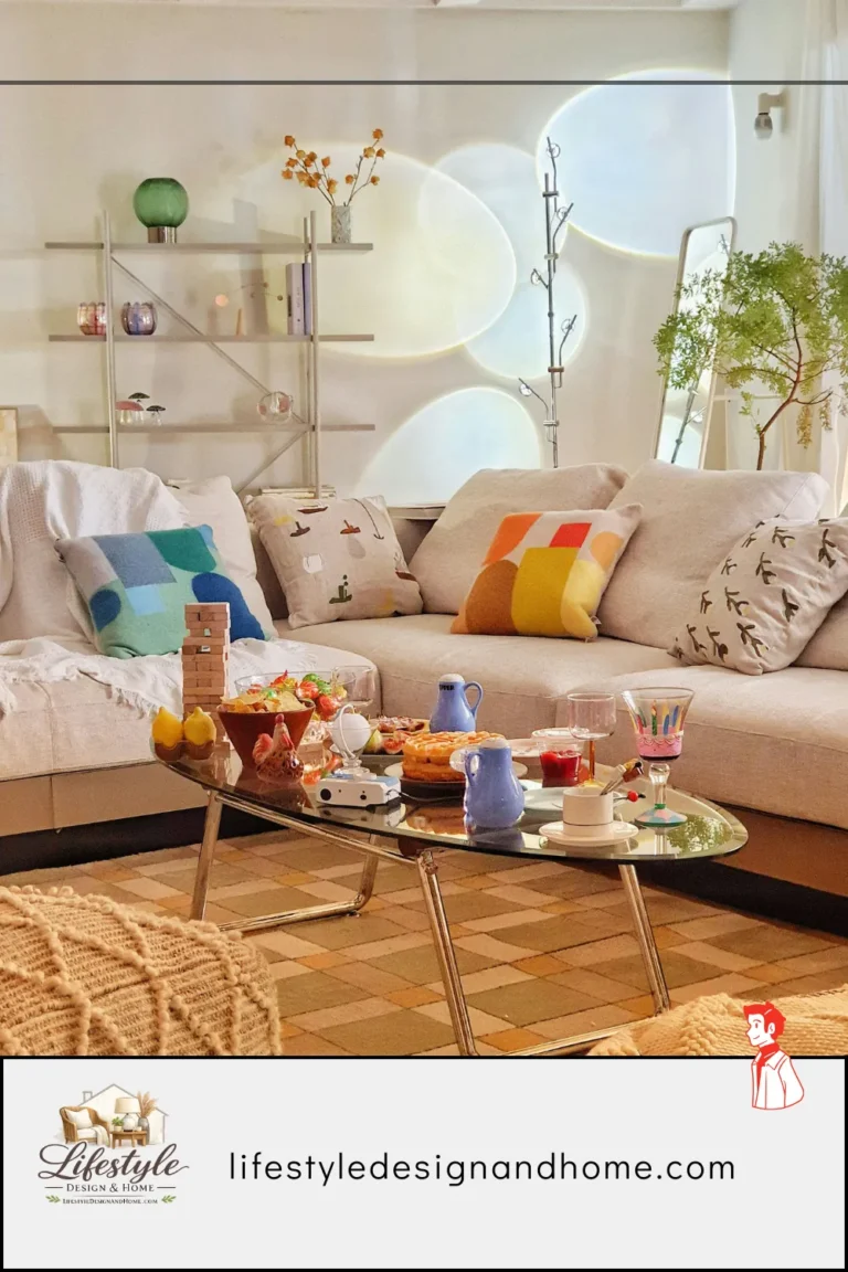
The formula for small rooms is a dominant-neutral-accent structure. Choose one neutral for the bulk of the room (walls, large upholstered pieces, rug) — this is your dominant color, and it should take up roughly 60% of the visual space. Choose one warmer or slightly contrasting neutral for secondary elements like throw pillows, side tables, and smaller upholstery — this takes up about 30%. Then use one or two intentional accent colors in accessories and art for the remaining 10%.
When the room is reading in closely related tones, the eye moves through it smoothly. There are no jarring stopping points. The space looks unified, controlled, and — critically — larger, because the brain doesn’t have to work as hard to process it.
Light colors also reflect light, which is worth stating plainly: a room painted in off-white or a warm greige will always read as bigger than the same room painted dark green, regardless of any other choices you make. That doesn’t mean you can’t use deep, dramatic colors in small rooms — but if you go dark, go dark on purpose, with intention, not because you couldn’t decide.
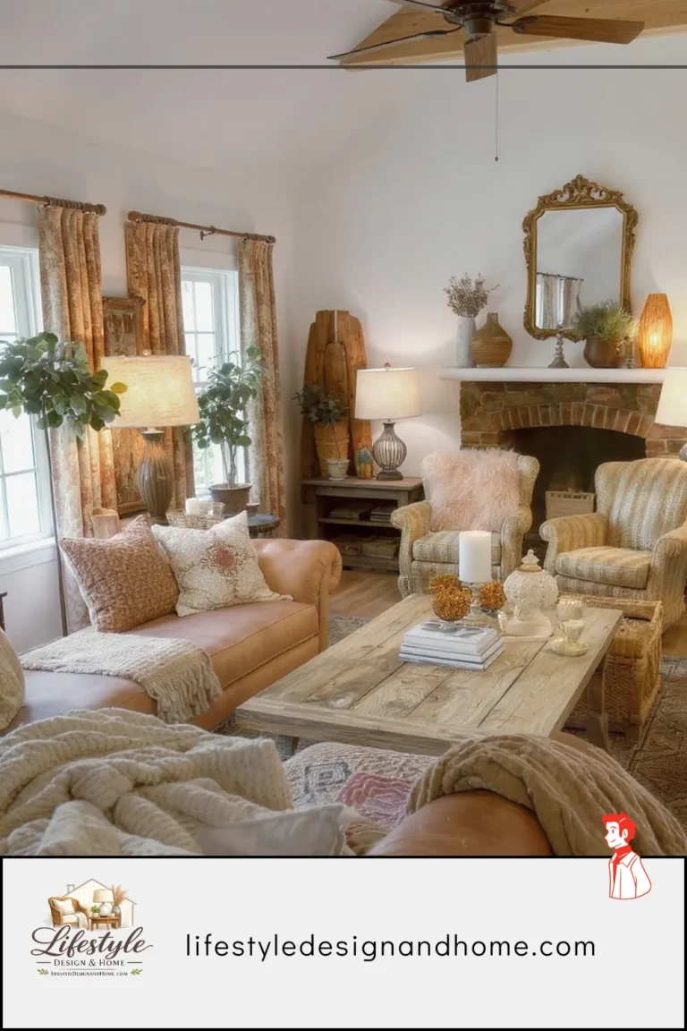
Move 5: Add a Mirror — But Place It Strategically
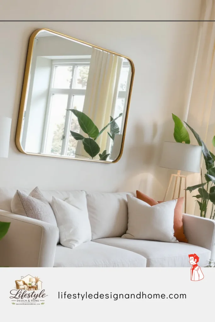
You’ve heard this one before, but most people get the placement wrong.
A mirror doesn’t automatically make a room feel bigger. A mirror hung in the wrong place just gives you a view of a wall, which accomplishes nothing. The way mirrors work spatially is by doubling a view — when a mirror reflects something interesting or light-filled, it effectively adds a whole additional visual plane to the room, creating the impression of depth and continuation beyond the wall.
The best placement for a mirror in a small living room is opposite or adjacent to a window. This reflects natural light back into the room and, when positioned correctly, gives the illusion of a second window — or even a doorway into another room. In rooms without much natural light, a mirror behind a lamp or cluster of candles will multiply the warm light in a way that changes the entire ambiance.
Size matters as much as placement. A small, decorative mirror hung on a large wall looks like an afterthought and does almost nothing spatially. A large mirror — think 30 inches wide at minimum, ideally larger — actually changes the room. Leaning a large mirror against the wall instead of hanging it is a look that’s both casual and sophisticated, and it tends to feel more proportional in low-ceilinged rooms.
Move 6: Declutter the Floor, Elevate Storage
One of the fastest ways to make any room feel instantly bigger requires no purchases at all: get objects off the floor.
Every item sitting on the floor — the stack of magazines, the basket of throws, the side table with stuff underneath it — registers as a visual obstacle. The more open floor you can see, the larger the room reads. This is why staged homes for real estate photography have almost nothing on the floor: it’s not because the owners live that way, it’s because clear floors photograph as significantly bigger and sell faster.
In practical terms, this means choosing furniture with legs rather than furniture that sits directly on the floor. A sofa on legs, a media console on legs, side tables with space underneath — all of these reveal floor, which the eye reads as space. It also means being ruthless about what’s actually on the floor that doesn’t need to be. Baskets can be wall-mounted. Books can go on shelves. The floor should be as clear as you can possibly make it.
For storage, go vertical. A tall bookshelf draws the eye up and uses wall space rather than floor space. Floating shelves do the same. The goal is to store things in the vertical plane and keep the horizontal plane — your floors, your surfaces — as clear as possible.
Move 7: Layer Your Lighting
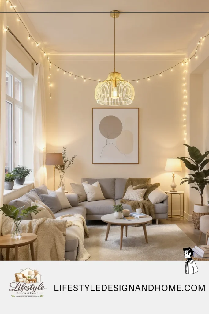
This is the most underestimated element on the entire list, and fixing it requires the least physical rearrangement.
A single overhead light creates flat, even illumination that reveals every corner of a room simultaneously. This is the lighting equivalent of a wide-angle camera shot — nothing is emphasized, nothing recedes, and the brain reads the full footprint of the space at once. This is exactly what you don’t want.
Layered lighting uses multiple sources at different heights to create pools of warm light and intentional shadow. A floor lamp in the corner. Table lamps flanking the sofa. Perhaps a small accent light under a shelf or behind a piece of furniture. When light comes from multiple low sources, the corners of the room naturally fall into softer shadow — and a room where you can’t quite see all the corners reads as potentially larger than one where everything is equally lit.
The psychological principle here is the same one casinos use to create a sense of timelessness and endless space: controlled light, intentional shadow, never too much illumination in any one place. You don’t need to go that far. But swapping your overhead light to a dimmer switch and adding two or three warm-toned lamps will transform a room in a way that no amount of furniture rearranging can match.
Putting It Together: A Visual Walkthrough
Imagine a 12-by-15 foot living room with one window on the north wall, a doorway on the east wall, and an existing arrangement: sofa against the south wall, television on the west wall, coffee table in the center, two chairs shoved into corners.
Before the formula: The sofa feels isolated, pushed against the wall. The chairs look like they’re in detention. There’s a rug under only the coffee table. The curtains hang at window height. A single ceiling light illuminates the whole space evenly. The eye scans it in about one second and concludes: small room.
After the formula: Pull the sofa 8 inches from the wall and angle the two chairs slightly inward to create a conversational triangle. Drop a 9-by-12 rug underneath all three pieces — front legs on the rug, at minimum. Hang curtain rods at ceiling height with panels that puddle slightly on the floor, extending 8 inches on each side of the window frame. Mount a large mirror on the wall opposite the window. Add a floor lamp in the far corner and two table lamps on side tables flanking the sofa. Swap anything sitting on the floor for wall-mounted or elevated alternatives. Choose a palette of warm white walls, a natural linen sofa, a jute-toned rug, and two or three deep terracotta accents.
Same room. Feels completely different. Not because anything structural changed, but because every decision now works with human perception rather than against it.
The Small Living Room Formula: Your Summary Checklist
Before you do anything else, print this out and take it room by room:
Furniture Layout
- Sofa and major pieces floated at least 6–12 inches from walls
- Seating arranged in a conversational grouping with a clear center
- Traffic flow around the grouping is logical and at least 30 inches wide
- Furniture on legs wherever possible to reveal floor
Rug
- Rug is large enough for front legs (at minimum) of all seating pieces
- 8×10 is the starting size — consider going up to 9×12
- Light to medium tone unless dramatic contrast is intentional
Curtains and Windows
- Curtain rods mounted 4–6 inches below ceiling
- Panels fall to the floor
- Rods extend 6–8 inches beyond window frame on each side
Color
- 60/30/10 structure: dominant neutral / secondary neutral / accent
- No more than two or three distinct wood tones in the room
- Light or warm neutral for walls if maximizing perceived space
Mirrors
- At least one large mirror placed to reflect light or a window
- Mirror is minimum 30 inches in largest dimension
- Positioned to create depth, not just reflection
Floor and Storage
- Floor as clear as possible — objects stored vertically or off-floor
- Tall vertical shelving used instead of wide horizontal storage
- Surfaces edited to only intentional objects
Lighting
- At least three light sources: one overhead (dimmed) + two floor or table lamps
- Warm-toned bulbs (2700K–3000K)
- Overhead on a dimmer switch if possible
- Pools of light in corners to soften room edges
The Takeaway
Small living rooms don’t need to feel small. They need to be designed with intention — every choice from rug size to curtain height working in the same direction, all of it telling the eye that this space is larger, warmer, and more expansive than its measurements suggest.
The formula isn’t complicated. Float the furniture. Scale the rug up. Hang the curtains high. Unify the palette. Use mirrors strategically. Clear the floor. Layer the light.
Seven moves. One small room. An entirely different room.
The only thing left to do is start.