The Color I Almost Painted Over Three Times
I have repainted exactly one room in my adult life with a color I chose specifically because a designer told me it would work, while my every instinct said it wouldn’t.
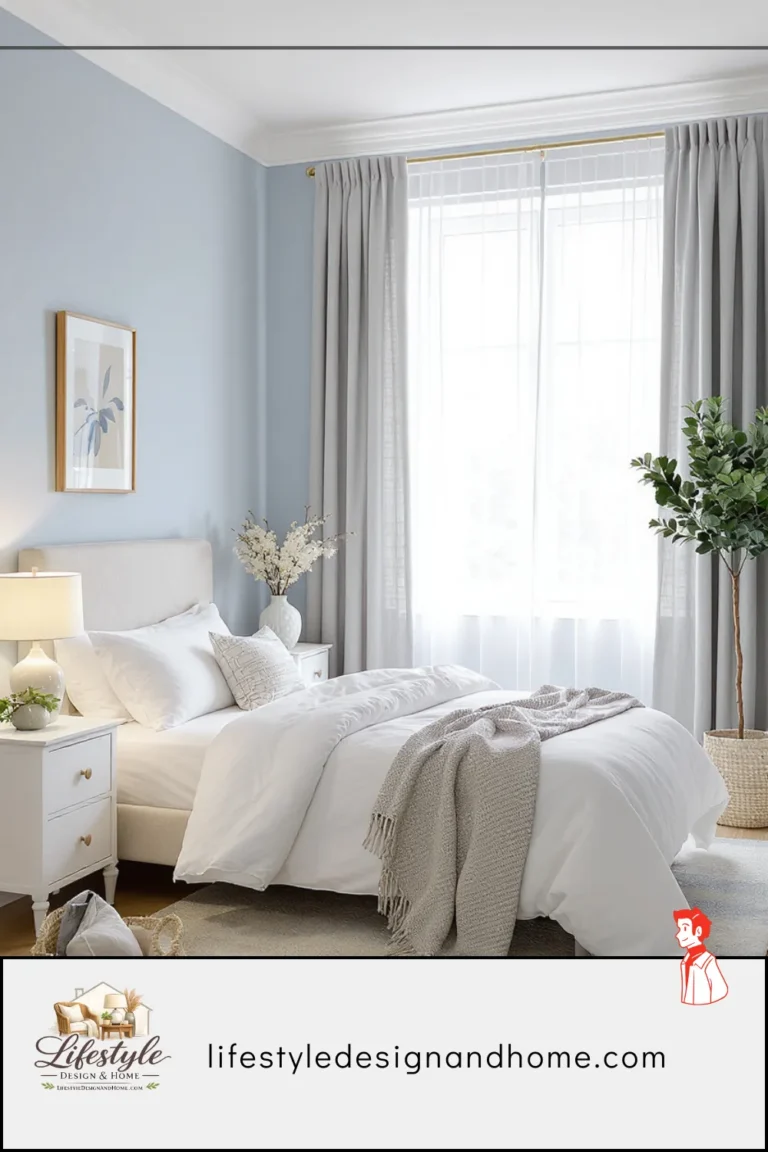
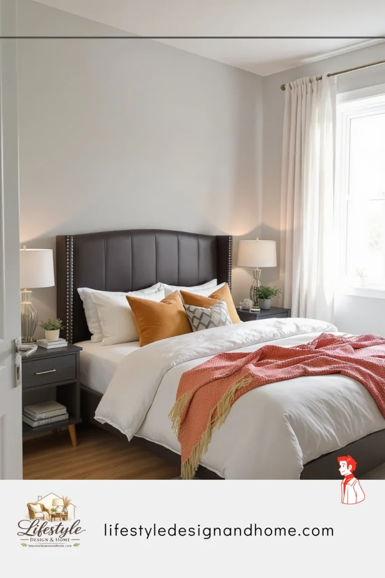
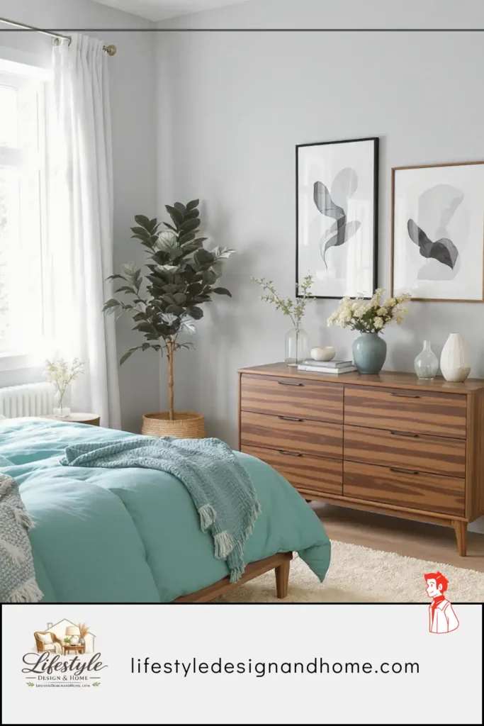
The color was a deep, slightly dusty terracotta — not the bright terracotta of Southwestern tile but the specific muted terracotta of aged clay pots left outside for several seasons, a color that had brown in it and some grey and the faintest suggestion of pink. The designer described it as “the color of warmth at dusk.” I described it, privately, as a significant risk in a bedroom that was already challenged by a north-facing window and limited natural light.
I painted it on a Saturday. By Saturday evening I had decided it was too dark. By Sunday morning I had decided it was interesting but possibly wrong. By Sunday evening I had accepted that it might be right. By Monday morning, when I woke up in the room for the first time and lay there for a few minutes in the specific quality of light that warm paint creates at 7 AM — the light that bounces off warm-toned walls and returns to you as something softer and more amber than what came through the window — I understood what the designer had known: that this color was exactly right for this room, and that my instinct had been wrong because I had been evaluating the color in isolation rather than understanding what it would do in combination with the room’s light, the room’s purpose, and the human nervous system’s specific response to warm tones at rest.
That experience permanently changed how I think about bedroom color. Not just which colors work — the specific logic of why certain colors work in bedrooms and others don’t, and how that logic differs from the logic of color in any other room.
This article is that logic, applied to the palette ideas that designers return to most consistently.
Why Bedroom Color Is Different From Every Other Room
The bedroom is used differently from every other room in the home, and that difference determines everything about how color should be chosen for it.
Every other room in the home is primarily used during waking hours — for cooking, working, gathering, entertaining, relaxing in the active sense. Color in these rooms is experienced primarily when the occupant is alert and oriented — when the visual cortex is processing at full capacity, when the emotional response to color is mediated by conscious thought, when the room’s color is something you see rather than something you are in.
The bedroom is different in two specific ways.
First, it is the room where the transition from wakefulness to sleep happens — where the nervous system is asked to downregulate, where the body prepares for rest, where conscious thought gives way to drowsiness. Color in this context is not processed the way waking-state color is processed. It is absorbed rather than evaluated. It creates an ambient tonal environment that the body responds to below the level of conscious assessment.
Second, it is the room experienced in states of vulnerability — at the beginning of the day before full alertness, at the end of the day when resources are depleted, during illness, during rest. In these states the room’s color is more influential, not less, because the filtering mechanisms of conscious evaluation are reduced.
This means that bedroom color choices have consequences that are more directly physiological than color choices in other rooms. A stimulating color in a living room produces a room that feels energetic and activating — which may be exactly right. The same color in a bedroom works against sleep, rest, and recovery in ways that accumulate across weeks and months into a quality of the bedroom that the occupant experiences as vague dissatisfaction without knowing its source.
Designers who understand this choose bedroom colors for their physiological effect first and their aesthetic quality second. The colors that follow are the ones that consistently produce the right physiological effect — rest, calm, and the specific quality of warmth that makes waking in a room feel like arriving rather than departing.
Palette #1: Warm Whites and Soft Creams
The most versatile and most misunderstood bedroom palette is also the most commonly attempted and the most commonly gotten wrong.
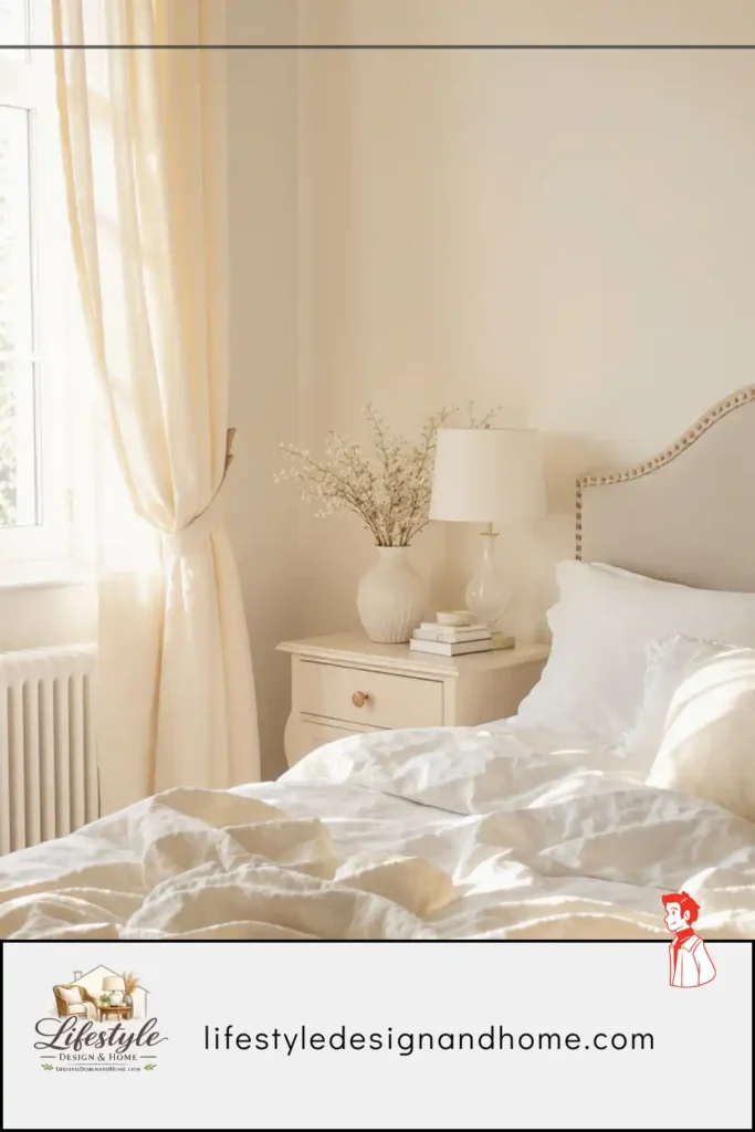
Warm white is not white. This is the distinction that determines whether this palette produces a bedroom that feels calm and inviting or a bedroom that feels clinical and cold. True white — cool white, blue-white, the white of freshly painted walls in a standard finish — is the white of hospitals and offices and rental apartments painted to neutral rather than chosen for warmth. It reflects light without warming it. It creates rooms that feel precise and bright and slightly cheerless in a way that is difficult to name but immediately felt.
Warm white is the white that has undertones — a touch of yellow, a slight cream, the faintest suggestion of sand or pink or ivory. These undertones are often not visible when the paint chip is held against other colors. They become visible when the paint is on the wall and interacting with the room’s light: the warm undertone catches the morning light and returns it as amber, catches the lamp light in the evening and deepens it, creates a wall surface that reads differently at different hours in a way that cold white never does.
The specific warm whites that designers return to consistently: whites described as “linen,” “cream,” “oyster,” “bone,” “warm grey,” or “antique white” by paint manufacturers. In practice this means looking at the paint chip in the specific light of the room — not in the paint store under fluorescent lights, which misrepresents almost every color — and asking whether the chip looks warm or cool in that context.
Why this palette works for bedrooms:
Warm white walls create a neutral background that the room’s other elements — bedding, wood furniture, lamps, textiles — can express themselves against without competition. The room reads as calm because nothing is asserting itself visually. The eye moves through the room without being stopped by any dominant color note. This is the physiological state of rest — visual ease rather than visual engagement.
Warm white also maximizes the room’s light without producing the clinical brightness of cold white. In north-facing rooms with limited natural light — like my room before the terracotta — warm white is often the correct choice specifically because it reflects and warms whatever light is available rather than reflecting it coldly.
The layering that completes the palette:
A warm white bedroom works best when the other elements add tonal depth and texture. Natural linen bedding in oatmeal or warm ivory. Wood furniture with visible grain in pale oak or warm walnut. A rug in natural wool or jute that adds warmth underfoot. Lamps with cream shades that produce warm pools of amber rather than white light. The warm white walls are the canvas — the other elements are the painting.
The mistake to avoid:
Choosing warm white walls and then populating the room with cool-toned elements — grey bedding, chrome fixtures, cool-toned wood, white-white accessories. The room reads as color temperature confusion: the walls are trying to be warm and everything else is trying to be cool, and the result is a room that feels unsettled rather than calm.
Palette #2: Soft Sage and Muted Greens
Green is the color of the natural world — of leaves, of moss, of water in certain lights — and the human nervous system has a specific response to it that makes it one of the most consistently effective bedroom colors available.
Research on color psychology and physiological response consistently finds that green is associated with rest, safety, and natural environments. This is not a learned association — it is older than learning, rooted in the evolutionary reality that green environments meant food, water, and safety for most of human history. The body reads green as a signal of favorable conditions. The nervous system responds with relaxation.
But not all greens produce this effect equally. Bright, saturated greens — the green of traffic lights, of bright foliage in direct sun, of highly saturated pigment — are stimulating rather than restful. The greens that produce the calm-and-rest response are the muted, dusty, grey-inflected greens that read as aged or natural rather than vivid and synthetic.
The specific greens designers return to for bedrooms: sage green (grey-green, the color of dried sage leaves), eucalyptus green (slightly blue-green, the color of eucalyptus bark), moss green (deep and muted, the color of forest moss in shadow), and the various dusty olive tones that sit between green and grey. All of these colors have been desaturated by the addition of grey or brown, which removes the stimulating quality of pure green while preserving its restful associations.
Why this palette works for bedrooms:
Muted green is one of the few colors that is simultaneously warm and cool — it sits in the zone between warm yellow-green and cool blue-green, and its specific temperature depends on its undertone and the room’s light. This temperature ambiguity is useful in bedrooms because it makes the color flexible — it reads as warm in warm light and cool in cool light, which means it tends to look good across the range of light conditions a bedroom experiences.
Muted green also has a specific quality of depth that flat neutrals lack. A sage green wall is not simply a surface — it has a layered quality, as if the color goes slightly into the wall rather than sitting on its surface. This depth creates the impression of a room that has been considered rather than simply painted.
The room that showed me this:
A friend’s bedroom painted in a deep muted sage — almost as dark as a forest in shade, much darker than I would have chosen — had the quality of being inside a natural space. Not overwhelmingly green, not themed, but with the specific quality of ambient restfulness that a room surrounded by trees might produce. I asked her if she slept well in it. She said it was the best sleep she’d had in any room she’d lived in. I believe her.
The layering that completes the palette:
Sage green works best with warm wood tones, natural linen in warm ivory or oatmeal, and warm lighting. The wood relates to the green through their shared natural origin — both are tones you would find in a woodland or garden setting. The warm linen provides the contrast that prevents the room from reading as monochromatic. The warm lighting at 2700K brings out the amber undertone of the sage and prevents it from reading as cool or institutional.
The mistake to avoid:
Combining sage green with too much cool grey or too much pure white. Both cool the palette beyond the range of warmth that makes the color restful. Sage green with warm cream or warm white reads as natural and calm. Sage green with cool grey reads as sophisticated but slightly cold — more spa than sanctuary.
Palette #3: Warm Neutrals — Taupe, Greige, and Warm Grey
The palette of warm neutrals — the various combinations of beige, brown, grey, and the specific middle territory called greige — is the most used bedroom palette in residential interiors and the one with the most variation in execution quality.
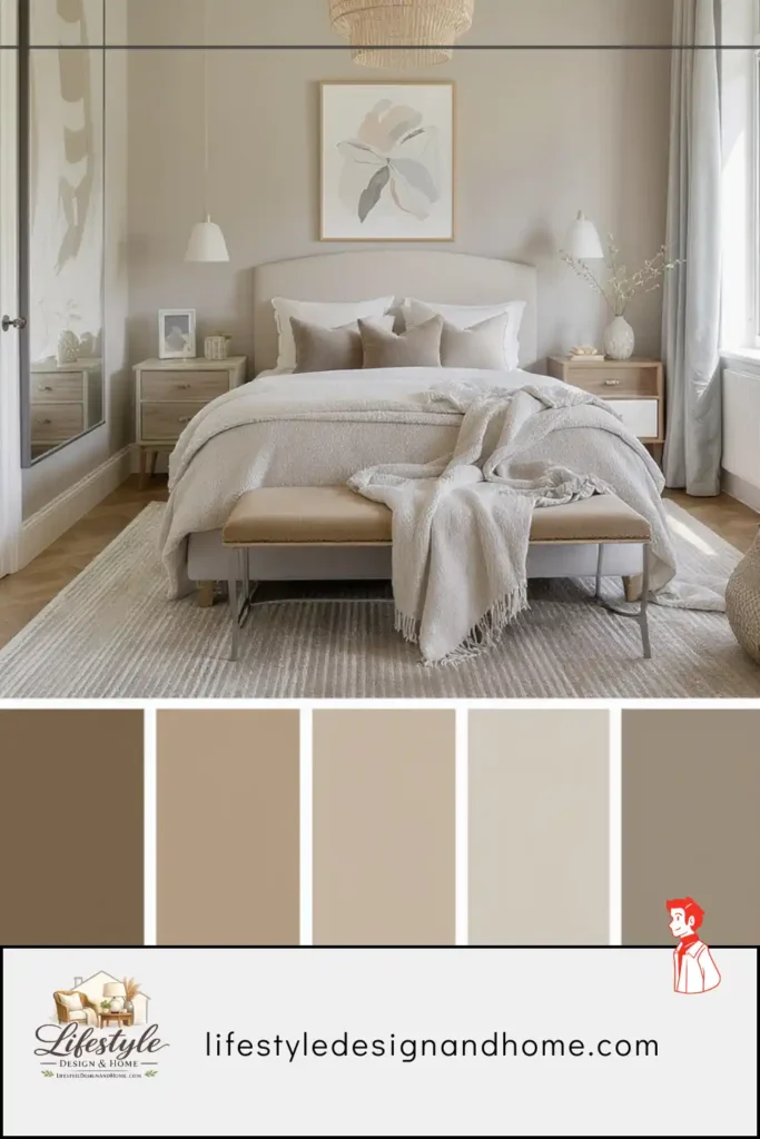
Done well, warm neutrals produce bedrooms of extraordinary calm and sophistication — the specific quality of rooms where nothing is asserting itself and everything is in quiet agreement. Done poorly, they produce rooms that feel beige in the specific modern pejorative sense: colors chosen to offend no one, that please no one, that produce rooms of perfect inoffensiveness and no particular warmth.
The distinction between successful warm neutrals and unsuccessful ones is almost entirely about undertone and coordination.
Undertone:
Every grey, beige, and neutral has an undertone — the color that emerges when the neutral is placed in specific lighting conditions or next to other colors. Cool greys have blue or green undertones. Warm greys have yellow, pink, or brown undertones. A greige (grey-beige combination) that reads as warm and sandy in one room can read as slightly purple in another, depending on the light and the adjacent colors.
The undertone matters in bedrooms because it determines how the color interacts with the room’s light, particularly in the evening under warm artificial lighting. A warm-undertoned neutral — one with yellow, sand, or pink in it — catches warm lamp light and glows. A cool-undertoned neutral — one with blue or green in it — reflects warm light without warming it, sometimes producing a slightly greenish or lavender quality that reads as wrong without being nameable.
The test for undertone:
Hold the paint chip next to a piece of warm white paper in the room’s actual light — window light during the day, lamp light in the evening. If the chip looks warmer than the paper, it has warm undertones. If it looks cooler or slightly greenish or purple compared to the paper, it has cool undertones. For bedrooms, warm undertones are almost always the better choice.
The coordination principle:
A bedroom in warm neutrals should have its neutrals coordinated — the walls, the bedding, the rug, the wood tones, and the textiles should all pull from the same temperature zone. A warm taupe wall with a cool grey bedding set is a temperature conflict that the eye reads as slight discord rather than calm harmony. A warm taupe wall with warm ivory bedding, warm oak furniture, and a wool rug in warm grey-brown is a palette that reads as unified and restful.
The specific warm neutrals that work best:
Warm greige in the medium value range — not too light (reads as unintentional) and not too dark (requires careful lighting to avoid feeling heavy). A specific category designers call “mushroom” — warm brown-grey that reads as sophisticated without reading as any specific color. Warm sand tones that have enough brown to read as warm without reading as beige in the dated sense. And the various “warm grey” classifications that have enough yellow or brown undertone to prevent the coolness that makes standard grey difficult in bedrooms.
Palette #4: Deep and Moody — Navy, Charcoal, Forest Green
This is the palette that most contradicts intuitive assumptions about bedroom color and that produces, when executed correctly, some of the most successful and genuinely restful bedrooms I have encountered.
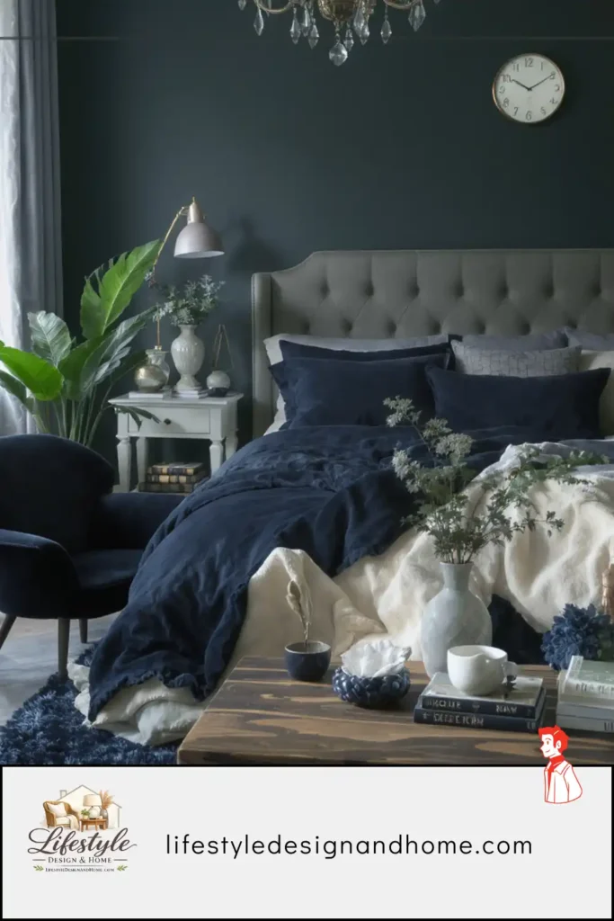
The assumption: dark colors make rooms feel smaller, heavier, and more oppressive. In some contexts, this is true. In bedrooms specifically, the opposite is often the case, for reasons that are both physiological and perceptual.
The physiological argument for deep colors in bedrooms:
The bedroom is a room used primarily in the dark or in low light. When a room is used in low light, the wall color is experienced primarily as the surface that absorbs and reflects that low light — not as a vivid color statement but as a tonal quality, a depth, a sense of the room being enclosed and separate from the outside world. Deep colors in low light produce exactly this quality: the room becomes a contained, warm, enclosed space that the nervous system reads as safe.
During the day, when natural light enters the room, deep colors do what they do in any well-lit space — they create depth and drama, with the room reading as intentional and considered rather than incidentally colored. The walls appear to recede, which creates a quality of the room being larger than it is — the counter-intuitive spatial effect of deep colors in rooms with adequate light.
The perceptual argument:
A deep navy bedroom with warm white linen and warm wood furniture produces a visual contrast that reads as composed and deliberate — the depth of the wall and the brightness of the bedding in clear dialogue. This contrast is more visually satisfying than the low-contrast quality of a pale room, where walls and bedding are in the same tonal range and the room reads as uniform rather than considered.
The specific deep colors that work:
Navy blue: the most consistently successful deep bedroom color. Navy has warmth in it — the blue is not cold but rich, with enough depth to create drama without the coldness of lighter blues or the edge of pure black. Navy in a bedroom with warm wood tones and warm white bedding produces a room of extraordinary calm and sophistication. I have seen this palette in perhaps a dozen different bedrooms and it has been excellent in every one of them.
Charcoal: the deep grey that reads as almost-but-not-quite-black. Charcoal in a bedroom creates a quality of enclosure and quiet that lighter greys lack — the room becomes a capsule of warmth. Charcoal requires careful lighting: the wrong lighting turns a charcoal bedroom into a cave; the right lighting (warm, multiple sources, none of them directly overhead as primary) produces a room of remarkable nocturnal beauty.
Forest green: the deep version of the sage green palette, with more blue in it and significantly more depth. A forest green bedroom has the quality of being inside a dense natural space — not in the literal way of a themed room but in the atmospheric sense of enclosure and natural calm. This is a brave choice and one that almost always rewards the bravery.
The execution requirements:
Deep bedroom colors are less forgiving than pale ones. They require warm lighting at 2700K without exception — cool light on deep walls is genuinely unpleasant. They require appropriate scale — deep colors in very small rooms can feel oppressive, though they work in rooms of any size with adequate light. And they require compatible bedding and furniture choices: deep walls with dark furniture reads as one tone; deep walls with warm white bedding and pale wood reads as considered contrast.
Palette #5: Warm Blush and Dusty Pink
I resisted writing about this palette for longer than I should have because blush pink has accumulated enough design-trend association that approaching it seriously requires pushing past several layers of trend-fatigue.
The case for dusty pink in bedrooms is not about trend. It is about the specific physiological response to warm-undertoned pink tones at low saturation — the response that makes certain pink rooms feel genuinely calm and unusually warm in a way that other palettes struggle to replicate.
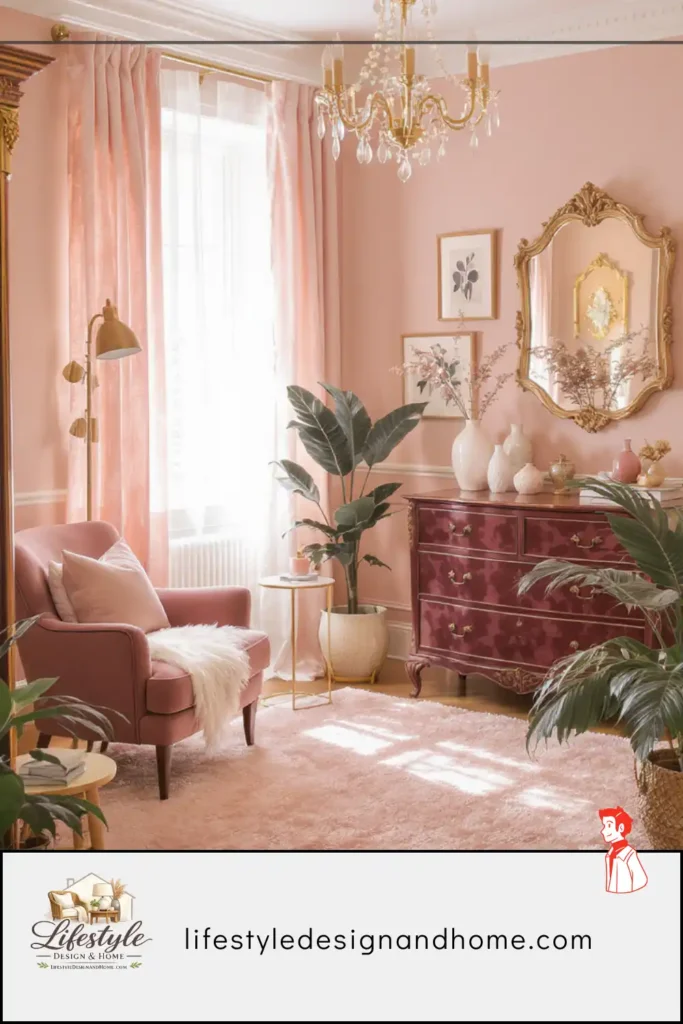
The color that works is not pink in the sense of bright or saturated pink — not the pink of children’s rooms or fashion statements. It is the pink that has been so thoroughly mixed with grey or brown that it reads as a neutral with an unexpected warmth — the pink of aged terracotta, of rose quartz, of dried flowers, of the specific warm-not-orange color that some people call blush and others call dusty rose and others call old rose.
This color has warmth of a specific type: the warmth of skin, of living things, of the hour after sunset. It is among the most physiologically flattering colors available — it makes skin look warm and healthy, which means that in a bedroom where you spend time in low light looking at your own reflection or at another person, a dusty rose or warm blush wall creates a flattering ambient that functions like permanent warm lighting from all directions.
Why designers return to it:
The dusty pink palette is forgiving in ways that other bedroom colors are not. It works with warm wood tones. It works with white or cream. It works with natural linen. It works with brass and copper. It works with grey if the grey has warm undertones. Its flexibility comes from its warmth — the warm-pink undertone relates to almost everything that is also warm-toned, which is most of the materials commonly used in residential interiors.
The specific tones that work:
Dusty rose — pink with significant grey in it, muted and sophisticated. Old rose — slightly more brown than dusty rose, the color of a dried flower rather than a fresh one. Warm blush — the palest end of the palette, barely-there pink that reads as a warm white until the light hits it at a certain angle and reveals the pink. And the deeper versions — the mauve-adjacent tones that read as pink from certain angles and grey-purple from others.
The layering that completes the palette:
Dusty pink walls with warm natural linen bedding. Pale oak or warm walnut furniture. Brass or bronze fixtures and hardware. A rug in warm ivory or natural jute. Lamps with cream shades at 2700K. The overall quality is warmth without sweetness — the palette’s natural tendency toward softness is balanced by the organic warmth of natural materials.
Palette #6: Terracotta, Clay, and Earthy Warmth
This brings me back to where this article started — the color I almost painted over three times and have not regretted since.
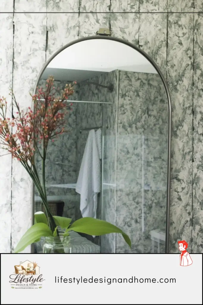
Terracotta and clay tones are earth colors — the colors of soil, of fired clay, of the earth in the hour before sunset. They are among the oldest colors in the human residential environment: every culture that has built with clay and fired ceramics has produced living spaces in these tones, across every continent and every era. The human nervous system has a long history with these colors. They read as home at a level below conscious thought.
The specific quality of terracotta in a bedroom: warmth that is not just visual but almost thermal. A terracotta bedroom feels warmer than a pale bedroom, measurably warmer in the physiological sense of the body’s response to it, despite being the same temperature. The color reads as warmth and the body interprets the reading as literal. In a cold climate or a north-facing room, this effect is not trivial — it is one of the things that makes the room feel like somewhere to be rather than somewhere to escape from.
The range within this palette:
Bright terracotta — the vivid orange-clay color of Mexican tile — is too stimulating for most bedrooms. It reads as active rather than restful, energizing rather than calming.
Muted terracotta — the color I painted, with grey and brown in it, the color of aged clay — is in the range that the body reads as warm without reading as energizing. This is the working range of the palette.
Pale clay — barely terracotta, a warm off-white with earthy undertones that reads as almost-neutral — is the least committed version of the palette and the easiest to live with. It produces a room that reads as warm and slightly earthy without reading as colored.
Deep clay — the rich, dark earth tones that sit between terracotta and brown — is the moody version of the palette, appropriate for rooms with good light and occupants willing to commit to depth.
The layering that completes the palette:
Terracotta and clay are at their best with natural materials: unbleached linen, natural cotton, raw wool, woven textiles, handmade ceramics. The palette is earthy and the other elements should be too — not in a heavy-handed way but in the sense that natural, organic, imperfect materials relate naturally to the earthy warmth of the walls. White-white bedding with terracotta walls creates a contrast that reads as stark. Warm ivory or natural linen bedding creates a warmth that reads as unified.
The Rules That Govern All of Them
Across all six palettes, several principles apply consistently enough to be stated as rules rather than suggestions.
Rule 1: Test in the room’s actual light.
Paint chips read differently in the paint store than they do on the walls. Always test a paint sample — at least 12 by 12 inches, ideally larger — on the actual wall of the actual room, and evaluate it at different times of day and under both natural and artificial light. The color you are choosing is the color that will be on those walls in that light, not the color on a chip in a store.
Rule 2: Warm undertones, always, in bedrooms.
This is not a rule about specific colors — navy has warm undertones, sage has warm undertones, charcoal can have warm undertones. It is a rule about the character of the color. Cool-undertoned colors in bedrooms read as clinical, restless, or slightly wrong, even when the specific color is a color that can work beautifully in other rooms.
Rule 3: The ceiling is part of the palette.
Most bedrooms are painted with white ceilings against colored walls, which creates a contrast that reads as a room with a specific limitation: the color ends at a line and above that line is something else. A ceiling painted in a slightly lighter version of the wall color — one or two shades lighter, not the same tone — creates a room that feels continuous and enveloping rather than lined. This is particularly effective with deep colors, where it prevents the ceiling from feeling like a ceiling-shaped hole.
Rule 4: The bedding is the palette’s primary element.
The bed occupies the largest visual field in the bedroom. The bedding is the most seen surface in the room. The color relationship between the wall and the bedding is the dominant color relationship in the space — more influential than the relationship between wall and floor, wall and furniture, or any other pairing. Choose the wall color in direct response to the bedding, not independently of it.
Rule 5: Lighting determines how the palette reads.
Every palette described in this article requires warm lighting at 2700K to read correctly in the evening. The same warm taupe that reads as sophisticated warmth under 2700K lamp light reads as dingy grey-beige under 4000K fluorescent. The same navy that reads as rich and enveloping under warm light reads as flat and institutional under cool light. The palette and the lighting are not separate decisions.
The Morning the Terracotta Was Finally Right
On the Monday after painting, I woke up in the room for the first time with the muted terracotta walls.
The north-facing window was producing its characteristic flat grey morning light. The light came through and hit the wall opposite the window — the terracotta wall — and what came back was not grey. It was warm. The reflected light from the terracotta wall had been warmed by the wall itself, and the room felt, at 7 AM on a grey morning, like somewhere that knew it was morning and had made peace with it.
I lay there for a few minutes — which I had not previously done in that bedroom, which had always felt like a room to leave rather than to linger in — and understood what the designer had known about this color and this room and this specific quality of warmth that earth colors produce in rooms used for rest.
The color was right. My instinct had been wrong. The two years since have confirmed it every morning.
That is what bedroom color does when it is right. It makes the room feel like the first place rather than the last — the place you want to be in the morning before the day starts, the place that receives you at the end of it.
That quality is not accidental. It is chosen, deliberately, in the color.